
To do basic statistical analysis in Excel, you type worksheet functions like =AVERAGE(), =MEDIAN() and =STDEV.S() into a summary area next to your data, or you enable the Analysis ToolPak and let Data > Data Analysis produce the whole summary table at once. Give it 30 to 60 minutes for your first clean run, and treat it as learnable rather than technical: if you can type a sum, you can do this.
I see this question every week from students who were handed a spreadsheet and no instructions. The formulas are the easy part. What actually trips people up is choosing the wrong standard deviation, or having numbers silently stored as text so every result is wrong without any error message.
So this guide walks the whole job in order — clean the data, calculate the measures, check the shape, look for relationships, then write up the results. Everything is written as text you can copy, not screenshots, because screenshots cannot be copied and you cannot read them on a phone.
Table of Contents
- 1What You Need to Use Excel for Basic Statistical Analysis
- 2Step-by-Step
- 31. Prepare and Clean Your Data
- 42. Calculate the Mean, Median, and Mode
- 53. Find the Minimum, Maximum, Range, and Standard Deviation
- 64. Count Values and Calculate Percentages
- 75. Create a Frequency Distribution and Chart
- 86. Check Relationships with Correlation and Scatterplots
- 97. Check and Present Your Results
- 10Common Mistakes
- 11Frequently Asked Questions
- 12Can I do basic statistical analysis in Microsoft Excel?
- 13Which Excel version should I use for basic statistical analysis?
- 14What is the difference between sample and population standard deviation in Excel?
- 15How do I handle missing values when calculating statistics in Excel?
- 16Does an Excel correlation prove that one variable causes another?
- 17Can Excel replace SPSS, Stata, or R for research analysis?
What You Need to Use Excel for Basic Statistical Analysis
You need three things: a spreadsheet program, one tidy table of numbers, and about half an hour. That is genuinely it. No add-in is required for the first half of this guide, because every statistic covered here is a built-in function.
The platform matters more than people expect, because menus moved between versions.
- Excel on Windows (Microsoft 365 and the current desktop releases) has everything, including the Analysis ToolPak.
- Excel for Mac has every function on this page, but the add-in manager sits under Tools > Add-ins rather than File > Options.
- Excel for the web has the functions, but no Data Analysis dialog at all.
- Google Sheets runs the same functions. For a frequency table, use
=COUNTIFS()instead of the FREQUENCY function, which Sheets does not have. - LibreOffice Calc handles the functions too, and its Data > Statistics menu covers a good share of the ToolPak tools.
You also need your data in the right shape before a single formula goes in. One variable per column, a header in row 1, numbers stored as numbers, and one observation per row.
This is the reference table I keep open in a tab. Every function in this guide appears here with its syntax and the question it answers.
| Function | Syntax | Question it answers | Sample or population |
|---|---|---|---|
| AVERAGE | =AVERAGE(B2:B21) | What is the mean? | Either |
| MEDIAN | =MEDIAN(B2:B21) | What is the middle value? | Either |
| MODE.SNGL | =MODE.SNGL(B2:B21) | Which value repeats most? | Either |
| COUNT | =COUNT(B2:B21) | How many numeric values? | Neither |
| COUNTA | =COUNTA(B2:B21) | How many non-blank cells? | Neither |
| MIN / MAX | =MIN(B2:B21) =MAX(B2:B21) | What are the extremes? | Either |
| STDEV.S | =STDEV.S(B2:B21) | How spread out is the sample? | Sample |
| STDEV.P | =STDEV.P(B2:B21) | How spread out is the whole population? | Population |
| VAR.S / VAR.P | =VAR.S(B2:B21) =VAR.P(B2:B21) | Variance of sample or population | Sample or population |
| QUARTILE.INC | =QUARTILE.INC(B2:B21,1) | What is the 25th percentile? | Either |
| COUNTIF | =COUNTIF(B2:B21,3) | How many rows match a value? | Neither |
| FREQUENCY | =FREQUENCY(B2:B21,C2:C7) | How many values fall in each bin? | Neither |
| CORREL | =CORREL(B2:B21,C2:C21) | Do two variables move together? | Either |
Step-by-Step
1. Prepare and Clean Your Data
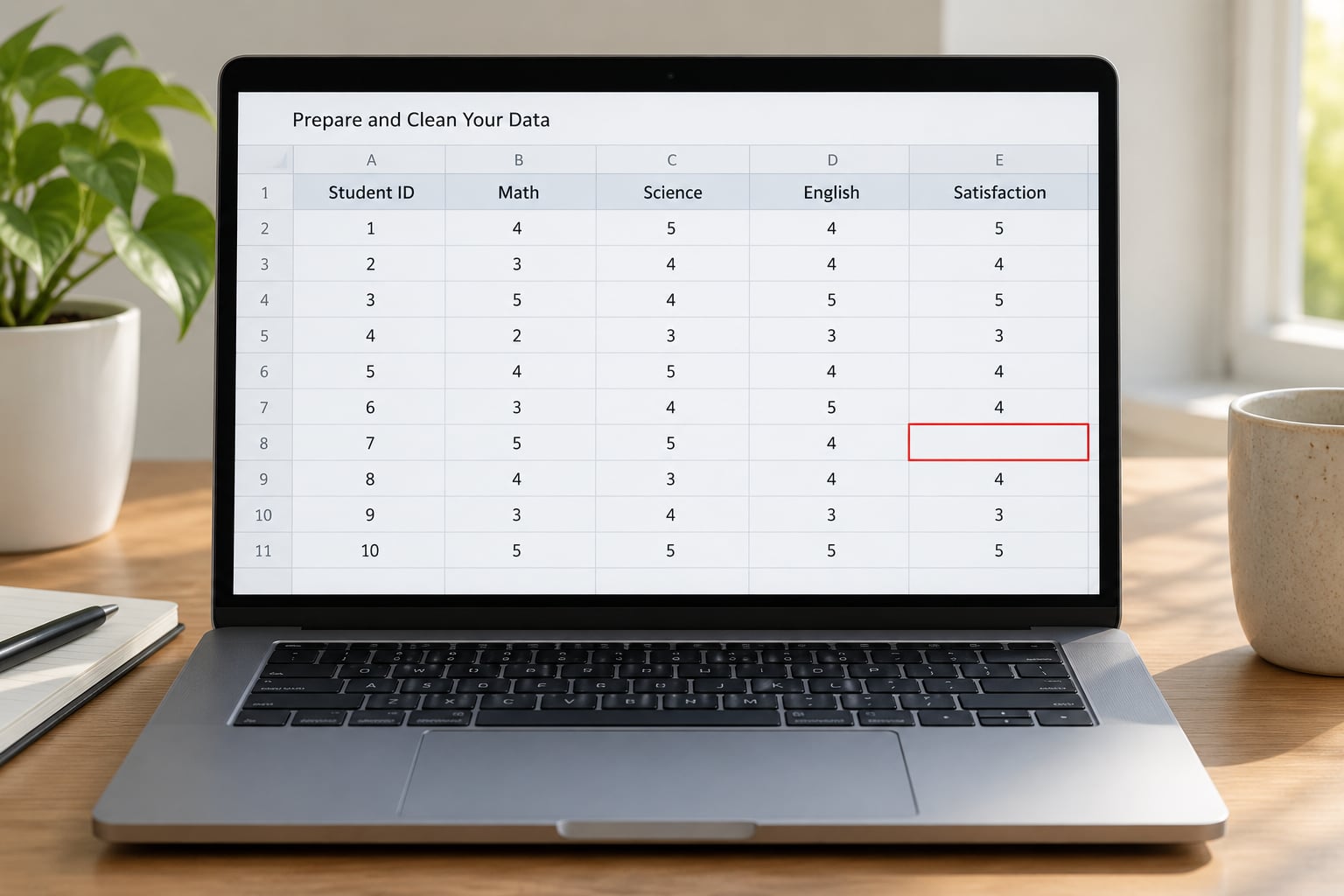
Start by putting one variable per column with a header in row 1, because every range you type later assumes that layout. Merged cells break formulas in ways that produce confusing errors, so unmerge anything you find.
The single most damaging problem is a number stored as text. It looks identical, sits with no padding on the cell side where text normally starts, and every statistical function silently ignores it. SUM and AVERAGE skip those cells without complaining, so your COUNT comes back lower than the number of rows and nobody notices for weeks.
Click any single cell in the suspect column. If the number appears with no padding on the cell side where text normally sits, or if the status bar at the bottom shows Count but a blank Average, you have text numbers. Fix them with Data > Text to Columns, Finish, and the alignment snaps right.
Blanks and duplicates get handled next. A genuinely missing value is fine — functions skip it. A stray space or a duplicate row is not fine, so use Data > Remove Duplicates before you calculate anything.
Here is the practice dataset used throughout this guide. Paste it straight into a blank sheet, with scores in column B and study hours in column C.
| Row | Score out of 100 | Study hours per week |
|---|---|---|
| 1 | 72 | 3 |
| 2 | 65 | 2 |
| 3 | 81 | 4 |
| 4 | 90 | 6 |
| 5 | 58 | 1 |
| 6 | 77 | 3 |
| 7 | 84 | 5 |
| 8 | 69 | 2 |
| 9 | 93 | 7 |
| 10 | 61 | 1 |
| 11 | 75 | 3 |
| 12 | 88 | 6 |
| 13 | 66 | 2 |
| 14 | 79 | 4 |
| 15 | 95 | 8 |
| 16 | 71 | 3 |
| 17 | 63 | 2 |
| 18 | 85 | 5 |
| 19 | 59 | 1 |
| 20 | 82 | 4 |
Two columns of twenty rows is the whole setup. A quick check before you calculate: put =COUNT(B2:B21) in an empty cell. If it returns 20, your numbers are real numbers. If it returns something smaller, fix the text formatting before going further.
2. Calculate the Mean, Median, and Mode
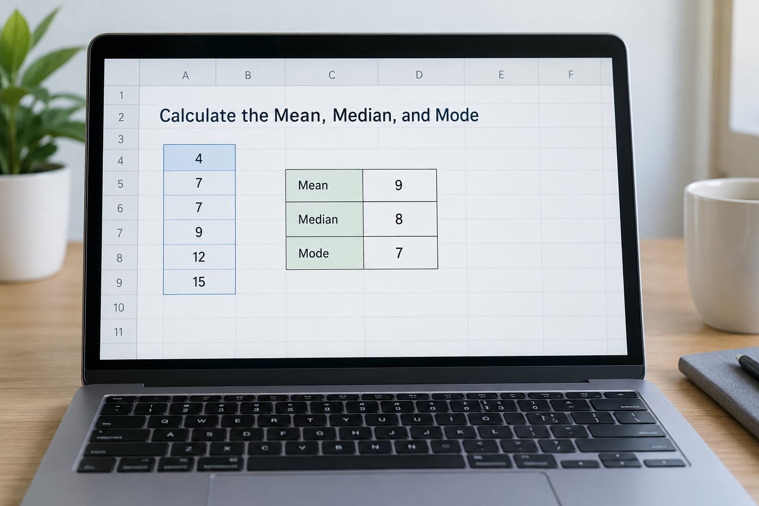
The mean is the arithmetic average, the median is the middle value when you sort, and the mode is the value that repeats most often. Excel computes all three in one line each.
Put these in an empty block of cells a few columns to the right of your data, writing the label in the cell beside each formula so you remember later what each number is.
| Label | Formula | Result |
|---|---|---|
| Mean | =AVERAGE(B2:B21) | 75.65 |
| Median | =MEDIAN(B2:B21) | 76 |
| Mode | =MODE.SNGL(B2:B21) | #N/A |
| Count | =COUNT(B2:B21) | 20 |
The mode comes back as #N/A, and that is the correct answer rather than a mistake. Every score in this dataset is distinct, so there is no repeating value. If a real dataset has two values tied for most frequent, MODE.SNGL returns only the first of them, and MODE.MULT is the function that returns all of them.
Notice the mean and median land close together here, at 75.65 and 76. When they sit far apart, that gap is the signal. A mean dragged well above the median means a few very high scores are pulling the average up, which is exactly the situation where the mean misrepresents a typical result. Report the median instead, or report both and explain the difference.
A mean of 75.65 sounds more precise than it is. With twenty observations, reporting two decimal places is false precision. Round to 75.7 or just 76 in a write-up.
3. Find the Minimum, Maximum, Range, and Standard Deviation
Standard deviation tells you how spread out the values are around the mean. A standard deviation of 11.5 means most scores fall roughly 11 points either side of 75.65, and it is the number that tells a reader whether two groups really differ or just look different.
The decision rule is short enough to memorise: use STDEV.S when your data is a sample drawn from a larger population, such as twenty students out of a class of two hundred. Use STDEV.P only when you have every member of the population, such as every transaction in a closed accounting period.
For most coursework and survey work the answer is STDEV.S, because a sample is nearly always what you have.
| Label | Formula | Result |
|---|---|---|
| Minimum | =MIN(B2:B21) | 58 |
| Maximum | =MAX(B2:B21) | 95 |
| Range | =MAX(B2:B21)-MIN(B2:B21) | 37 |
| Sample SD | =STDEV.S(B2:B21) | 11.52 |
| Population SD | =STDEV.P(B2:B21) | 11.23 |
| Sample variance | =VAR.S(B2:B21) | 132.77 |
| Lower quartile | =QUARTILE.INC(B2:B21,1) | 65.75 |
| Upper quartile | =QUARTILE.INC(B2:B21,3) | 84.25 |
| Interquartile range | =QUARTILE.INC(B2:B21,3)-QUARTILE.INC(B2:B21,1) | 18.5 |
Both standard deviations appear in that table on purpose. STDEV.P returns 11.23 and STDEV.S returns 11.52 — a small difference here, but with a sample of four or five values the gap becomes large enough to change a conclusion. STDEV.P divides by n; STDEV.S divides by n minus 1, which corrects for the fact that a sample mean is itself a guess at the true mean.
The interquartile range is 18.5, which spans the middle half of the scores from 65.75 to 84.25. Report it alongside the median when you have outliers, because unlike the standard deviation it cannot be dragged around by a single extreme value.
4. Count Values and Calculate Percentages
Survey data is usually categorical — agree, neutral, disagree — and counting is a two-function job. COUNT counts numbers only, while COUNTA counts every non-blank cell including text. For a response column full of words, COUNTA is the one you want.
Use COUNTIF to tally one category, then divide by the total to get a percentage.
For the study hours column in C2:C21, =COUNTIF(C2:C21,1) returns 3, and =COUNTIF(C2:C21,1)/COUNTA(C2:C21) returns 15%. Lock the denominator with a dollar sign so it does not drift when you fill the formula down: =COUNTIF(C$2:C$21,1)/COUNTA(C$2:C$21).
Build the full tally like this, one row per category with the label in one column and the count formula in the one beside it.
| Study hours | Count | Percentage |
|---|---|---|
| 1 | 3 | 15% |
| 2 | 4 | 20% |
| 3 | 4 | 20% |
| 4 | 3 | 15% |
| 5 | 2 | 10% |
| 6 | 2 | 10% |
| 7 | 1 | 5% |
| 8 | 1 | 5% |
The percentages total 100%, which is your own check that the counts are right. If they total 97% or 104%, a category is missing from the table or a count formula points at the wrong range.
5. Create a Frequency Distribution and Chart
A frequency distribution groups continuous values into bins and counts how many land in each. You need two things: a list of bin boundaries, and a FREQUENCY formula that counts against them.
Put the bin lower edges in an empty column as 50, 60, 70, 80, 90, then in the cell beside them type =FREQUENCY(B2:B21,that column range) and press Enter. That single formula spills five results down the column, because the cell underneath the last one must stay empty for the final bin to be counted correctly.
| Score range | Frequency |
|---|---|
| 50 to 59 | 2 |
| 60 to 69 | 5 |
| 70 to 79 | 5 |
| 80 to 89 | 5 |
| 90 to 100 | 3 |
The frequencies total 20, matching your COUNT. That check catches off-by-one bin errors immediately, and it is the fastest way to know whether a chart you are about to publish is telling the truth.
To chart it without any add-in, select the two columns, go to Insert > Charts > Insert Column or Bar Chart, then Clustered Column. Replace the automatic title with a real one, add axis titles carrying the measurement scale, and leave the data labels off unless there are only a handful of bars.
If you have the Analysis ToolPak enabled, Insert > Histogram is faster, but it produces a bin layout Excel chooses for you rather than the one you specified. For a report where the bin widths matter, your own FREQUENCY table is more defensible.
6. Check Relationships with Correlation and Scatterplots
To see whether two numeric variables move together, use =CORREL(B2:B21,C2:C21). For this dataset it returns roughly 0.97, a very strong positive relationship: students who study more hours tend to score higher.
To see it rather than read it, select the two columns and choose Insert > Scatter > Scatter with only markers. Excel’s default XY scatter decides the axis roles for you, putting whichever column comes first on the horizontal axis.
Correlation describes association and nothing else. It cannot show direction of cause, and it cannot rule out a third variable driving both — here, prior ability could raise both study hours and scores. Say “study hours and scores are strongly associated” rather than “studying more causes higher scores”.
A correlation near 0.97 also tells you something about your sample: it is nearly a straight line. That is unusual for real-world data, and if your own dataset produces a number this clean, check that you have not accidentally sorted one column or pasted values in the wrong order.
7. Check and Present Your Results
Before you trust a single number, verify the ranges. Select the formula cell and read the coloured border Excel draws around the range it is using — a range that stops two rows short of the bottom of your data is the single most common silent error in a spreadsheet analysis.
Then open the Analysis ToolPak, which returns the whole summary in one action. On Windows, go to File > Options > Add-ins, choose Excel Add-ins in the Manage box, click Go, tick Analysis ToolPak, then OK. On Mac, it is Tools > Add-ins > Excel Add-ins and enable Analysis ToolPak there instead. In Excel for the web there is no Data Analysis dialog, so use the formulas above instead.
With a Data Analysis button on the Data tab: select B1:B21, click Data > Data Analysis, choose Descriptive Statistics, set the Input Range to $B$1:$B$21, tick Labels in First Row, choose Columns under Grouped By, set an Output Range such as $H$1, and tick Summary statistics. OK. You get sixteen rows of output in a single action, which is the fastest way to confirm the numbers you calculated by hand.
Most of those rows are irrelevant to basic work. Here is what each one actually means.
| Output row | What it means | Do you need it? |
|---|---|---|
| Mean, Median, Mode | Central tendency | Yes, quote these |
| Standard Deviation | Spread around the mean | Yes, quote it with the mean |
| Variance | Spread, in squared form | Only for further maths |
| Count | Number of numeric values used | Yes, as a sanity check |
| Minimum, Maximum, Range | Extremes and spread | Range is worth reporting |
| Sum | Total of all values | Sometimes |
| Standard Error | How precise the mean is | Only for inferential work |
| Skewness | Asymmetry, around 0 is balanced | Yes, to justify mean vs median |
| Kurtosis | Tail heaviness, around 3 is normal | Rarely at this level |
| Confidence Level | Input parameter, not a result | Ignore |
Skewness is the row worth understanding properly, because it tells you whether to trust the mean. A value between minus 1 and plus 1 means the distribution is close enough to symmetrical for the mean to represent a typical case. Beyond plus 1, a mean pulled upward by a long tail is misleading, and you should report the median instead.
Then write the results up. A report-ready summary of this dataset looks like this, and it needs no more than four numbers.
| Measure | Score out of 100 |
|---|---|
| Number of students | 20 |
| Mean | 75.65 |
| Standard deviation (sample) | 11.52 |
| Minimum to maximum | 58 to 95 |
Written in prose: the twenty students averaged 75.65 out of 100 with a sample standard deviation of 11.52, and scores ranged from 58 to 95. Always report the standard deviation next to the mean. A mean on its own tells a reader nothing about whether the group was consistent or scattered.
Common Mistakes
Numbers stored as text are the most damaging, because nothing flags them. SUM and COUNT quietly skip text cells, so your mean and standard deviation are computed on a fraction of the data with no error message anywhere.
Using the wrong standard deviation costs marks. STDEV.P on a sample understates the spread, and on a small sample of four or five values the difference is large.
Merged cells break range references and produce #VALUE! errors that send people hunting for a formula problem that is really a layout problem.
Selecting rows instead of columns in the Descriptive Statistics dialog summarises each student rather than each column, which looks like a result but is not one.
Mismatched ranges across two variables is the bug behind most false correlations. If column B has twenty values and column C has nineteen because one row is blank, CORREL returns #N/A or, worse, pairs the wrong values together.
Reading skewness as a failure is a misunderstanding rather than an error. A dataset does not have to be symmetrical. It does have to be described accurately, which is what the median is for.
Publishing a chart with no axis labels or an automatic title such as “Chart Title” makes the chart decoration rather than evidence. Label both axes using the measurement scale your data uses and put the sample size in the caption.
A #DIV/0! error means the function had nothing to work with — usually an empty range, or a selection of headers with no numbers beneath them. Check that the range points at data cells rather than at row 1.
And if Data Analysis is missing entirely, check your version before anything else. Excel Online has no ToolPak, and on Mac the add-in manager lives under Tools rather than File, which is where most people look and fail to find it.
Frequently Asked Questions
Can I do basic statistical analysis in Microsoft Excel?
Yes. Every measure in this guide, including mean, median, mode, range, standard deviation, variance, quartiles, percentages, frequency counts and correlation, is a built-in worksheet function that needs no add-in. Excel also ships an optional Analysis ToolPak that produces a full descriptive statistics table in one click. For datasets under a few thousand rows, Excel is genuinely enough.
Which Excel version should I use for basic statistical analysis?
Any current desktop version works, including Microsoft 365 and recent standalone releases on Windows, plus Excel for Mac. The statistical functions are identical across them. The difference is the Analysis ToolPak: on Windows it is enabled through File Options Add-ins, and on Mac through Tools Add-ins. Excel for the web has no Data Analysis dialog at all.
What is the difference between sample and population standard deviation in Excel?
STDEV.S treats your values as a sample drawn from a larger population and divides by n minus 1, which corrects for the fact that a sample mean is only an estimate of the true mean. STDEV.P treats your values as the complete population and divides by n, giving a slightly smaller number. For the twenty scores in this guide, STDEV.S returns 11.52 and STDEV.P returns 11.23. Use the sample version for coursework and surveys.
How do I handle missing values when calculating statistics in Excel?
Leave them blank and let the functions skip them. AVERAGE, MEDIAN and STDEV.S all ignore empty cells, and COUNT reports how many values were actually used, which tells you whether the exclusion was large. Avoid typing a zero or the text NA as a placeholder, because both get pulled into the calculation and drag the mean down.
Does an Excel correlation prove that one variable causes another?
No. CORREL measures the strength and direction of a linear association and nothing more. Two variables can correlate strongly because one causes the other, because a third variable affects both, or because the pattern is a coincidence of the sample. A high r in a small dataset is also unstable, so check that your paired ranges have the same number of rows before drawing any conclusion.
Can Excel replace SPSS, Stata, or R for research analysis?
For descriptive statistics on a small or medium dataset, yes. Excel handles cleaning, summary measures, frequency tables, charts, correlation and simple regression, and most student and business reporting stops there. Move to dedicated software when you need reproducible scripted workflows, complex survey weighting, mixed models, or a project with enough data that formulas become hard to audit.
Start with three checks and you will catch most problems before they reach your report. Put =COUNT(B2:B21) in an empty cell to confirm your numbers are stored as numbers and nothing was skipped. Then =AVERAGE(B2:B21) and =STDEV.S(B2:B21) side by side, and report those two numbers together rather than the mean on its own. Once those three values look right, everything else in this guide builds on them.