You can quickly get a complete summary of your data using the Analysis ToolPak built into Microsoft Excel. It takes a single column of numbers and returns a table of mean, median, mode, standard deviation, variance, quartiles, skewness and more in about fifteen seconds of clicking.
If the Data Analysis button is missing from your ribbon, or you would rather not enable an add-in at all, you can build the same numbers with ordinary formulas like =AVERAGE(A2:A11) and =STDEV.S(A2:A11). This guide covers both routes, plus what each row of the output actually means.
Everything below uses one small dataset of ten exam scores so you can reproduce the exact figures yourself. It takes about five minutes on a desktop copy of Excel.
Table of Contents
- 1What You Need
- 2Lay your data out one observation per row
- 3Check that your values are really numbers
- 4Step-by-Step
- 5Use Excel Formulas for Descriptive Statistics
- 6Create an Automatic Descriptive Statistics Table
- 7Use Excel’s Analysis ToolPak
- 8Enable the Analysis ToolPak on Windows
- 9Run the tool
- 10Choose the Right Statistic for Your Data
- 11Common Mistakes
- 12How to Report Descriptive Statistics in Your Research
- 13Frequently Asked Questions
- 14How do you calculate descriptive statistics?
- 15Why is the Data Analysis button missing from my Excel ribbon?
- 16Can you do ANOVA in Excel?
- 17Which Excel function calculates standard deviation?
- 18How do I get descriptive statistics in Google Sheets?
- 19Start With the Formula Check, Then Use the ToolPak
What You Need
Descriptive statistics summarise one variable at a time: where its centre sits, how spread out it is, and what shape it has. Excel can do this for a single column in one click, or cell by cell with formulas. Before you start, the data needs a specific shape.
Lay your data out one observation per row
Put a header in row 1 and one observation in each row below it, with no blank rows and no merged cells. Excel’s descriptive statistics tool reads a column of individual values, so a two-column layout of distinct values and their counts will not work directly.
Here is the dataset used throughout this guide, in cells A2 to A11:
| Cell | Score |
|---|---|
| A2 | 58 |
| A3 | 62 |
| A4 | 69 |
| A5 | 73 |
| A6 | 74 |
| A7 | 77 |
| A8 | 81 |
| A9 | 85 |
| A10 | 90 |
| A11 | 95 |
Check that your values are really numbers
Text-formatted numbers are the single most common reason a column of digits gets ignored. Click an empty cell, type =ISNUMBER(A2), and press Enter. TRUE means the cell holds a real number; FALSE means it is text and every statistic will ignore it.
You can also select the range and look at the status bar. If it shows Average, Count and Sum, the values are numeric. If Count shows a smaller number than your visible rows, some cells are text. To fix text numbers, select the column, click the warning triangle in the top-left corner and choose Convert to Number.
Step-by-Step
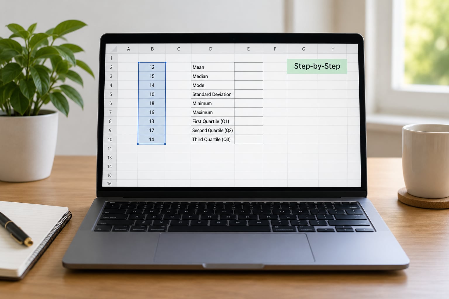
Use Excel Formulas for Descriptive Statistics
Formulas are the most portable option. They work in every version of desktop Excel, in Excel for the web, and in Google Sheets, with no add-in to switch on. Type each one into a separate empty cell such as D2 and the value appears next to your data.
| Statistic | Excel 2010 and later | Legacy name | Formula for A2:A11 | Result |
|---|---|---|---|---|
| Count | COUNT | COUNT | =COUNT(A2:A11) | 10 |
| Mean | AVERAGE | AVERAGE | =AVERAGE(A2:A11) | 76.4 |
| Median | MEDIAN | MEDIAN | =MEDIAN(A2:A11) | 75.5 |
| Mode | MODE.SNGL | MODE | =MODE.SNGL(A2:A11) | #N/A |
| Minimum | MIN | MIN | =MIN(A2:A11) | 58 |
| Maximum | MAX | MAX | =MAX(A2:A11) | 95 |
| Range | MAX minus MIN | none | =MAX(A2:A11)-MIN(A2:A11) | 37 |
| Sample SD | STDEV.S | STDEV | =STDEV.S(A2:A11) | 11.76 |
| Sample variance | VAR.S | VAR | =VAR.S(A2:A11) | 138.27 |
| Lower quartile | QUARTILE.INC | QUARTILE | =QUARTILE.INC(A2:A11,1) | 70 |
| Upper quartile | QUARTILE.INC | QUARTILE | =QUARTILE.INC(A2:A11,3) | 84 |
| Interquartile range | Q3 minus Q1 | none | =QUARTILE.INC(A2:A11,3)-QUARTILE.INC(A2:A11,1) | 14 |
| Sum | SUM | SUM | =SUM(A2:A11) | 764 |
| Skewness | SKEW | SKEW | =SKEW(A2:A11) | 0.03 |
| Kurtosis | KURT | KURT | =KURT(A2:A11) | -1.32 |
Two function names changed in Excel 2010. The old STDEV, VAR and MODE still work, but they now behave as the sample versions, so STDEV and STDEV.S return identical numbers. Use the dotted names in new work because supervisors and journal style guides increasingly ask for them.
A #N/A from MODE.SNGL means every score appears only once, which is normal for continuous data such as test scores or measurements. It is not an error. If you need the most common score when there are ties, MODE.MULT returns every tied value, and on older workbooks entered with Ctrl+Shift+Enter.
Create an Automatic Descriptive Statistics Table
Instead of scattering formulas, build a small block that recalculates whenever your data changes. This is the version I keep in a separate sheet of any analysis workbook.
Put these labels in column C starting at C1: Count, Mean, Median, Mode, Minimum, Maximum, Range, Standard Deviation, Variance, Q1, Q3, IQR. In column D, enter the matching formulas with $A$2:$A$11 so the reference stays locked. Absolute references matter here: without the dollar signs, dragging or copying the formula shifts the range and the numbers quietly go wrong.
Now that block updates itself if you paste new scores into column A. To add a second variable, put it in column B, copy the labels across to column F and the formulas to column G, then edit each range from $A$2:$A$11 to $B$2:$B$11. Use Find and Replace on the copied formulas to change the column letter in one pass rather than editing sixteen cells by hand.
For a score column, the extra rows worth adding are skewness and kurtosis, and a trimmed mean that ignores the top and bottom 10 percent: =TRIMMEAN(A2:A11,0.2).
Use Excel’s Analysis ToolPak
The ToolPak is the fastest route and the one most tutorials open with. It is a built-in add-in, so no download is needed. The blocker is that it is not loaded by default on some installations, which is why the enable steps come first.
Enable the Analysis ToolPak on Windows
- Open Excel and click File.
- Choose Options, then Add-ins.
- At the bottom, pick Excel Add-ins in the Manage box.
- Click Go and tick Analysis ToolPak.
- Press OK, then restart Excel.
On Mac, there is no File > Options path. Go to the Excel menu, choose Preferences, then Add-ins. In older Mac builds the route is Tools > Excel Add-ins. Tick Analysis ToolPak there and restart.
Excel for the web and the mobile apps do not include the ToolPak, so the dialog below simply will not open there. Use the formula method instead. Google Sheets has no ToolPak either, but it supports AVERAGE, MEDIAN, MODE.SNGL, STDEV.S and the QUARTILE family natively, so the formula table above transfers almost unchanged.
Run the tool
- Click Data on the ribbon.
- Click Data Analysis in the Analysis group.
- Select Descriptive Statistics from the list.
- Set Input Range to $A$1:$A$11.
- Check Labels in first row.
- Check Summary statistics.
- Set Output Range to an empty cell such as D1, then click OK.
Excel writes its summary starting at D1. That area must be empty; if it is not, the tool warns you it will overwrite existing content. Choose a genuinely blank cell or pick New Worksheet Ply from the Output Range dropdown to keep the results on their own tab.
Grouped By should stay on Columns for a single variable. If your data runs across a row instead of down a column, switch it to Rows, or Excel will return a single summary of a single cell rather than a summary per variable.
For the ten scores above, the output table reads:
| Row in output | Value | What it tells you |
|---|---|---|
| Mean | 76.4 | The arithmetic average score |
| Standard Error | 3.72 | Typical distance of the mean from the true mean |
| Median | 75.5 | Middle value, unaffected by extremes |
| Mode | #N/A | No score repeats in this data |
| Standard Deviation | 11.76 | Sample spread, using n minus 1 |
| Variance | 138.27 | Standard deviation squared |
| Kurtosis | -1.32 | Flatter than a normal distribution |
| Skewness | 0.03 | Almost perfectly symmetric |
| Range | 37 | Maximum minus minimum |
| Minimum | 58 | Lowest score |
| Maximum | 95 | Highest score |
| Sum | 764 | Total of all ten scores |
| Count | 10 | Number of numeric values found |
Skewness near zero means the distribution is roughly symmetric, and it is here. A positive value means a long tail to the right, which is the usual shape for income or response times. A negative value means a tail to the left, common in bounded scores near the top of a scale.
Kurtosis of zero corresponds to a normal distribution. Excel’s KURT function returns excess kurtosis, so a negative number here means the data has thinner tails than normal rather than containing outliers. Values above about 2 point toward a few extreme cases worth inspecting individually.
The Kth Largest and Kth Smallest rows only appear if you tick those boxes in the dialog. They are handy for finding the second-highest or second-lowest observation without sorting the whole column.
To see the shape directly, select the data and use Insert > Charts > Insert Statistic Chart > Histogram. The box and whisker chart gives you median, quartiles and outliers in one view.
Choose the Right Statistic for Your Data
Getting the numbers is the easy part. Reporting a mean and standard deviation for badly skewed data is what gets a paper sent back with comments, so match the statistic to the distribution you actually have.
Report the mean and standard deviation when the data is roughly symmetric and has no serious outliers. You can check by looking at skewness: a value close to zero, roughly between minus 1 and 1, supports this choice. It is also the default most journals expect for test scores, reaction times and measurements from stable processes.
Report the median and interquartile range when the distribution is strongly skewed, when the scale has a hard limit, or when the sample is small and a few extremes would drag the mean. Income data, satisfaction ratings, exam scores that pile up at 100 and any dataset where a ceiling effect exists all fit this description. The IQR tells you the spread of the middle half of the data, which is more stable than a full-range figure when outliers are present.
Report the mode when the most common value is itself meaningful, such as the most selected option in a survey. On continuous measurements it is usually absent, as it is here.
Use a frequency table when the data is categorical rather than numeric, or when the sample is small enough that the individual values are worth listing. The FREQUENCY function builds one from a range plus a bin array, and a PivotTable does it without formulas.
Two things change the recommendation. Sample size matters most: below roughly 20 observations, report every value individually rather than trusting a summary, because one point can shift the mean noticeably. And the presence of outliers argues for the median and IQR, or for reporting both so a reader can see the difference the extremes make.
Common Mistakes
Numbers stored as text. The most frequent cause of a wrong count. The values look right and the formulas return blanks or errors. Use Find and Replace to search for ^ from the left, or check alignment: text sits left in the cell, numbers sit right.
Blank cells inside the range. Excel ignores them in most functions, which quietly shrinks your n. Count only what you analysed, and mention the missing data in your results section rather than leaving the reader to guess.
Misplaced header. If Labels in first row is ticked but your data has no header, the first value is consumed as a label and disappears from the count. If you do have a header and the box is unticked, your header text is treated as a non-numeric entry instead. The checkbox and the data must agree.
Wrong range. A range that stops short silently omits rows. A range that runs into the next variable merges two different things into one summary. Select the range, then read the cell count in the status bar and compare it with the number of observations you expect.
Confusing sample and population standard deviation. Use STDEV.S when your data is a sample drawn from a larger population, which is the normal case for research. Use STDEV.P only when your data is the entire population, such as every employee in a company directory or every student in one class. For our ten scores, STDEV.S gives 11.76 while STDEV.P gives 11.14, a difference that grows as n shrinks. Publishing the wrong one is a common and easily spotted error.
Copied formulas losing their references. If a formula gave the right answer in D2 and nonsense in D3, the range probably moved. Lock it with $A$2:$A$11.
Reading Standard Error as Standard Deviation. The two sit next to each other in the output and differ by the square root of n. Standard Error is 3.72 here; Standard Deviation is 11.76. Standard Error matters for confidence intervals and hypothesis tests, not for describing individual values.
Value and count columns. If you have five distinct values each with a total, the ToolPak cannot read that layout because it expects one observation per row. Expand the values into individual rows, or compute weighted statistics with SUMPRODUCT and COUNTIF.
How to Report Descriptive Statistics in Your Research
Your results section needs five things: the measure, its value, a measure of variability, the sample size, and a note on anything unusual. Leaving out the variability figure is the most common omission, and reviewers notice.
The standard APA pattern is M(SD) = value, n = count. For the ten scores in this guide, that reads: The mean score was 76.4 (SD = 11.76, Mdn = 75.5, n = 10).
A fuller version for a skewed variable might read: Median reaction time was 340 ms (IQR = 210 to 480 ms), n = 62. Two values were excluded as outliers before analysis.
Quote a mean or median to one or two decimal places, a standard deviation to two, and always state the sample size. If you excluded outliers, say how many and why. If the distribution is strongly skewed, say so, because a reader who only sees a mean will not anticipate the spread you actually observed.
One more habit worth keeping: put the summary table in the paper, not just the paragraph. Most journals want a table with n, mean, standard deviation or IQR, minimum and maximum for each group, and that table is exactly the automatic block described earlier, exported and tidied.
Frequently Asked Questions
How do you calculate descriptive statistics?
You either select your numeric column and run Data Data Analysis Descriptive Statistics from the Analysis ToolPak, which returns a full summary table in one pass, or you build the values yourself with =AVERAGE, =MEDIAN, =MODE.SNGL, =STDEV.S, =VAR.S, =COUNT, =MIN and =MAX. The first route is faster, the second is more transparent and works everywhere including Google Sheets.
Why is the Data Analysis button missing from my Excel ribbon?
The Analysis ToolPak add-in is not loaded by default. On Windows go to File Options Add-ins, choose Excel Add-ins in the Manage box, click Go and tick Analysis ToolPak, then restart Excel. On Mac use Excel Preferences Add-ins instead, because there is no File Options. Excel for the web and the mobile apps do not include the add-in at all, so use formulas there.
Can you do ANOVA in Excel?
Yes. Once the Analysis ToolPak is enabled, the same Data Analysis dialog that gives you descriptive statistics also offers ANOVA: Single Factor and ANOVA: Two-Factor without Replication. You will need your data arranged with one column per group. The ToolPak covers a useful set of routines including t-Tests, Correlation, Regression, F-Test and Exponential Smoothing.
Which Excel function calculates standard deviation?
STDEV.S in Excel 2010 and later. The older STDEV function still works and returns the identical sample result. Use STDEV.P instead only when your data is the whole population rather than a sample of one, such as every transaction in a single month of a small business. Reporting the sample version is the norm in academic work.
How do I get descriptive statistics in Google Sheets?
Google Sheets has no Analysis ToolPak, but it supports the same function names, so the formula approach transfers directly. Use =AVERAGE, =MEDIAN, =MODE.SNGL, =STDEV.S, =VAR.S, =QUARTILE.INC, =SKEW and =KURT over your range, then label the results in the column beside them. For a frequency count by group, build a PivotTable from Insert PivotTable.
Start With the Formula Check, Then Use the ToolPak
Enter =COUNT(A2:A11) in an empty cell first. If it returns 10 and your column has ten scores, your data is clean and the rest will follow. If it returns something else, fix the formatting first, because no amount of clicking will correct text-stored numbers.
Once the count checks out, run Data > Data Analysis > Descriptive Statistics for the full summary, and keep the formula block beside your data so you can refresh it and add variables later. That is how to calculate descriptive statistics in Excel in a way that survives the next round of data collection.