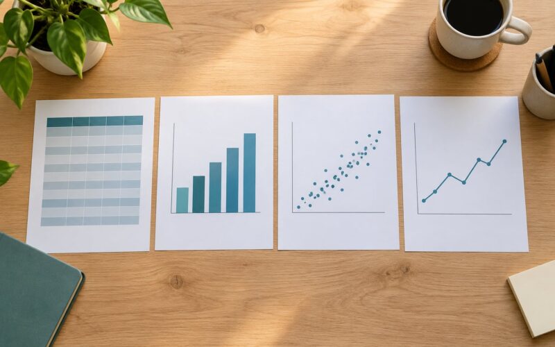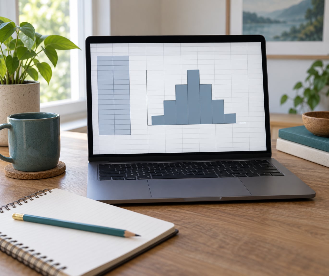
A histogram in Excel takes one column of numbers, groups the values into bins, and draws a bar for each bin showing how many observations landed in it. That is the whole idea, and for research data it is usually the fastest way to see the shape of a distribution before you decide which statistical test to run. This guide covers the native chart, the bin controls that trip people up, the axis labelling problem almost nobody explains, and how to get the finished figure into a paper.
The instructions are written for Excel 365 and Excel 2021 on Windows, with the Mac and web differences noted where they matter. Menu names shift slightly between versions, so treat the ribbon paths as landmarks rather than exact commands.
Table of Contents
- 1What You Need to Make a Histogram in Excel for Research Data
- 2Step-by-Step
- 3How to Make a Histogram in Excel for Research Data
- 4Check That Excel Selected the Right Data
- 5Choose Research-Suitable Bin Widths
- 6Format the Histogram for Reporting
- 7Check the Distribution and Export the Chart
- 8Common Mistakes
- 9Quick Reporting Tips
- 10Frequently Asked Questions
- 11Why is the histogram option missing in my Excel?
- 12Can I make a histogram for categories such as gender or course type?
- 13How do I choose the right bin width for research data?
- 14How do I change a histogram from frequencies to percentages?
- 15Are the steps different in Excel for Mac or Excel for the web?
- 16Conclusion
What You Need to Make a Histogram in Excel for Research Data
You need less than most people expect. If your observations sit in a single numeric column, you can have a chart on screen in about two minutes.
- Excel 365, 2021, 2019 or 2016. The native histogram chart arrived in Excel 2016. If you are on Excel 2007 or 2010 the Insert button will not be there, and you will need the Analysis ToolPak route instead.
- One column of numeric observations. One variable per column, a header row, and no merged cells above the data.
- A clean column. No text, no dashes standing in for missing values, no stray apostrophes. A single hyphen in a numeric column is enough to break the older methods.
- A name for the variable. You will put it on the horizontal axis, so decide what it is called in your write-up.
- A rough sense of the scale. Knowing whether scores run from 0 to 100 or ages from 18 to 79 tells you immediately whether the default bins make sense.
One optional item saves time later: a short note on your bin width and any exclusions you made. Reporting a figure is much easier when the bin decision still exists somewhere other than in your head.
Step-by-Step
The workflow below is the same on every platform, and the result should be a chart showing the distribution of one quantitative research variable: bars that touch, an x-axis covering your value range, and a y-axis counting observations. Menu labels differ a little between Windows, Mac and the web version, so I name both where they diverge.
How to Make a Histogram in Excel for Research Data
Here is the six-step version for the snippet. The longer explanation of each step follows underneath.
- Put your observations in one column with a header in row 1.
- Click any single cell inside that column.
- Go to Insert, then Statistic Chart in the Charts group, then Histogram.
- Confirm the chart appears with touching bars and your value range on the x-axis.
- Set the bin width from the Format Axis pane.
- Add a chart title and axis titles, then remove the legend and gridlines.
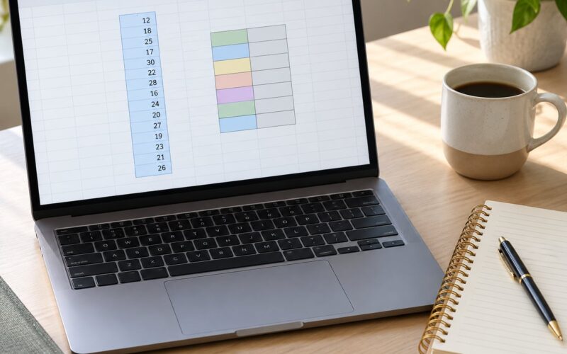
Step 1: prepare the column. Excel reads a contiguous block, so tidy the worksheet first. One variable per column, header in row 1, no blank rows inside the data and nothing merged. Sort the values if you like; the chart does not care about order, but a sorted column makes it easier to spot gaps or a stray text cell at the end.
Step 2: select the data. Click one cell inside the column rather than dragging a range. Excel expands to the whole current region, which is exactly what you want and removes the risk of missing the last observation. To see what it grabbed, click the chart and look at the coloured borders around the cells.
Step 3: insert the chart. On the Insert tab, find Statistic Chart in the Charts group and choose Histogram. It is the first icon in that row, a set of bars. If your window is narrow the chart groups collapse behind a small dialog launcher, which is where people get stuck.
Step 4: verify the output. The bars should touch each other with no gaps, the x-axis should span your lowest to highest value, and the y-axis should show counts. If the bars have gaps or the axis is a date scale, something went wrong at step 1 and the next section covers it.
Step 5: set the bin width. Right-click the horizontal axis and choose Format Axis, then open the Axis Options tab and find the Bin section.
Step 6: label it. A chart with a generic title like “Chart Title” is a chart nobody can interpret later.
Check That Excel Selected the Right Data
Before changing anything else, confirm the chart is plotting the observations you meant to plot. Click the bars once and Excel outlines the source cells in colour.
Three problems cause most wrong-looking histograms, and each has a quick fix.
The whole worksheet got selected. If your sheet holds a second variable, the chart may try to plot both series and split your data into nonsense. Right-click the chart, choose Select Data, and delete any series that is not your variable.
Text or missing values inside the range. Excel quietly skips text entries when counting, so your histogram is accurate but your bar total is lower than the number of participants. If one respondent left a score blank, say so in your write-up. To strip text entries out fast, use Data, Text to Columns, Finish, then re-check the count.
The axis is formatted as dates. This one catches nearly everyone. If your values are age, time or a code that looks like a date, Excel decides the axis is a date scale, spaces the bars oddly and hides gaps you think are real. Right-click the horizontal axis, Format Axis, and change Axis Type to Automatic or Text axis. The bars immediately become evenly spaced.
If you are on Excel 2010 or earlier, or you simply want the counts visible in cells, there are two fallback routes. The Analysis ToolPak histogram (Data, Data Analysis, Histogram) produces a small frequency table with an accompanying chart, and it needs the ToolPak enabled under File, Options, Add-ins. The FREQUENCY function gives you the same numbers as a formula and works in every version.
Neither fallback changes the underlying statistics. They differ in effort and in what you can adjust afterwards, which matters more than it sounds.
Choose Research-Suitable Bin Widths
Bin width is the single decision that determines whether a histogram is informative or misleading. Excel picks it automatically from the range and the sample size, and the default is often too fine for a small sample.
Change it in the Format Axis pane under Axis Options, in the Bin section. You get three controls: By category, By bin width and By bins. Tick By bin width and set a number. Tick By bins instead if you want to fix the count of bars rather than the interval.
Three standard rules give a defensible number, and all three want between roughly 6 and 12 bars for most research datasets.
| Rule | How to calculate it | What it tends to give you |
|---|---|---|
| Square root | Bin width equals the range divided by the square root of n | A simple, stable default that works for most coursework |
| Sturges | Number of bins equals 1 plus 3.322 times the base-10 logarithm of n | Slightly more bins than the square-root rule on small samples |
| Freedman and Diaconis | Bin width equals twice the interquartile range divided by the cube root of n | Fewer, wider bins, and it adapts when a distribution has a heavy middle |
Worked example: 50 exam scores with a lowest value of 42 and a highest of 96, so a range of 54. The square-root rule gives 54 divided by about 7.07, so roughly 7.6. Round to a bin width of 8 and you get bars covering 40 to 48, 48 to 56, and so on, about seven bars in total. That sits inside the 6 to 12 range and is easy to describe in a results section.
On a sample of 30 you want wider bars than on a sample of 3,000, because narrow bins on a small sample produce a spiky chart where single observations look like peaks. Widening bins smooths the noise; narrowing them on small data invents structure that is not there.
Custom bin edges are a separate problem, because the native histogram does not accept an arbitrary list of boundaries. If you genuinely need bins of 0 to 399 then 400 to 799, build the edges in cells and chart them yourself. Put the lower edge of each bin in a column, and in the next column put the count for the interval starting at that edge:
=COUNTIFS(data_range,">="&edge_cell,data_range,"<"&next_edge_cell)
Then insert a clustered column chart from those two columns and set the series overlap to 100% and the gap width to 0%. The bars will touch, which is what a histogram of continuous data requires. This is the route that gives you exact edges, and it is more work than the built-in chart, but it is the only way to control boundaries precisely inside Excel.
Format the Histogram for Reporting
A default chart will not survive contact with a reviewer. Four changes do most of the work.
Title. Click the title and replace the placeholder with something descriptive, for example “Distribution of Final Exam Scores (n = 50)”. Keep the sample size in the title or the caption, not both.
Axis titles. Use Chart Elements, Axis Titles. Name the horizontal axis with your variable, in the units you measured, and label the vertical axis Frequency or Percentage. Frequency on the y-axis and the variable name on the x-axis is the near-universal convention, and reversing them is one of the most common errors in student reports.
Percentage instead of frequency. There is no built-in switch for this. Add a helper column beside your bin counts that divides each count by the total and multiplies by 100, then plot that series instead. When your groups differ in size, or when two data sets share a chart, percentages make the comparison honest.
Remove the decoration. Delete the legend; a single series does not need one. Turn off the major gridlines, or lighten them considerably. Set chart area and plot area fills to no fill if you are pasting into a document, and use one typeface at a readable size rather than Excel’s default mixture.
Keep the bars a single flat colour. No 3-D, no drop shadows, no gradient fills, because a journal printed in greyscale will turn them into mud and none of them carry information.
Check the Distribution and Export the Chart
Once the chart is right, read it. You are looking for four things.
- Shape. Symmetrical and mound-shaped, skewed with a long tail on one side, flat, or bimodal with two humps.
- Centre. Where the mass of the data sits.
- Spread. How wide the x-axis range is relative to the sample size.
- Gaps and isolated bars. Empty bins in the middle of the range suggest data entry problems or a genuinely discontinuous variable. A single bar far to one side is worth investigating before it becomes a footnote.
One caution: a histogram is not a normality test. A smooth-looking shape does not prove the assumption holds for a parametric test, and reviewers have rejected papers that argued normality from a picture alone. Report the histogram as descriptive context, and pair it with a numerical summary such as a median and interquartile range, or with a formal test where your method requires one.
Overlaying two data sets. To compare a treatment group with a control group, build the first histogram, then right-click the plot area and choose Select Data, Add, and point to the second variable’s column. The second series appears overlapped. Open Format Data Series, set Series Overlap to about 30% and turn on a fill colour with transparency, so both shapes stay readable. Set a shared bin width on both axes first, because mismatched bins make the comparison meaningless.
Exporting. Select the chart, then Copy, and paste it into Word or your document editor as a picture. To control resolution, use Home, Paste, Paste Special, Picture (Enhanced Metafile) for a vector image that stays sharp at any size. For a raster file, right-click the chart and choose Save as Picture, then place the file; Excel saves at screen resolution, so check the final image at print size before submitting. There is no one-click SVG export from the chart itself, so for a journal that requires vector artwork, paste the EMF into a drawing program and save it as SVG.
Worth knowing: your institution may require you to keep the underlying data alongside the figure, so save the chart and the worksheet on the same drive before you start rearranging anything.
Common Mistakes
Nearly every bad research histogram comes down to one of these.
| Symptom | Why it happens | Fix |
|---|---|---|
| Histogram option is greyed out or missing | Excel 2007 or 2010 has no native histogram chart | Use Data, Data Analysis, Histogram, or build it with FREQUENCY and a column chart |
| Analysis ToolPak errors out | A dash, apostrophe or text entry sits in the numeric column | Find the non-numeric cells, clear them, then re-run |
| Bars have gaps between them | You have a column chart, or gap width is above zero | For a column chart set Series Overlap to 100% and Gap Width to 0% |
| Bars are bunched at odd values like 411 to 811 | Excel anchors bins at the minimum value you set | Set an explicit bin width, or build bin edges in cells |
| The bin width box will not accept a value | A PivotChart or a chart made from FREQUENCY has fixed bins | Rebuild from the raw column so the axis options unlock |
| x-axis numbers do not sit on bin boundaries | Excel draws tick labels at bin midpoints while showing inclusive upper bounds | Describe the bins in the caption, or switch to the FREQUENCY and column chart route |
| Axis shows dates or odd categories | Excel typed the column as a date or text axis | Format Axis, Axis Type, choose Automatic or Text axis |
| Bar totals do not match participant count | Blank or text cells were skipped during counting | Count the missing entries and state them alongside the figure |
| The chart looks wrong but nothing errors | A histogram was used on categorical data | Switch to a bar chart, or a frequency table for a Likert item |
That axis-label row deserves a second look, because it produces a chart that looks fine and is quietly wrong. Excel draws the tick mark at the centre of each bin but prints the upper boundary of that bin. A bar labelled 60 actually covers the interval below it, not 50 to 60. Anyone reading the chart will miscount. The honest fix is to state the bin intervals in the caption, or to rebuild the chart from your own bin-edge column so the labels sit where the bars are.
Quick Reporting Tips
What you write next to the figure decides whether it helps a reader. State the variable and its units, the sample size, the bin width or the bin boundaries, and any observations you excluded before charting. If the chart is in percentages, say so and give the denominator.
Keep the figure caption short and factual: “Figure 1. Distribution of final exam scores, n = 50, bin width 8 points.” Do not write interpretation into the caption that belongs in the results text.
Use percentages rather than raw counts when group sizes differ, and when two groups share an axis. Pair the histogram with numerical summaries rather than letting it carry the argument alone. Avoid claiming normality from the picture, and avoid describing a single isolated value as an outlier until you have checked whether it is a data entry error.
Frequently Asked Questions
Why is the histogram option missing in my Excel?
The native histogram chart only exists in Excel 2016 and later. On Excel 2007 or 2010, use the Analysis ToolPak instead: go to Data, Data Analysis, Histogram, then set your input range and bin range. You can also build one in any version with the FREQUENCY function and a column chart. If you use Mac Excel, check that you are on a current release, since older Mac builds lack the chart entirely.
Can I make a histogram for categories such as gender or course type?
You can, but a histogram is the wrong chart for those variables. Histograms describe a continuous quantitative variable grouped into numeric intervals, and bars in a histogram must touch. Gender or course type have no meaningful numeric intervals, so use a bar chart with a gap between categories, or a frequency table when there are only a handful of categories and the counts matter more than the picture.
How do I choose the right bin width for research data?
Aim for roughly 6 to 12 bins, then adjust until the shape is readable without inventing peaks. Start with the square root of n: divide your range by the square root of the sample size and round. Sturges rule gives slightly more bins on small samples, and Freedman and Diaconis gives wider bins when the middle of the distribution is heavy. Set the chosen width under Format Axis, Axis Options, Bin width.
How do I change a histogram from frequencies to percentages?
Excel has no switch for this, so build it yourself. Divide each bin count by the total number of observations and multiply by 100 in a helper column next to your counts, then chart that column instead of the raw frequencies. Label the vertical axis Percentage and state the denominator in the caption. Percentages are the right choice whenever group sizes differ or two data sets share one chart.
Are the steps different in Excel for Mac or Excel for the web?
Mostly the same, with minor label differences. On Mac, Insert, Chart, Insert Statistic Chart, Histogram leads to the same result. The web version supports the native histogram and the Format Axis pane, though the ribbon layout is more compact and options sit behind a dialog launcher. The FREQUENCY and pivot table routes behave identically across all three platforms, so use those if a menu is missing.
Conclusion
Start by arranging one clean column of numeric observations, with no text or missing values inside the range, then select a single cell inside it and pick Insert, Statistic Chart, Histogram. Check the axis type, set a bin width that gives you six to twelve bars, label the horizontal axis with your variable and the vertical axis with frequency, and strip out the legend and gridlines before you export at print resolution.
Once that works, the histogram is the easy part. Deciding what the shape means, and reporting it alongside numbers rather than on its own, is the part that earns marks.