
A pivot table turns a long list of survey responses into a frequency table you can filter, segment and format in a few clicks. To make a pivot table for survey data, put your survey question in Rows, a second question or demographic in Columns, and a respondent ID in Values set to Count. No formulas involved.
That last detail matters more than it sounds. Most people who struggle with survey pivots are trying to sum a column of ID numbers and getting a number like 7,398 instead of 122. The fix is one dropdown, and I will show you exactly where it lives.
Here is the whole process in five moves, then I break each one down:
- Clean the export so every row is one respondent and every column is one question.
- Click a single cell inside the data, then Insert, PivotTable, From Table/Range.
- Drag the question you want summarised into Rows.
- Drag a respondent ID into Values, then switch Sum to Count.
- Right-click the numbers and choose Show Values As to convert counts to percentages.
The steps below assume Excel 2016 or Microsoft 365 on Windows, since that is where most researchers and students work. I will flag the places where Google Sheets and older Excel releases differ.
Table of Contents
- 1What You Need
- 2Step-by-Step
- 31. Prepare the Survey Data
- 42. Decide What You Want to Compare
- 53. Insert the Pivot Table
- 64. Add Survey Questions to the Pivot Table
- 75. Calculate Percentages and Format the Results
- 86. Filter and Interpret the Pivot Table
- 97. Save and Export the Finished Table
- 10Common Mistakes
- 11Frequently Asked Questions
- 12Does this work in Google Sheets and Mac Excel?
- 13How do I handle check all that apply questions?
- 14What should I do about missing or blank responses?
- 15Why do my percentages add up to more than 100%?
- 16Can I filter the pivot table to see one group only?
- 17Conclusion
What You Need
You need four things, and only one of them is software. The other three are properties of your data, and if they are not right no amount of clicking will fix the result.
Excel 2016, 2019, 2021 or Microsoft 365. Pivot tables have been in Excel for decades, so almost any desktop version will do. Excel for Mac works the same way with the same Insert tab. Excel for the web has a reduced feature set and no field pane, so I would not build anything there. Google Sheets is covered later in this guide.
A survey export with one row per respondent. Row 2 is Respondent 1, row 3 is Respondent 2, and so on down the sheet. This is the structure Excel expects and it is the structure most survey tools give you by default.
A unique respondent ID column. This is the field that gives the pivot something countable. Most platforms export one automatically. If yours does not, add a column of sequential numbers before you start, because a timestamp or a repeated value will quietly break your counts later.
Headers in row 1, no blank rows or columns inside the range. A stray empty row between respondents splits the source range in two and the pivot silently ignores everything past the gap. Survey exports often carry a title row, a timestamp line or a footnote underneath the data. Delete those or move them to a separate sheet.
One more thing worth saying early: a pivot table summarises what respondents said, not why. If your survey has 31 replies, you can build a crosstab, but you should be careful about reporting the segments. Anything under about 10 respondents in a subgroup turns into percentages built on noise.
Step-by-Step
1. Prepare the Survey Data
The quality of your crosstab is decided before the pivot table exists. Getting this step right removes most of the problems readers email about later.
Open the export and check four things. First, confirm that each row is one person and one response. If you exported a summary sheet instead of a response-level sheet, go back to the platform and choose the response-level or detailed download option.
Second, look at your rating and scale questions. Some survey tools export these as text labels such as “Strongly agree” or as numbers stored with a leading apostrophe. Pivot tables group text fine, but you lose the ability to average or calculate a Top-2-Box score later. Export scales as numeric values where the platform gives you the choice, and set the scale in the survey tool before collecting, not in the spreadsheet.
Third, delete merged cells. Every platform produces a few of them in summary exports, and a merged header confuses the field list.
Fourth, standardise your answer labels. “Female”, “F” and “female ” are three different categories to Excel and will show up as three rows. Pick one spelling, use Find and Replace, and check the demographic columns especially, since those are what you will crosstab against.
Convert the range to an Excel Table while you are here. Select any cell in the data and press Ctrl+T, then confirm the header row. The pivot will now follow the data when you paste new responses underneath, which saves you a lot of range-resetting later. I would also put the raw data on its own sheet, named something like RawData, and build every pivot on a separate sheet.
2. Decide What You Want to Compare
Before you drag anything, write down the two questions you want crosstabbed and the denominator you intend to report. People skip this and end up with a table that is technically correct and analytically useless.
A typical student or research request looks like one of these. How strongly do you agree that the course workload is manageable, broken down by year of study. Which of these services do you use, broken down by employment status. What is your overall satisfaction, broken down by age bracket.
Each one maps to the same three fields. The survey question goes in Rows because its answer options are the categories you want counted. The demographic or second question goes in Columns because it splits the results into side-by-side groups. The respondent ID goes in Values, changed from Sum to Count.
Decide the denominator at the same time. If every respondent answered the question, counts and percentages are simple. If some skipped it, you have to decide whether the base is everyone who started the survey or everyone who answered that question, and you have to say which one you used in your write-up.
One rule of thumb keeps crosstabs readable: no more than two fields in Rows and two in Columns. Three fields in Rows and the table becomes a wall of labels that nobody reads. When I hit that point I move the third variable into the Filters area instead.
3. Insert the Pivot Table
Click any single cell inside your survey data, not an empty cell below it. Excel reads backwards from wherever you click to find the edges of your table, and starting from the wrong cell is the usual reason a pivot comes up empty or missing fields.
On Microsoft 365 and Excel 2021 the path is Insert, then PivotTable in the Tables group, then From Table/Range. In Excel 2019 the button sits in the same place with the same name. In Excel 2013 and earlier the path is Insert, PivotTable, then PivotTable at the bottom of the menu, which opens the classic Create PivotTable dialog box.
In the dialog that appears, check the Table/Range box shows your full range including the headers. Choose New Worksheet, then click OK. A blank sheet opens with an empty pivot table in cell A3 and the PivotTable field list panel on the right.
That field list is where the whole operation happens, and it confuses beginners more than anything else in Excel. Four boxes are listed down the side. Filters sits at the top and holds the fields you want to switch on and off. Columns runs across the top. Rows runs down the left. Values sits in the bottom right and holds the numbers Excel calculates. Every field in your survey appears in a list at the top right, and you drag fields into the boxes.
If the field list panel does not appear, right-click anywhere inside the pivot table and choose Show Field List. If you want to check exactly which range the pivot is reading from, right-click inside it, choose PivotTable Options, and look at the top of the Data Source tab.
4. Add Survey Questions to the Pivot Table
Drag your survey question from the field list into the Rows box. Excel fills the column with every distinct answer it found, so a single-choice question such as “Which term do you prefer?” immediately produces a row per option.
Now find your respondent ID field and drag it into Values. Excel will probably label it “Sum of RespondentID”, which is the part that confuses everyone. Your IDs are numbers, and Excel sums numbers by default, so you get a meaningless total that grows with every row.
Click the “Sum of RespondentID” header in the pivot, then in the Value Field Settings box choose Count under Summarize Values By. The header changes to “Count of RespondentID” and your total matches the number of people in the survey. Count is the right option for categorical survey questions because it counts respondents, not the value of an answer.
To crosstab, drag your second field into Columns. Now each answer option gets its own column of counts for each segment. If you want to look at a segment separately rather than side by side, put the same field in Filters instead of Columns.
Use a plain numeric question and the logic flips. For an age field or a spending amount, leave Sum in place, and for a satisfaction score out of ten, change Summarize Values By to Average.
5. Calculate Percentages and Format the Results
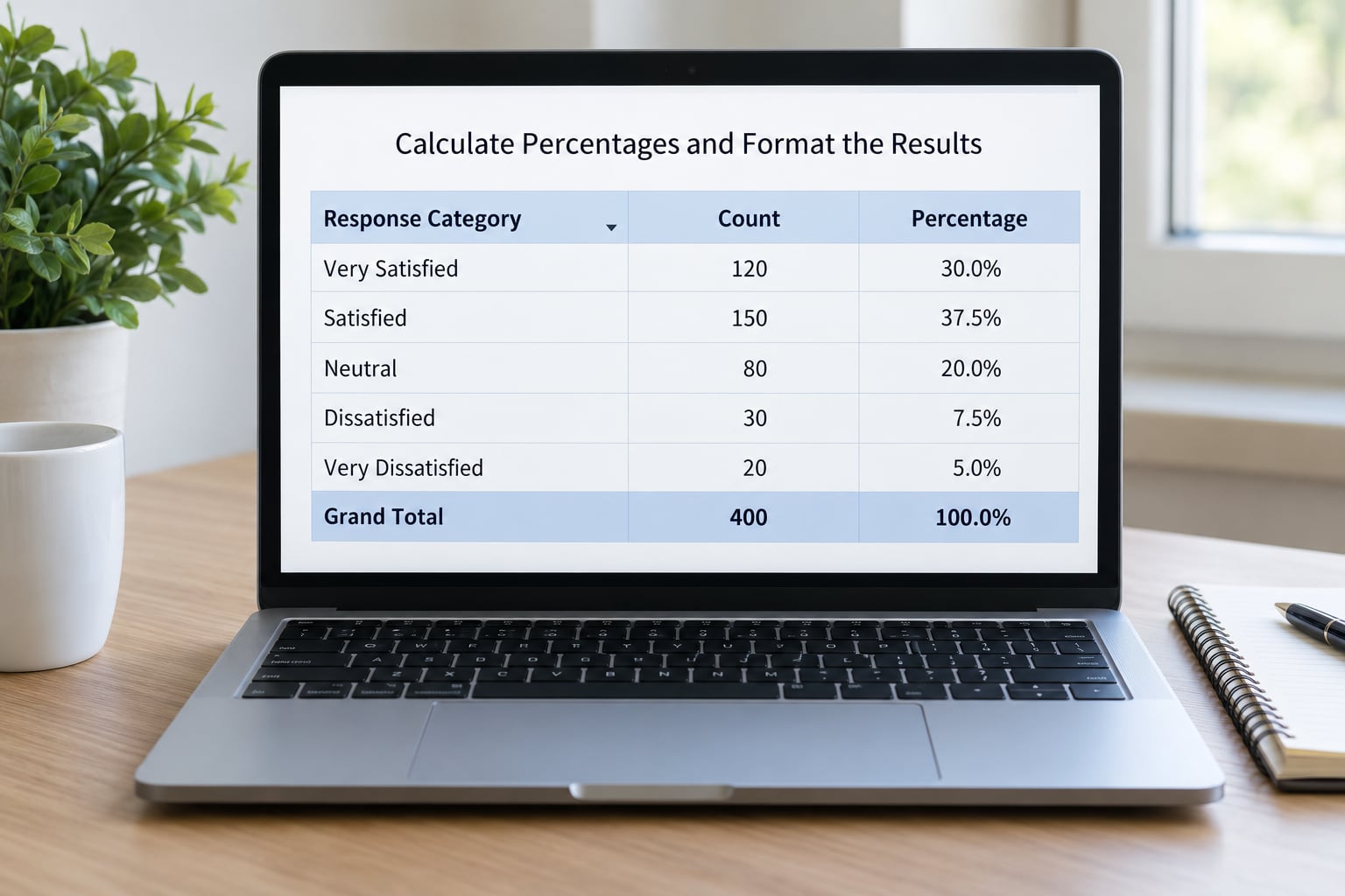
Counts are rarely what you report. Right-click any number in the Values area and choose Show Values As, and the submenu gives you the denominator choices that decide whether your percentages mean anything.
% of Grand Total divides every cell by the whole table, which works for one question but produces nonsense in a crosstab because it mixes segment sizes into the answer. % of Row Grand Total compares answers within each segment, which is what you usually want when the segment is the thing you are comparing. % of Column Grand Total does the same vertically.
Here is the check that catches most errors. After switching to a row or column percentage, read the grand total row. It should read 100 percent for a single-choice question where everyone answered. If it reads something like 240 percent, you are looking at a check-all-that-apply question, which is covered in the next section.
Before you format anything, decide how to treat blank answers. Excel creates a row labelled “(blank)” whenever respondents skipped the question, and it counts them in the total. In the pivot, right-click that label and choose Filter, then uncheck blanks, or use the Filters area. If you exclude them, the percentages recalculate against the smaller base automatically.
Formatting is what turns a working table into something you can paste into a report. Right-click the value field, choose Number Format, and set one decimal place for percentages. Use PivotTable Tools, Design to turn off banded rows and drop the borders so it reads like a report table rather than a database dump.
Finally, retitle the fields. A cell that says “Row Labels” tells a reader nothing, so click it and type the actual question text. Do the same for “Count of RespondentID” and the column header. Academic and funder reports live or die on labels that explain themselves without a caption.
6. Filter and Interpret the Pivot Table
Drag a demographic field such as age bracket or tenure into the Filters box at the top of the pivot. The field becomes a dropdown above the table, and choosing a value recalculates the counts for that group only. This is the feature that makes a pivot table better than a hand-built COUNTIFS crosstab, where every segment means rewriting the formula.
For something you can click through, use a slicer instead. Click inside the pivot, go to PivotTable Analyze, then Insert Slicer. Tick the fields you want and you get a set of buttons beside the table that filter it, and each button shows its own count. A slicer connected to a pivot chart makes a decent one-screen report for a monthly pulse survey.
Watch the base sizes. PivotTable Design, Grand Totals, On for Rows and Columns gives you a count under every segment, and it is the fastest way to spot a group of three people rendered as a confident-looking 67 percent. Decide a suppression rule, commonly hiding segments under ten, and apply it consistently.
Then be honest about what the table supports. A crosstab showing that satisfaction differs by tenure is a description of your sample, not proof that tenure causes satisfaction. Anyone who quotes those percentages as a causal finding is overreaching, and pivot tables make that overreach easy because the numbers look so authoritative.
Two more interpretation habits are worth building. Check that the grand total of any crosstab matches your original response count, which catches accidental double-counting. And if a row label is alphabetical, sort it properly: click any cell in Rows, then Sort Largest to Smallest, or set a custom order so Strongly Agree sits above Strongly Disagree instead of in the middle of the alphabet.
7. Save and Export the Finished Table
Keep the pivot live rather than flattening it. Copy the visible range, paste it into Word, a report or Google Slides with Paste Special, Values Only, and paste as formatted text so the labels come with it. The pivot on its own sheet still updates, and the static copy in your document is a snapshot you control.
When you need a chart, click inside the pivot and choose Insert, PivotChart. The chart stays linked to the table, so new responses plus a refresh redraw it. Conditional formatting works too: with the values selected, go to Home, Conditional Formatting, Color Scales, and the highest response in each row fills with the strongest colour, which reads well on a Likert scale.
Save the workbook with the raw data, the pivot sheet and the report sheet together. If the survey runs on a schedule, set the refresh to automatic: right-click inside the pivot, PivotTable Options, Data, and tick Refresh data when opening the file. After you paste a new wave of responses into the Excel Table, right-click and choose Refresh Data. Skip this and the table keeps reporting last month’s numbers, which is the most common way these reports quietly go wrong.
Common Mistakes
Almost every survey pivot problem is one of a small number of recurring mistakes, and each has a quick fix.
Blank rows or columns inside the export. The pivot stops at the gap and ignores everything past it. Delete them, or select the true range manually in the Create PivotTable dialog.
Sums of respondent IDs. You will see a large number instead of your sample size. Click the value header and switch Summarize Values By to Count.
Text answers that should be numbers. Ratings exported as text sort alphabetically and cannot be averaged. Re-export with numeric values, or convert the column before building the pivot.
Percentages over 100 percent. You are using % of Grand Total on a multiple-response question. Each respondent counts once per option, so the column total legitimately exceeds 100, and you should say so in the caption rather than hide it.
An unclear denominator. Counts include blanks and percentages exclude them, so the two stop matching. Decide which base you are reporting, filter out blanks deliberately, and label the table.
Rows and columns swapped. If the segment names run down the left and the answer options run across the top, you wanted the opposite. Drag the field out of its box and into the other one, then fix the sort order.
Merged cells in the header row. The field list will show half a question name or nothing at all. Unmerge every header and retype the labels.
A stale field list after new responses arrive. The field list is a snapshot of the columns at the time of creation. Right-click the pivot and choose Refresh, or rename the field in PivotTable Analyze, Field Settings.
A 200-column export nobody can navigate. Wide survey exports are a real problem, especially the matrix and grid questions that put one column per row-label combination. Hide the columns you are not analysing by clicking their headers and pressing Ctrl+0, or copy the fields you need onto a clean sheet as an Excel Table before you start.
There is one limit worth naming. Above about 1 million rows, Excel will not load the data, and complex sampling designs with replicate weights need real statistical software. If your survey uses disproportionate weighting, stratified clusters or a complex sampling frame, the honest move is SPSS, Stata or R, where the weighting and standard errors are handled properly. The pivot table is a descriptive tool.
Frequently Asked Questions
Does this work in Google Sheets and Mac Excel?
Yes, with small differences. In Google Sheets the path is Data, then Pivot table, then Insert pivot table, and the field picker appears on the right with the same Filters, Columns, Rows and Values boxes. Google Sheets has no Show Values As menu, so you add a calculated field for percentages instead. Mac Excel matches Windows for the Insert tab, but slicers are recent additions there, so pivots and charts are the safer route.
How do I handle check all that apply questions?
Each respondent picked several options, so the column total will exceed 100 percent and that is correct rather than a bug. Count respondents per option as normal, then report percentages against the total number of respondents and state in the caption that the question allowed multiple responses. Summing across options gives you average options selected per respondent, which is often the most informative number in the table.
What should I do about missing or blank responses?
Decide before you report. Either treat blanks as a genuine category, keeping the (blank) row so the base is everyone invited, or exclude them by clearing blanks in the row filter so percentages use only valid responses. Both are defensible, and mixing them inside one table is not. Whichever you choose, write the base size next to the percentages and keep it the same across every table in the report.
Why do my percentages add up to more than 100%?
Two causes account for nearly all of it. The first is a check-all-that-apply question, where each respondent contributes to several options, so a column total of 150 percent is correct and expected. The second is choosing Show Values As, % of Grand Total on a crosstab, which divides by the whole table instead of by the segment. Switch to % of Row Grand Total or % of Column Grand Total and check the grand total reads 100.
Can I filter the pivot table to see one group only?
Drag the demographic field into the Filters box at the top of the pivot and pick a value from the dropdown. Everything below recalculates for that group, including the percentages, which is the whole reason to use a pivot rather than hand-built COUNTIFS formulas. For something you can click through in a report, use Insert Slicer from the PivotTable Analyze tab. Right-click a filter and choose Clear Filter to return to the full sample.
Conclusion
Start with the data, not the pivot table. Confirm that each row is one respondent, that every column has a real header, that blank rows are gone and that you have a unique ID field to count. Then insert the pivot, drag your question into Rows and your segment into Columns, and change Sum to Count before anything else.
Once the counts look right, verify them against a simple frequency check on the raw sheet before you trust a single percentage. That ten-second habit catches almost every mistake in this guide.