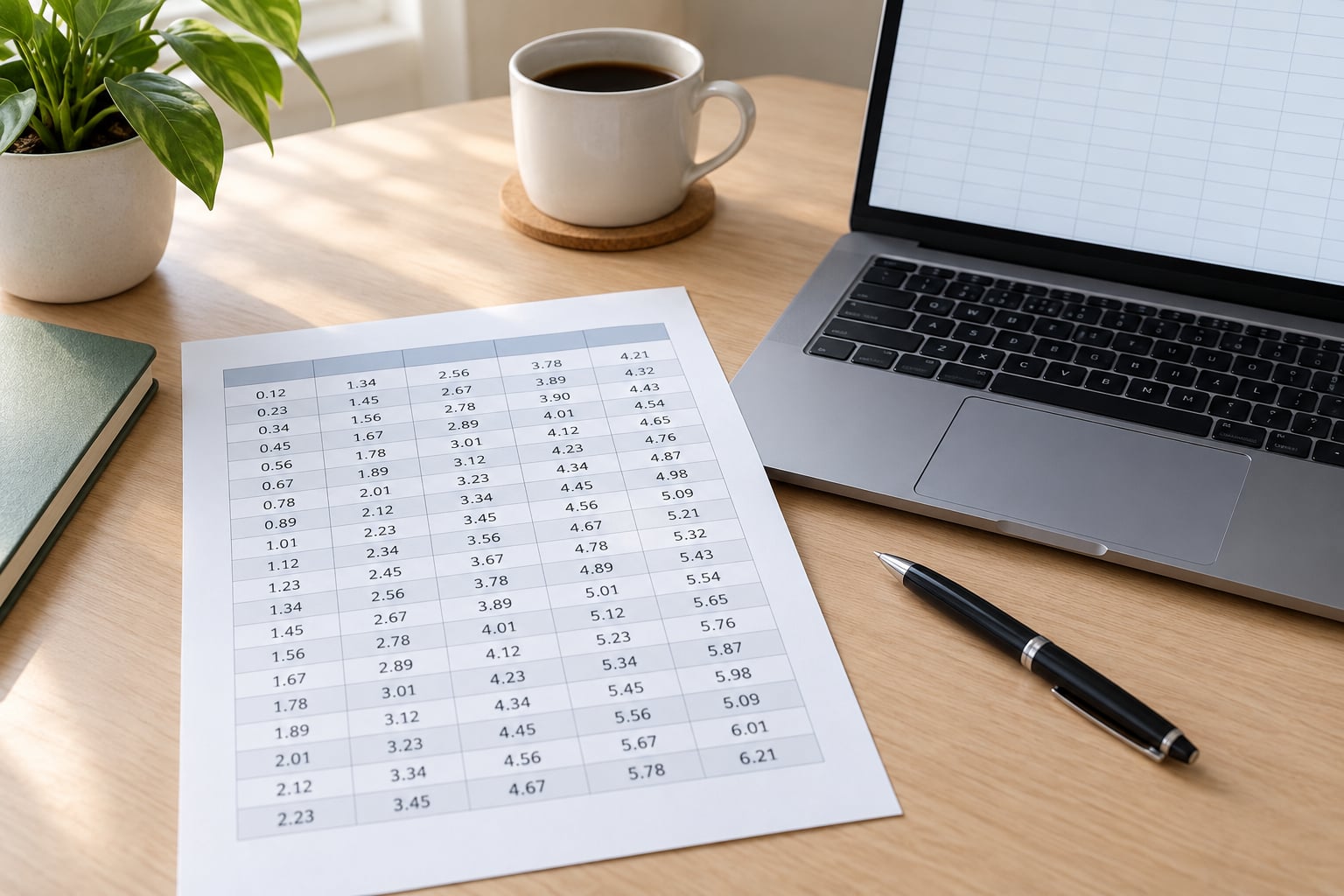
A readable results table lets a reader find any value, understand what it means, and compare it to the other values without reading the table twice. The difference between a table that works and one that does not comes down to five things: descriptive labels, consistent number formatting, aligned columns, restrained visual styling, and notes that explain rather than crowd. If you know how to make a results table readable, the same raw output from SPSS, Stata or R turns into something a supervisor or reviewer can read in under a minute.
Most of the work happens before you touch formatting. Decide what the table has to prove, cut everything that does not help it prove that, and the formatting decisions get much easier. The steps below follow that order on purpose.
Table of Contents
- 1What You Need Before You Build the Table
- 2Step-by-Step: Build a Clear Results Table
- 31. Decide What the Table Should Show
- 42. Write Clear Row and Column Labels
- 53. Choose a Simple Structure
- 64. Format Numbers Consistently
- 75. Add Notes Without Overloading the Table
- 86. Check the Table in Context
- 9Common Mistakes That Make Tables Hard to Read
- 10Frequently Asked Questions
- 11How many decimal places should I use in a results table?
- 12Should I include statistical significance stars in my results table?
- 13How should I report p-values in a student research table?
- 14Do I need to include every statistic from my software output?
- 15Should a results table have notes or a caption?
- 16How do I make a statistical table readable in a thesis?
- 17Conclusion
What You Need Before You Build the Table
You need five things in front of you, and the first two matter most.
- The statistical output. The raw export from your software, not a screenshot of it.
- The reporting requirements. Your course handbook, department template or journal guidelines, because they decide what must be present.
- A reference format. APA 7th edition is the common default in the social sciences, but check rather than assume.
- A spreadsheet or word-processing document. Excel and Google Sheets handle number formatting and alignment well; Word handles a finished table for submission.
- An optional style guide. If your department has one, it will already answer most of the notation questions below.
Copying the raw output into a document first, before you edit anything, gives you a fallback. Formatting decisions get revised more often than people expect.
Step-by-Step: Build a Clear Results Table
Work through these six steps in order. Each one is quick on its own, and each one makes the next easier to get right.
1. Decide What the Table Should Show
A results table should show one comparison and the numbers that support it, nothing else. Start from your research question and write the single comparison the table has to carry. Group means for three conditions, a regression with six predictors, a before-and-after change score — whatever the question actually asks for.
Then delete everything that does not serve that comparison. Descriptive output, model diagnostics, intermediate steps and significance markers with no accompanying estimate all belong in an appendix or not in the paper at all. Software output often contains five tables’ worth of material because the program is being thorough, not because you need it.
2. Write Clear Row and Column Labels
Every label should read as plain English rather than a variable name. Replace Q3_SATISF with Satisfaction with service, and replace cond_2 with Evening session.
Keep one reading direction across the whole table. Readers scan left to right across a row, so the variable name belongs in the header and the group or observation name belongs in the first column. That first column is called the stub column, and it anchors every row label in the table.
3. Choose a Simple Structure
One variable per column and one group or observation per row keeps the table flat enough to follow. When you have more than about six columns, consider a spanner header — a grouping label above related columns, such as Baseline over two columns and Follow-up over two more.
Length is the other limit. A table that runs past a single page in portrait orientation is usually a table that should be split into two, or moved to an appendix, or turned sideways.
4. Format Numbers Consistently
Consistency in numbers is what makes a column scannable, and it is the fastest readability win available to you.
- Match decimal places across the column. If one cell reads 3.40, every cell in that column should show two decimals.
- Put units in the header, not in the cells. Write Score (0–100) in the column header instead of repeating “(0-100)” in every row.
- Right-align numbers and align decimals vertically. This is what makes 12.4 and 9.87 comparable at a glance.
- Report exact p-values. Write
p = .032rather thanp < .05. The threshold tells the reader nothing about how close the result was, and journals increasingly ask for the exact value. - Use standard symbols consistently. M for mean, SD for standard deviation, n for a subgroup size, N for the total, df for degrees of freedom, and italic p, F and t.
- Flag missing data with one symbol and define it in the notes, rather than leaving cells blank where a blank could mean zero.
Avoid false precision too. Reporting a mean to four decimal places when your sample is 30 people implies an accuracy the data does not support.
5. Add Notes Without Overloading the Table
Notes carry what the table cannot show inline. Keep them to the essentials: the symbols you used, the sample size if it is not already a column, the test or model behind the numbers, and any adjustments such as a correction for multiple comparisons.
Table 1. Descriptive statistics by session condition
Note. Scores range from 0 to 100. Higher scores indicate greater satisfaction. M = mean; SD = standard deviation; N = 128.
Number and title the table above it, and put the notes below it. APA 7th edition wants that order, and it means a reader never has to hunt for context.
6. Check the Table in Context
Read the table next to the paragraph that introduces it, then next to your research question. If the table does not visibly answer what that paragraph claims it answers, you have the wrong table.
Two more checks before you move on. Make sure you have not restated every number from the table in the surrounding text — point to the table and interpret it instead. And check your department or journal rules on table placement, since some require tables after the discussion rather than immediately after their first mention.
Common Mistakes That Make Tables Hard to Read
Almost every unreadable results table I have reviewed fails on one of a handful of predictable points.
- Unexplained abbreviations. A reader should not need to guess what a column label means. Write the full term and add the abbreviation only if you use it again.
- Too many decimal places. Three decimals in a table of percentages suggests a precision your instrument does not have.
- Mismatched decimal places down a column. Values like .041, .32 and .1286 force the reader to do the alignment mentally, which is exactly what the table should be doing for them.
- Significance markers without meaning. An asterisk is not self-explanatory. State the threshold in the note, for example
*p < .05. - Making the reader infer the comparison. If the reader has to work out which columns to compare, the table’s main point is not obvious. Order the columns so the comparison sits next to itself.
- Pasting raw output in. Software output carries index columns, confidence interval bounds, footnotes and repeated headers. Strip it back to the numbers you are reporting.
- Full gridlines in every cell. Borders around each cell compete with the numbers. A few horizontal rules separate sections and leave the rest to white space.
A table that has all seven of these problems is usually easier to rebuild from the raw output than to edit cell by cell. Rebuilding takes ten minutes and produces a better result than an afternoon of patching.
Frequently Asked Questions
How many decimal places should I use in a results table?
Match the precision to your measurement and keep it identical down the column. Raw score means and percentages usually need two decimals; proportions often need three. If your instrument measures to the nearest whole point, reporting a mean of 4.2837 implies accuracy the data does not have, and reviewers notice that before anything else.
Should I include statistical significance stars in my results table?
It depends on your audience and your guidelines. Significance stars save space in a thesis table, but they work only if the note defines them clearly, for example that a single asterisk means p below .05. In a client report or a journal that discourages threshold notation, report the exact p-value instead, since a threshold hides how close the result actually was.
How should I report p-values in a student research table?
Report the exact value with two or three decimal places and no leading zero, so p = .032 rather than p = 0.032. Never write p = .000, since a p-value is never zero. Italicize the symbol, keep the equals sign, and define any threshold notation such as p less than .05 in the table note.
Do I need to include every statistic from my software output?
No, and usually you should not. The table should carry the estimates your research question is about, plus the sample size and the test or model behind them. Significance markers, model fit indices and intermediate diagnostics belong in an appendix or a supplementary table, where they can be checked without crowding the result you are reporting.
Should a results table have notes or a caption?
Both. The number and title go above the table so a reader knows what they are looking at before they read a single number, and the notes go below to define symbols, state the sample size, name the test and set the scale. A caption without notes leaves symbols unexplained, and notes without a caption leave the reader guessing what the table is.
How do I make a statistical table readable in a thesis?
Keep the same structure you would use for a journal article, since thesis readers are often examiners looking for exactly that. Number the table, title it, keep the stub column descriptive, right-align numbers with matched decimals, and put the notes beneath it. Check your department template for placement rules, since many require tables after the discussion rather than at first mention.
Conclusion
Start with the caption, not the formatting. Write what the table shows and name the comparison it exists to make, then build only the rows and columns that carry that comparison. Labels in plain English, numbers with matched decimals and units in the header, and the rest is tidying. If you can hand the finished table to someone who has not seen your data and they read it correctly on the first try, it works.