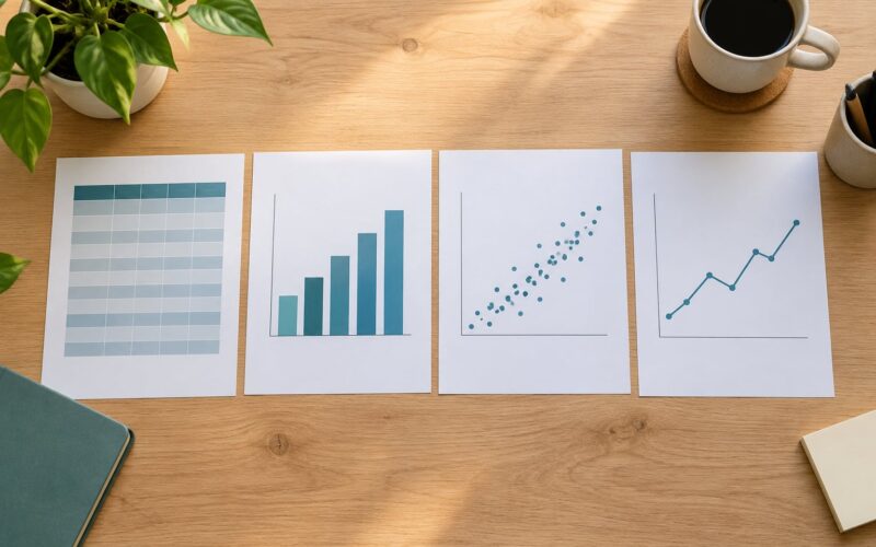
A chart mistake is any figure or table choice that makes the data say something other than what it actually says: a bar chart with a truncated y-axis, 3D bars that distort their own length, a pie chart with nine slices, an axis labelled “Score”. Most of them are one-click accidents in Excel, SPSS or R rather than deliberate choices.
The chart mistakes to avoid in a research report are the ones below, and I have written each as the error, why it misleads, and the fix. That order matters, because a reviewer who cannot tell what a figure claims will assume the worst about the analysis behind it.
None of this needs specialist software. You can run the whole list as an audit on a draft in about an hour, and the fixes are usually one setting rather than a redesign.
Table of Contents
- 1Chart Mistakes to Avoid in a Research Report at a Glance
- 21. Choosing the Wrong Chart Type
- 32. Starting the Numerical Axis at a Nonzero Value
- 43. Using an Inconsistent or Misleading Scale
- 54. Overloading a Chart with Too Many Categories
- 65. Omitting Units, Sample Sizes, or Definitions
- 7Where APA 7th puts the title and the note
- 86. Failing to Label Axes Clearly
- 9Before and after
- 107. Using a Legend When Direct Labels Would Be Clearer
- 118. Choosing Colors That Lack Contrast or Carry the Wrong Meaning
- 129. Using a Three-Dimensional Effect for No Analytical Purpose
- 1310. Presenting Percentages Without Denominators or Valid Bases
- 14Chart mistakes to avoid in a research report when n is small
- 1511. Showing Error Bars or Significance Symbols That Mean Nothing
- 1612. Letting Style and Decoration Compete with the Data
- 17Frequently Asked Questions
- 18What is the most common chart mistake in a research report?
- 19How can I check whether my chart scale is misleading?
- 20Should every graph in a research report start at zero?
- 21What information should appear in a chart caption?
- 22How do I make research charts accessible to color-blind readers?
- 23Should I include significance stars and error bars in every results chart?
- 24Conclusion
Chart Mistakes to Avoid in a Research Report at a Glance
The table below is the short version. Use it to audit a draft, or to find the section you need when a supervisor has flagged one specific figure.
| Mistake | What the reader misreads | Correction |
|---|---|---|
| Wrong chart type | That the visual pattern is meaningful | Match the chart to the variable role and the question |
| Nonzero axis baseline | Small differences as large gaps | Start bar charts at zero, label the break if you use one |
| Inconsistent scale | Panels as comparable when they are not | One scale and unit across comparable panels |
| Too many categories | Nothing, because nothing is readable | Group small values, sort by value, split the figure |
| Missing units and n | Magnitude and reliability of the values | Unit on the axis, n in the note, definitions stated once |
| Vague axis labels | That the reader must guess the variable | Name the variable and its unit on each axis |
| Legend instead of labels | Series identity after three seconds of eye travel | Label series directly at their endpoints |
| Low-contrast colour | Groups as different when they are the same | One colour-blind-safe palette plus a non-colour cue |
| 3D effects | The nearest bar as the largest | Flat two-dimensional bars, no perspective |
| Percentages with no base | A stable rate from a handful of cases | Report the count and the denominator alongside |
| Unexplained error bars | Uncertainty as meaninglessness or as precision | State SD, SE or 95% CI in the figure note |
| Decoration competing with data | The styling instead of the result | Cut gridlines, backgrounds and extra decimals |
1. Choosing the Wrong Chart Type
Pick the chart type from the research question first and the data second. A wrong chart type does not just look wrong, it invites the reader to compare things people are bad at comparing, such as slice angles.
Bar charts handle comparisons between categories, which is most survey and experiment results. Line charts handle change over an ordered variable, usually time, where the connecting line carries meaning. Scatter plots handle the relationship between two continuous variables, and box plots show the spread and outliers of a continuous outcome by group.
So comparing mean scores across six survey groups means six bars, not six pie slices. Slices of 24% and 26% are hard to judge by eye, and once you pass five categories the chart becomes a guessing game. Reserve a pie chart for a genuine part-to-whole split with two or three segments.
2. Starting the Numerical Axis at a Nonzero Value
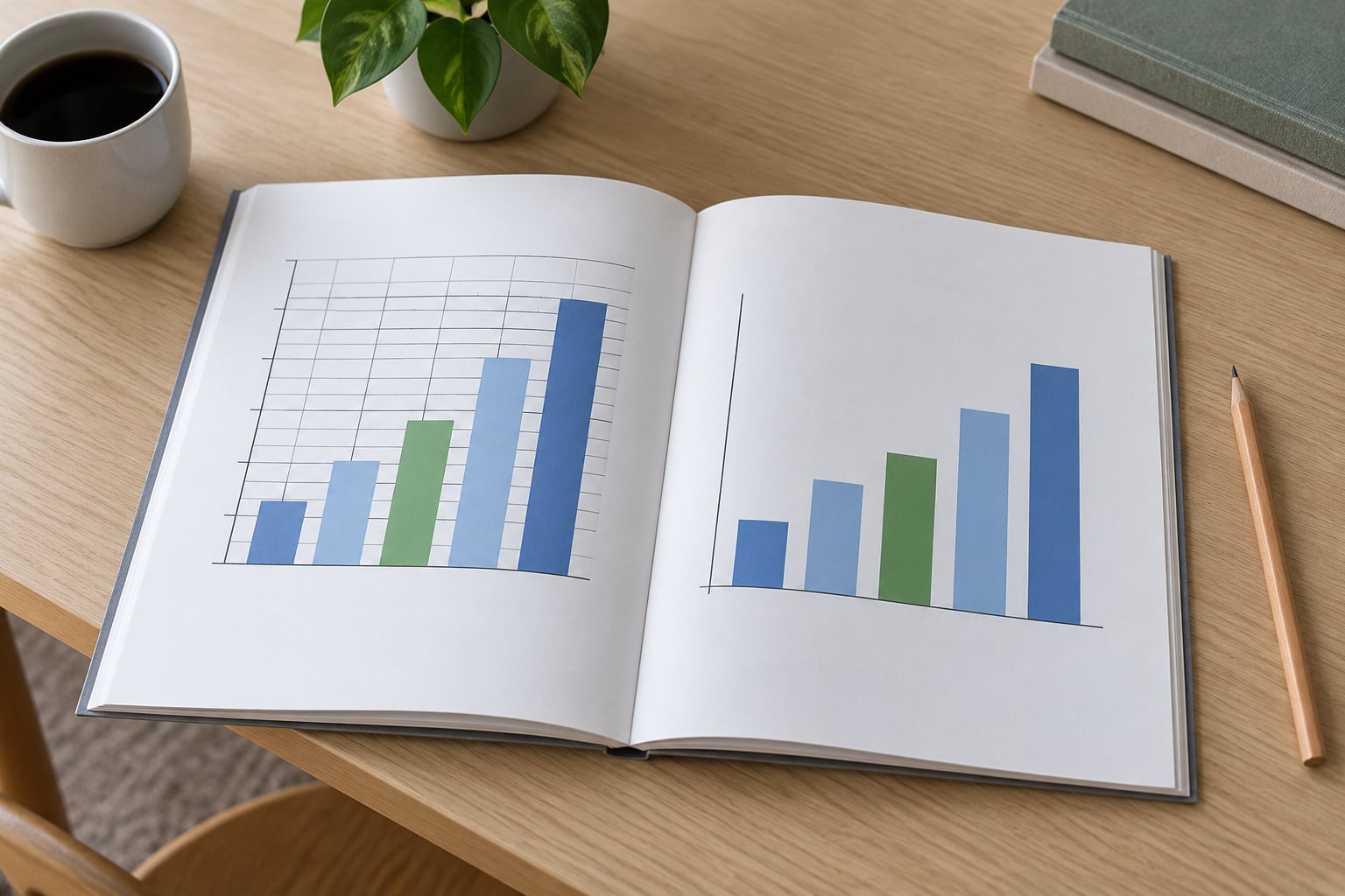
Bar charts must start at zero, because bar length is the value. Cut the baseline and a 2% difference can look like a doubling.
Take response rates. On a 0-100 scale, 49% against 51% reads as a wash. On a 48-52 scale the same two numbers look like a dramatic split, and the reader takes away a conclusion the data does not support.
Line charts are the exception, because position rather than length carries the value, so a zoomed axis is legitimate there as long as it is labelled. Box plots and scatter plots can also start above zero. If a broken axis is genuinely necessary, mark the break clearly and never hide it.
3. Using an Inconsistent or Misleading Scale
Comparable panels must share a scale, otherwise the reader compares the picture rather than the data. Two line charts showing temperature change on different vertical ranges invite a comparison that only exists because of the axes.
The usual causes are copy-pasting a chart and forgetting to reset the range, or letting software auto-scale each panel from its own minimum and maximum. The fix is unglamorous: set both axes by hand, use the same limits, and state the range in the caption.
Watch the upper limit too. A percentage axis that stops at 55% when your values reach 90% does not flatter the data, it hides the rest of it. And never mix units across panels without saying so, such as minutes on one panel and seconds on the next.
4. Overloading a Chart with Too Many Categories
A chart stops working somewhere around a dozen bars, and well before that if the labels are long. Crowded categories turn a clear pattern into a smear of similar marks.
Three fixes work. Combine rare values into an Other category when that grouping is defensible and report its size. Sort the bars by value so the shape of the distribution is visible. Or split the data into two figures rather than shrinking the type until it is unreadable.
For survey responses, combining everything under five percent into Other is reasonable as long as you name what went in it. It is not reasonable if Other quietly contains six different answers that would have changed the conclusion.
5. Omitting Units, Sample Sizes, or Definitions
A number without a unit and an n is not a result, it is a rumour. The reader cannot judge magnitude or reliability without them.
Put the unit on the axis itself, minutes or mmHg or percent, so it travels with the scale. Put n for each group in the figure note, because group sizes often differ and that difference matters. Define abbreviations and category meanings once, then use them consistently.
Where APA 7th puts the title and the note
In APA 7th edition the figure number and title sit above the image, and any note sits below it. Tables work the other way round: the number and title sit above the table, and the general note goes below it. Figures take a figure note, tables take a table note, and they are not interchangeable in the manuscript.
The same distinction runs through the styling. Tables use horizontal rules above and below the table and under any spanner headings, with no vertical rules. Figures should carry no border at all.
6. Failing to Label Axes Clearly
Vague labels force the reader to guess, and guessing is where chart mistakes to avoid in a research report quietly become misinterpretations. “Value”, “Score” and “Group” tell nobody what is being measured.
Name the variable, the unit and the population where it matters. Mean satisfaction score out of 10 for each group tells the whole story in one line.
Before and after
“Frequency” becomes “Number of respondents with valid surveys”. “Response rate” becomes “Percent of respondents selecting each option”. The second version is longer and worth it, because the first version is compatible with at least three different denominators.
7. Using a Legend When Direct Labels Would Be Clearer
A legend asks the reader to hold a colour in memory, then look away to check it, then look back. With two series that round trip is pure overhead.
Label the lines directly at their right-hand endpoints instead. Treatment and Control written at the end of each line removes the legend entirely and shortens the chart.
Legends still earn their place with three or more series, or with fill patterns in stacked bars. The test is simple: if a reader has to flip back and forth to follow one panel, the legend is costing you accuracy.
8. Choosing Colors That Lack Contrast or Carry the Wrong Meaning
Colour is an encoding channel, so it has to distinguish things reliably. About one in twelve men has some form of colour vision deficiency, and a red-green pair is the classic way to lose them.
Use a colour-blind-safe palette such as dark blue and orange, and check the figure in greyscale because plenty of journals still print that way. Add a second cue, so pattern fills, direct labels or different marker shapes, so colour is never carrying the meaning alone.
Be careful with convention too. Red for improvement and green for decline reads naturally to some audiences and backwards to others. Whatever you pick, state it once in the note and keep it identical across every figure in the report.
9. Using a Three-Dimensional Effect for No Analytical Purpose
3D charts have no analytical purpose at all. Perspective changes apparent height, the back bar can appear taller than the front one, and depth shading shifts perceived value even when the data is identical.
This matters most in Excel, where a 3D column chart sits one click away from the correct one and is easy to leave in by accident. If your results chapter has any 3D in it, assume a reviewer will flag it.
The fix is a flat grouped bar chart with the same four group means, no gradient fills and no rotation. Compare the two versions printed in greyscale. The flat one reads correctly at a glance; the 3D one makes you squint. This is the fastest win on the whole list, because the correction costs nothing and the original costs you credibility.
10. Presenting Percentages Without Denominators or Valid Bases
Percentages hide their base, and the base is what tells you whether the percentage means anything. Eight of ten cases is 80%. Eight of ten thousand is also 80%, and the two do not belong in the same sentence without n.
Report the count and the denominator together, and say what counted as a valid response. Where cases were excluded, report that in the note rather than quietly shrinking the base.
Unequal denominators are the sneakier version. A completion rate of 90% for one subgroup and 60% for another may mean the second group was twice as likely to drop out, which changes how you read every other number in the table. Same issue with missing data: if 40% of a group failed to answer the item, the bar chart is showing you the people who answered.
Chart mistakes to avoid in a research report when n is small
Below about 20 cases per group, a percentage is a rumour with a decimal point. Write it as a count with the denominator in brackets, such as 8 of 10 cases, or move to a dot plot or a table that shows every observation. If you must show a percentage, round hard and put n beside it, because 83% of 6 and 83% of 600 are not the same claim and the reader cannot tell which one you made.
11. Showing Error Bars or Significance Symbols That Mean Nothing
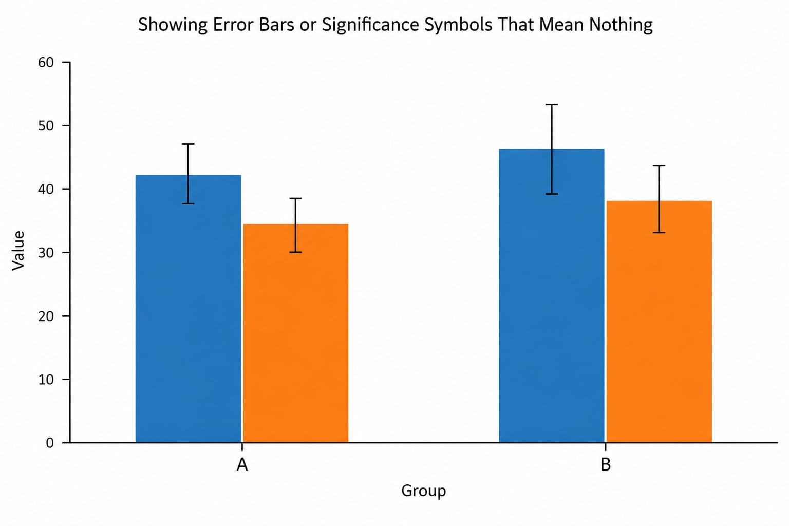
Error bars without a definition are decoration. A reader cannot tell whether your whiskers are standard deviation, standard error or a 95% confidence interval, and those three support very different claims.
Choose by purpose. Standard deviation describes the spread of the observations themselves. Standard error describes how precisely you have estimated the mean. A 95% confidence interval describes the range of plausible values for the population mean. Report the statistic, the level and the comparison basis in the figure note, every time.
Asterisks have the same problem. If you use them for significance, define each level in the note and state which comparison the test came from, whether that is a planned pairwise comparison after an omnibus test or something else. A lone asterisk next to a bar means nothing at all.
12. Letting Style and Decoration Compete with the Data
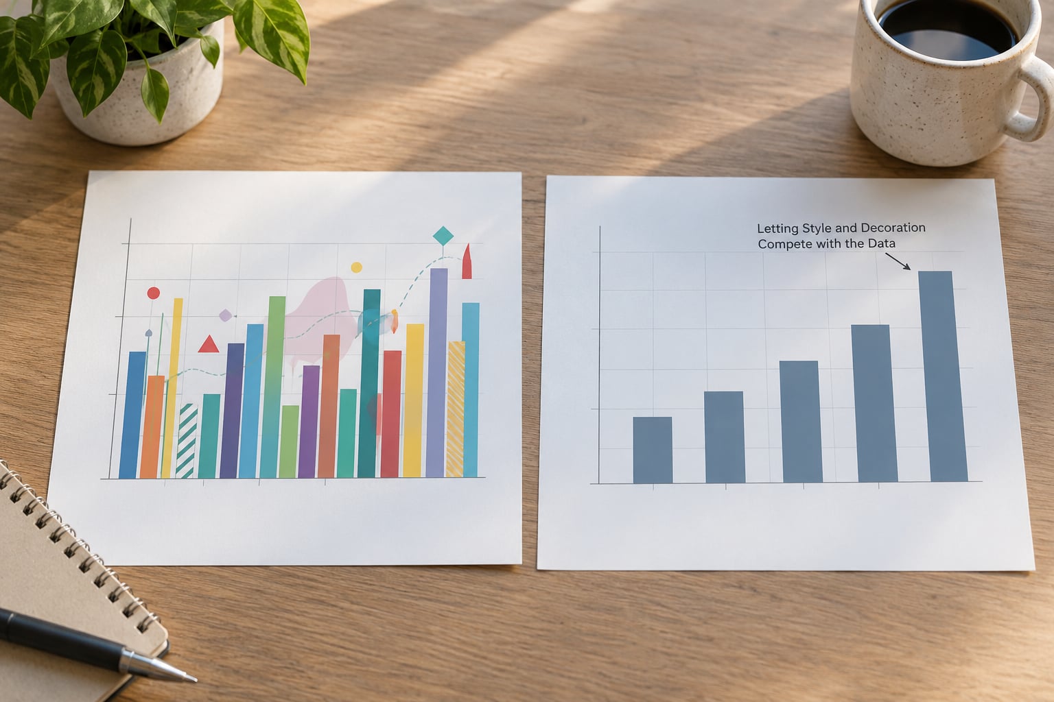
Every non-data mark on a chart makes the data marks slightly harder to read. Heavy gridlines, patterned backgrounds, drop shadows and a legend the size of the plot area all spend attention you did not budget for.
Trim the usual offenders. Keep light horizontal gridlines if they help read values and drop the rest. Cut decimals to the precision your measure actually supports, so 12.4 stays 12.4 but 72.4167 becomes 72.4. Reduce the font count to two sizes.
Then annotate once, on the one result that matters, rather than putting a label on every bar. One callout that points at the finding your reader should leave with beats six decorative ones.
Frequently Asked Questions
What is the most common chart mistake in a research report?
The most common one is an axis that does not start at zero on a bar chart, usually because software auto-scaled it. It is common because it happens silently. The second most common is a pie chart with too many categories, where angles cannot be compared reliably. Both come from accepting defaults rather than from a decision you made.
How can I check whether my chart scale is misleading?
Ask two questions. Does the bar length still represent the value proportionally, which means a zero baseline? And would a reader describe the main difference differently if they saw the raw numbers beside the figure? If the visual gap looks larger than the numeric gap, the scale is doing work your data does not support. Check it in greyscale too.
Should every graph in a research report start at zero?
No, but bars almost always should. Length encodes value in a bar chart, so a nonzero baseline exaggerates every difference. Line charts, scatter plots and box plots encode value by position, so a zoomed axis is legitimate there. If you do truncate, mark the break visibly and state the range in the caption so the reader is not misled.
What information should appear in a chart caption?
A useful caption tells a reader what is plotted, on what, for which groups, and how to read the uncertainty. Name the variables and units, give n per group where they differ, define error bars as SD, SE or 95% CI, and explain any abbreviations or exclusions. In APA 7th edition the figure number and title sit above the image and the note below it.
How do I make research charts accessible to color-blind readers?
Do not rely on hue alone. Pick a colour-blind-safe palette such as dark blue and orange instead of red and green, then add a second cue like direct labels, marker shapes or pattern fills. Check the figure in greyscale, since many journals still print that way, and keep the same colour mapping across every figure in the report so readers do not relearn it.
Should I include significance stars and error bars in every results chart?
No. Add uncertainty only where it changes how the reader should interpret the result, which usually means charts used to support a claim. If you show them, define them in the note and state the comparison the test came from. Decorative error bars create a false impression of rigour in one direction and of noise in the other, so leave them off descriptive charts.
Conclusion
Start by checking one thing: does every figure answer the question it is placed next to, on a scale a reader can verify, without the body text? If those three hold, most of the rest is cleanup rather than repair. That is the good news about the chart mistakes to avoid in a research report, since almost none of them require new analysis.
Before you submit, run this short pass. Bar charts start at zero. Panels that get compared share a scale and a unit. Every axis names its variable and unit. n appears wherever group sizes differ. Percentages come with counts and denominators. Error bars and asterisks are defined in the note. Colour is backed by a second cue and survives a greyscale print. No 3D, no chart junk, no duplicated table. Every figure is discussed in the results text, not just placed there. And the title and note sit where your style guide says they sit, which in APA 7th edition is above and below for a figure and above and below for a table.