
If you have ever opened the SPSS Output Viewer and scrolled past a wall of numbers with no idea which ones matter, you are in the right place. Reading a crosstab table in SPSS is really a fixed sequence: look at the counts, convert them to percentages so the groups compare fairly, check the expected counts, read the residuals to find the cells doing the work, and only then look at the chi-square output. Work through those five things in order and the table stops being intimidating.
It also helps to know what the procedure will not do for you. SPSS gives you a number for whether two categorical variables are associated, but it never tells you the direction of the relationship, which cells drive the result, or whether the effect is worth acting on. That interpretation is your job, and this guide walks through it step by step.
Throughout, I will use one small worked example so every number has somewhere to land. Imagine a survey of 120 students where the row variable is study mode (On campus, Online) and the column variable is use of academic support (Yes, No).
Table of Contents
- 1What You Need Before You Read the Output
- 2Step-by-Step: How to Read a Crosstab Table in SPSS
- 3Read the Table Structure and Cell Counts
- 4Compare Percentages Instead of Raw Counts
- 5Check Expected Counts and Residuals
- 6Interpret the Chi-Square Test and Significance
- 7Common Mistakes
- 8Tips for Reporting the Results
- 9Frequently Asked Questions
- 10Should I use row percentages or column percentages in an SPSS crosstab?
- 11What do the asterisks and footnotes under my crosstab table mean?
- 12What does an adjusted standardized residual tell me?
- 13Why is my chi-square significant but Cramer’s V so small?
- 14When should I use Fisher’s exact test instead of chi-square?
- 15Can I run a crosstab on an ordinal variable such as a 5-point Likert scale?
What You Need Before You Read the Output
Crosstabs only works on categorical variables: nominal ones like gender or programme, and ordinal ones like a Likert scale you have grouped into bands. SPSS will happily run it on a continuous variable, but the output is meaningless because every case gets its own category and every table ends up with a single case per cell. If you have a continuous variable, group it into bands first with Transform, then Recode into Different Variables.
The data must be structured as one row per case. This is the single most common reason beginners get the wrong N. If you already have a summary counts table — say, four numbers instead of 120 rows — you need to weight the cases by the frequency variable, which I cover in the steps below.
Missing values matter more here than in most procedures, because a case with a blank on either variable drops out of the table entirely. The valid N printed under the table is your real sample. Check that it matches what you expect before you read anything else, and use the MISSING subcommand in syntax if you need to treat a specific code as missing only for this analysis.
Finally, note the menu path: Analyze > Descriptive Statistics > Crosstabs. In the dialog, put your grouping variable in the Row(s) box and your outcome in Column(s). Open the Cells button and tick Observed, Expected, Row, Column and Total. Open Statistics and tick Chi-square, Phi and Cramér’s V. Those two dialogs are where most of the useful reading material comes from.
Step-by-Step: How to Read a Crosstab Table in SPSS
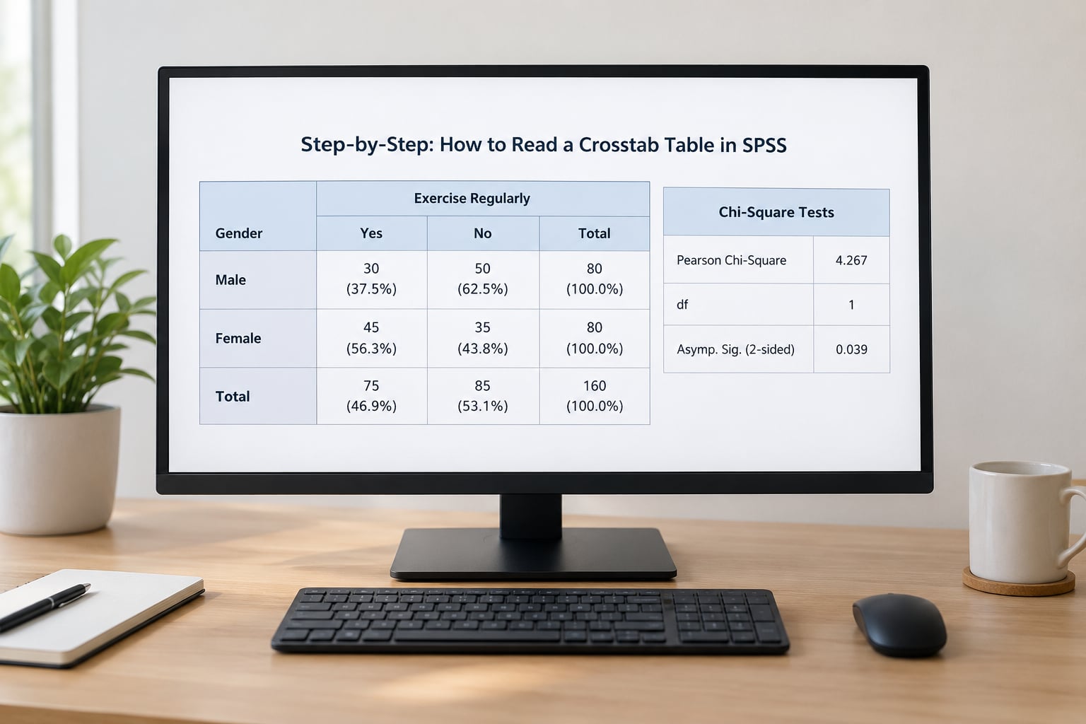
Read the Table Structure and Cell Counts
A crosstab table in SPSS is a grid: the row variable runs down the side, the column variable runs across the top, and each cell holds the number of cases that landed in that combination. The totals appear in the margins and at the bottom corner. Start with the counts, because every percentage and every expected value is built from them.
Our worked example table looks like this once Observed, Row % and Column % are all ticked.
| Study mode | Academic support: Yes | Academic support: No | Total |
|---|---|---|---|
| On campus | 63 (70.0%) | 27 (30.0%) | 90 |
| Online | 9 (30.0%) | 21 (70.0%) | 30 |
| Total | 72 (60.0%) | 48 (40.0%) | 120 |
Read the corner total first: 120 cases, matching our sample, so nothing was silently dropped. The row totals are 90 on campus and 30 online, and the column totals are 72 and 48. The middle cell, 63, says 63 of the 120 students were on campus and used academic support. That is all the observed table tells you directly.
One warning here: SPSS sometimes nests totals and notes inside cells, and the Note and Comment rows at the bottom can carry more than the counts. Read those. Footnotes such as “Based on the marginal totals” or “100.0% of the cases have a valid response” change how you should treat the numbers above them.
Compare Percentages Instead of Raw Counts
Use percentages, not counts, whenever the groups being compared are not the same size. In our table the raw counts suggest 63 versus 9 uses of support, but the groups differ by a factor of three. Once you convert to row percentages, the real story appears: 70.0% of on-campus students used support compared with 30.0% of online students. That is a 40-point gap, and it comes straight out of the row margins.
The choice of denominator is a rule, not a preference, and the rule follows your research question.
| Percentage | Denominator | Use it when | Our example |
|---|---|---|---|
| Row % | The row total | The row variable is your grouping or independent variable and you want to compare outcomes within each group | 70.0% on campus vs 30.0% online used support |
| Column % | The column total | The column variable is the grouping variable, or you want to describe the makeup of one category | 87.5% of support users were on campus, 12.5% were online |
| Total % | The grand total, 120 | You want to describe the sample itself or highlight how much weight a cell carries | 63 cases = 52.5% of the whole sample |
Here is how to settle it in three questions. Ask yourself: which variable is my grouping variable? Which direction does my hypothesis run? And which comparison do I want to state in the results sentence? If your sentence reads “among students who used support, X% were on campus”, that is a column percentage. If it reads “X% of on-campus students used support”, that is a row percentage. Write the sentence before you pick the cells and the denominator picks itself.
When both variables are symmetric, with no clear predictor and outcome, report both row and column percentages, or just row percentages and say so. Consistency matters more than the choice, and reviewers will accept either as long as you name it.
Check Expected Counts and Residuals
The expected count is what each cell would contain if the two variables were unrelated. For any cell, expected equals the row total times the column total divided by the grand total, so 90 × 72 ÷ 120 gives 54 for the on-campus, support-yes cell. SPSS prints these directly when you tick Expected in the Cells dialog.
Our expected values are 54, 36, 18 and 12, sitting alongside observed values of 63, 27, 9 and 21. The deviation is clear: on-campus students used support more often than chance would predict, and online students used it less.
There is a rule about when those expected values are too small to trust. The conventional guidance is that no expected count should be below 1, and at least 80% of cells should have expected counts of 5 or more. SPSS marks the failures for you with an asterisk and a footnote underneath the table, and you should read that footnote every single time. If the rule is broken badly, collapse categories where that makes substantive sense, or use Fisher’s exact test for a 2×2 table.
Residuals are what turn a significant chi-square into a specific finding: they tell you which cells are responsible. The raw residual is simply the difference between observed and expected, which in our table is +9 in two cells and -9 in the other two. SPSS also reports the standardized residual, which divides that difference by the standard error of the expected count, and the adjusted standardized residual, which is scaled so values can be compared across tables of different shapes. Treat anything beyond plus or minus 1.96 as a cell that departs from the overall pattern at roughly the 5% level. In our example the standardized residual for online students who did not use support is roughly +3.9, well past the threshold, which is how you know the pattern is not just an artefact of the totals. Adjusted residuals run smaller, around ±1.4 here, because the adjustment is deliberately conservative in a table this small, so keep comparing them against 1.96 rather than expecting the same magnitudes.
Residuals matter because a significant chi-square can be driven by a single cell. If you skip them, you will report a relationship and then be unable to say which category is responsible for it.
Interpret the Chi-Square Test and Significance
The Chi-Square Tests panel reports several statistics. The one you will cite is Pearson Chi-Square, which measures how far the observed counts sit from the expected counts across the whole table. Degrees of freedom equal the number of rows minus one multiplied by the number of columns minus one, so our 2×2 table has df = 1. The p-value (marked Asymp. Sig. in the output) tells you how often a result at least this extreme appears if the variables were truly unrelated.
Our result is χ²(1, N = 120) = 15.0, p < .001. The Likelihood Ratio and Linear-by-Linear Association lines exist mainly as cross-checks; if the Likelihood Ratio is much larger than Pearson Chi-Square, that is a signal the expected counts are too small and the chi-square approximation is shaky. The Continuity Correction line applies the Yates adjustment for 2×2 tables and is more conservative; ours gives roughly 13.4, still significant, so the conclusion does not depend on which one you read.
Statistical significance is not practical importance. With a large N, a trivial relationship produces a tiny p-value, which is the concern that comes up most often on statistics forums. Always read the effect size alongside the test. For a 2×2 table, Phi is the effect size; for larger tables, use Cramér’s V, which runs from 0 to 1 and is corrected for table size. Our V is about .35, a moderate association, which is a far more informative sentence than “significant” on its own.
Use the adjusted degrees of freedom, written df*, rather than fixed cut-offs, because the same V means different things in tables of different shapes.
| df* | Small | Medium | Large |
|---|---|---|---|
| 1 | 0.10 | 0.30 | 0.50 |
| 2 | 0.07 | 0.21 | 0.35 |
| 3 | 0.06 | 0.17 | 0.29 |
Finally, remember what the test does not claim. A significant crosstab shows association between variables, not that one causes the other. With observational survey data, a third variable is often doing the work, and a strong association can disappear once you stratify it with a layer variable. Phrase it as “associated with”, never “caused” or “led to”.
Common Mistakes
Reading percentages off the wrong denominator. The percentages in a cell are sitting in different columns, and students routinely quote a column percentage as if it were a row percentage. Fix: state the comparison in words first, then match it to the right percentage column.
Entering summary counts as if they were raw data. Pasting four counts into a data grid gives you an N of 4 and a nonsense table. Fix: enter one row per case, or weight the frequency column with Data > Weight Cases > Weight cases by, and confirm the N matches your source table.
Forgetting to tick Expected in the Cells dialog. Without expected counts you cannot check the assumptions at all. Fix: always select Observed, Expected, Row, Column and Total in the Cells dialog before running anything you plan to report.
Ignoring the asterisk footnote. That little marker is SPSS telling you the expected frequency rule failed. Fix: read the footnote, then merge categories substantively or switch to Fisher’s exact test for a 2×2 table.
Treating p < .05 as proof of causation. The test is descriptive of your sample’s association, nothing more. Fix: use associational language, and add a limitation sentence if the data are cross-sectional.
Reporting significance without an effect size. A p-value tells you the relationship exists somewhere, not how strong it is, and reviewers increasingly ask for the effect size. Fix: report Cramér’s V (or Phi for 2×2) alongside the test statistic.
Running crosstabs on a continuous variable. Each value becomes its own category and the table fills up with cells containing one case. Fix: recode into meaningful bands first, then re-run.
Tips for Reporting the Results
Write one results sentence that pairs the test with the substantive comparison, then add a table only if your style guide requires one. The pattern is: test statistic with its symbol, degrees of freedom, the N in a usable position, the p-value, and the effect size.
A fill-in-the-blanks template for APA style:
χ²(df, N = N) = value, p = value, V = value. A significant association was found between variable 1 and variable 2, χ²(df, N = N) = value, p = value, Cramér’s V = value. X% of group 1 reported outcome compared with Y% of group 2.
Applied to the example: “A significant association was found between study mode and use of academic support, χ²(1, N = 120) = 15.0, p < .001, Cramér’s V = .35. A larger share of on-campus students used academic support (70.0%) than online students (30.0%).”
Two formatting notes that save marks. Report p as p < .001 rather than p = .000, because a p-value is never exactly zero. And keep the chi-square symbol and its p-value italic in APA, while df, N and Cramér’s V are not italic. For the table itself, export from the Output Viewer by double-clicking the table, then use File > Export, or copy and paste into Word and remove the SPSS default gridlines before you paste.
If your course requires syntax rather than the menus, the same analysis is three lines: CROSSTABS study_mode BY support_use /CELLS(COUNT ROW COLUMN TOTAL EXPECTED)/STATISTICS(CHISQ PHI V). Add /MISSING(LISTWISE) to handle blanks, and if your data are summary counts, add WEIGHT BY frequency_count on a line of its own before the CROSSTABS command.
Frequently Asked Questions
Should I use row percentages or column percentages in an SPSS crosstab?
Use row percentages when the row variable is your grouping variable and you want to compare an outcome within each group, for example the share of each study mode that used academic support. Use column percentages when the column variable is the grouping variable, or when you want to describe the composition of one category. If neither variable is a predictor, report row percentages and say which you used so readers can follow the denominator.
What do the asterisks and footnotes under my crosstab table mean?
An asterisk next to a cell or to a count in the Expected Count column is SPSS flagging a cell where the expected value fails the rule of thumb: no expected count below 1, and at least 80% of cells with expected counts of 5 or more. A note such as “Based on the marginal totals” just explains that the column percentages are derived from the row totals. Always read these lines because they change how the numbers above them should be interpreted.
What does an adjusted standardized residual tell me?
It tells you how far a single cell sits from what you would expect if the variables were unrelated, expressed in standard deviations and adjusted for the table’s degrees of freedom, so values are comparable across tables. Values beyond plus or minus 1.96 indicate a cell that differs significantly from the overall pattern at roughly the 5% level. That is how you identify which specific category is driving a significant chi-square result.
Why is my chi-square significant but Cramer’s V so small?
That combination usually means a large sample rather than a strong relationship. With thousands of cases, even a trivial association produces a very small p-value. Cramer’s V is the effect size and stays small because the percentages in the cells differ only slightly. Report both, describe the practical difference in the percentages themselves, and avoid describing a significant but tiny effect as important.
When should I use Fisher’s exact test instead of chi-square?
Use Fisher’s exact test for a 2×2 table when expected counts fall below 1, or when at least 20% of cells have expected counts under 5. SPSS calculates it automatically for 2×2 tables once you tick it in the Statistics dialog, and you can request it in syntax with /STATISTICS(CHISQ FISHER). For tables larger than 2×2, collapse categories that have a defensible reason to be combined rather than relying on the exact test.
Can I run a crosstab on an ordinal variable such as a 5-point Likert scale?
Yes, as long as the categories are ordered and you have grouped the scale into a manageable number of bands, usually three to five. SPSS will run the test, but the chi-square test of independence ignores the ordering of your categories. If you want to exploit the order, ask for Linear-by-Linear Association in the Statistics dialog, which tests for a linear trend across the ordered categories and is usually more powerful.
Start at the corner total. Confirm the N matches your sample, then read the counts before the percentages, and switch to the percentage column that matches the comparison you want to state. After that, check the expected counts and the footnote, use the residuals to name the cells that drive the result, and finish with the chi-square and Cramér’s V side by side. That order will keep you out of trouble every time you open the Output Viewer in 2026.