
A Kaplan-Meier curve is a step-down graph showing the probability that an individual stays free of a defined event, such as death, relapse or machine failure, over a period of time, while accounting for people whose follow-up ends before that event happens. Once you know which axis is which, the reading takes about a minute.
Most people who struggle with these figures are not weak at arithmetic. They are reading the picture before reading the study design, so the event, the time origin and the censoring rules are never pinned down. Fix that first and the rest follows.
The walkthrough below uses a small hand-calculated example of 20 participants so you can see exactly where each step comes from. The same mechanics apply to a 2,000-patient oncology trial, to time to machine failure in reliability work, and to churn-free survival in a customer dataset.
Table of Contents
- 1What You Need
- 2How to Read a Kaplan Meier Curve, Step by Step
- 3Start With the Axes and Study Variables
- 4Follow the Step Function
- 5Read Values at Specific Times
- 6Locate Median Survival
- 7Check the Number at Risk
- 8Account for Censoring and Study Limits
- 9Compare Groups Without Overstating the Difference
- 10Check Censors, Risk Tables, and Confidence Intervals
- 11How to Report Kaplan Meier Results
- 12Frequently Asked Questions
- 13What does a Kaplan-Meier curve actually tell you?
- 14Why is median survival sometimes reported as not reached?
- 15How do you interpret the 95% confidence interval of a hazard ratio?
- 16What do the tick marks and the numbers at risk table mean?
- 17Can you start the y-axis above 80% on a Kaplan-Meier curve?
- 18Conclusion
What You Need
Before you touch the curve, gather these items. If one of them is missing from the paper or the output window, that gap is part of your reading, not a detail to skip.
- The time-to-event variable. What is being timed, and in what scale — months, weeks, days, or something measured differently per person.
- The event definition. Death, recurrence, progression, dropout, a sensor reading above a threshold. Every endpoint choice produces a different curve.
- The time origin. Date of diagnosis, date of randomisation, date of repair, first purchase.
- Survival probability. The vertical scale, usually 1.0 (or 100%) at the start of follow-up, falling toward 0.
- The censoring rules. Which participants left the risk set early, when they left, and why.
- The study groups. How many arms, what they are, and which colour or line style belongs to which.
- The numbers-at-risk table. The small table under the plot showing how many people were still at risk at each time point.
- Any reported statistics. Median survival, landmark estimates, a log-rank test result, and a hazard ratio with its 95% confidence interval.
If the source gives you a median but no risk table, treat the median as a summary without visible support. Ask for the table before you describe how long people lasted.
How to Read a Kaplan Meier Curve, Step by Step
Here is the ordered workflow. Follow it in sequence and the figure stops being a decorative staircase.
Start With the Axes and Study Variables

- X-axis: time measured from the study’s defined time origin, with the scale named (months, days, years).
- Y-axis: the estimated probability of being event-free, starting at 1.0 (100%) at time zero and falling as events accumulate.
At time zero the curve always starts at 1.0 because by definition every participant has not yet had the event. The curve never climbs, because survival probability only decreases with time in this framework.
Now read the caption, not just the axis labels. Does it say overall survival, progression-free survival, or time to progression? Those three answer different questions about the same patients, and mixing them up is one of the most common interpretation errors in published figures.
Follow the Step Function
A horizontal segment means no events occurred during that interval. A vertical drop means an event occurred, and the size of the drop is set by how many events happened relative to how many people were still at risk at that moment.
The estimator behind the steps multiplies the survival probability by (1 − d/n) at every distinct event time, where d is the number of events at that time and n is the number still at risk just before it. The curve is flat between events because nothing is assumed to happen in between.
Our example starts with 20 participants. Here is the running calculation, with censoring times listed so the risk set stays visible:
| Time (months) | Events (d) | At risk just before (n) | Censored before this time | Survival probability |
|---|---|---|---|---|
| 0 | 0 | 20 | 0 | 1.000 |
| 3 | 1 | 20 | 0 | 1.000 × (1 − 1/20) = 0.950 |
| 4 | 0 (1 censored) | 19 | 1 | 0.950 |
| 5 | 2 | 18 | 0 | 0.950 × (1 − 2/18) = 0.844 |
| 7 | 0 (1 censored) | 15 | 1 | 0.844 |
| 8 | 1 | 15 | 0 | 0.844 × (1 − 1/15) = 0.788 |
| 9 | 0 (2 censored) | 13 | 2 | 0.788 |
| 10 | 3 | 12 | 0 | 0.788 × (1 − 3/12) = 0.591 |
| 11 | 0 (1 censored) | 8 | 1 | 0.591 |
| 12 | 2 | 8 | 0 | 0.591 × (1 − 2/8) = 0.443 |
Notice how unequal the drops are: 0.05 at month 3, 0.11 at month 5, 0.13 at month 10. A single event early on causes a small drop because 20 people were at risk; three events at month 10 cause a larger drop because only 12 remained. The staircase encodes that arithmetic directly.
Read Values at Specific Times
To estimate survival at a clinically meaningful time, find that time on the horizontal axis, move up to the step, then read across to the vertical axis. This is called a landmark survival estimate.
In our example: at 3 months, 0.950 (95%). At 6 months, the curve is still on the step after month 5, so 0.844 (84%). At 12 months, after the final drop, 0.443 (44%).
Report these as estimates with a confidence interval, not as hard facts. A curve is a model fitted to a sample, and the width of the band around it tells you how much the answer could move with a different sample.
Locate Median Survival
Median survival is the time at which the curve first falls to 0.50, meaning half the participants have had the event and half have not. Draw a horizontal line at 0.50 and a vertical line down to the time axis; the time where they meet is the median.
In our table the curve is at 0.591 after month 10 and at 0.443 after month 12, so median survival is 12 months.
When the curve never reaches 0.50, the median is reported as not reached or not estimable. That does not mean survival is excellent or undefined. It means the event rate was too low, or follow-up too short, for the halfway point to be observed. Report the landmark estimate at your chosen time instead, and say so explicitly.
Check the Number at Risk
The numbers-at-risk table underneath the plot is not decoration. It tells you how many people were still contributing information at each time point, which is exactly the denominator behind each drop.
Reading our example at 0, 5, 10 and 12 months gives 20, 18, 12 and 8 people at risk. The 25% drop at month 12 rests on those last eight participants, which is a fragile estimate: two events move a number that small a long way.
This is the main reason the far end of a Kaplan-Meier curve deserves caution. Curves often stay flat or step down oddly past 80% of the follow-up because only two or three people are left, and one person’s event moves the estimate sharply. Some software also prints the number censored alongside the number at risk; a large gap between them means much of your information was administrative rather than observed.
Readers frequently confuse number at risk with number still in the study. They are not the same thing. A participant can still be alive and in follow-up while no longer being at risk for the event you plotted, which happens when the event and the observation end at different points.
Account for Censoring and Study Limits
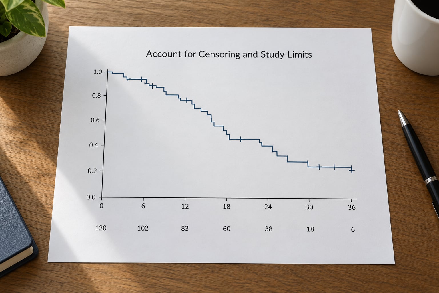
Right-censoring means a participant’s follow-up ended while they were still event-free. It happens at study closure, loss to follow-up, withdrawal, or death from a cause unrelated to the event. That person contributed information up to that moment, then leaves the risk set.
The small tick marks on the curve mark those censored observations. In our example, five people were censored before the last event. Dropping them instead of accounting for them would push the survival probability upward, sometimes dramatically, because their event-free time would be discarded.
Two limits matter here. First, the estimator assumes censored participants carry the same future risk as everyone still observed; when sicker participants leave earlier, the curve looks better than reality. Second, confidence bands show the uncertainty around the estimate, not a range in which future individuals will fall. Treat them as sampling error, not prediction.
Compare Groups Without Overstating the Difference
With two or more curves, look at three things: whether they separate consistently, whether they cross, and how many people remain at risk at the end.
Curves that stay apart in roughly the same way over follow-up support a proportional hazards reading, where the log-rank test compares groups across all event times and a Cox model reports a hazard ratio. Crossing curves warn against that interpretation: the ratio is no longer a single stable number, and a single hazard ratio can be misleading. Check scaled Schoenfeld residuals or report time-varying effects instead.
A hazard ratio of 0.70 with a 95% confidence interval of 0.55 to 0.89 means the event rate was 30% lower, with enough precision to exclude no difference. A hazard ratio of 0.70 with a confidence interval of 0.45 to 1.10 includes 1, so the data are compatible with no effect and with a benefit. Always read the interval, never the point estimate alone.
Visually different subgroups are not evidence of interaction. A formal test of the treatment-by-subgroup term is needed before claiming that one group benefits more than another.
Check Censors, Risk Tables, and Confidence Intervals
These are the interpretation errors that survive peer review, usually because the sentence sounds reasonable but the figure does not support it. Each row pairs a wrong reading with a defensible one for the same curve.
| Wrong reading | Correct reading |
|---|---|
| A flat stretch means nobody was being observed. | A flat stretch means no events occurred among those at risk; they were still contributing. |
| A censored participant had the event at that time. | A censored participant was event-free until that time and then left the risk set. |
| The curve reaches 20%, so 80% of patients survived. | The estimate is 20% event-free probability at that time, with the event being whatever was defined. |
| Median survival is the average survival time. | Median survival is the halfway point of the event-free distribution; means are not estimated from this curve. |
| The last point on the curve shows the true long-term probability. | The tail rests on very few people; the numbers-at-risk table tells you how few. |
| The bands show where most future patients will fall. | The bands show sampling uncertainty in the estimate at each time point. |
| The y-axis starts at 80% so the difference looks bigger. | A truncated y-axis exaggerates separation; insist on a 0 to 1 scale or a clearly stated truncation. |
| The curves separate, so the treatment works. | The visual difference needs a log-rank test or a fitted model before it becomes a claim. |
| An 82% versus 70% gap is a 12% risk reduction. | That is a 12 percentage-point absolute difference; the relative difference is about 15%. |
Two more checks catch most remaining problems. Confirm whether censoring is administrative (a fixed study end) or informative (people leave when they get worse), because only the first is handled safely by the standard estimator. And confirm the endpoint: progression-free survival counts progression and death, while time to progression ignores deaths, so the latter can look better simply because fatal events were dropped.
How to Report Kaplan Meier Results
When you write up the analysis, a reader should be able to reconstruct the figure. Cover these items in this order.
- Event and endpoint. State exactly what counted as an event and which composite definition applies.
- Time origin and scale. Name the starting point and the time scale used on the axis.
- Groups and sample sizes. Give the number randomised in each arm and the number analysed.
- Follow-up. Report median follow-up; a reverse Kaplan-Meier estimate is a common way to obtain it.
- Landmark survival estimates. Give survival probability with 95% confidence intervals at prespecified times such as 12, 24 and 36 months.
- Median survival. Report it per group, or record it as not reached with the reason.
- Numbers at risk and censoring counts. Include the risk table and say how many participants were censored in each group.
- Comparison method. Name the log-rank test result and, if a model was fitted, the hazard ratio with its interval and any check of the proportional hazards assumption.
- Subgroup analyses. State whether they were prespecified and how multiplicity was handled.
If you work in SPSS, Stata or R, the same reading order applies to the output window. Check the KM and Mean Survival table for the survival estimates and medians, then read the censoring rows and the numbers at risk printed alongside the plot rather than trusting the picture alone.
Frequently Asked Questions
What does a Kaplan-Meier curve actually tell you?
It estimates the probability that an individual stays free of a defined event over time, using data where many participants have not had the event yet. At each event time the estimate is multiplied by one minus events divided by people at risk, so censored people keep contributing until they leave. You get the timing of events, not just whether events happened, and the answer covers the whole follow-up period instead of one fixed time point.
Why is median survival sometimes reported as not reached?
Because the curve never fell to 0.50 during the observation period. That happens when fewer than half the participants had the event, or when follow-up was too short to reach that point. Not reached is a statement about the data, not a claim that survival is excellent or undefined. Report a landmark estimate at a chosen time with its confidence interval so the reader gets a usable number.
How do you interpret the 95% confidence interval of a hazard ratio?
A hazard ratio of 0.70 compares the event rate in two groups over follow-up, on the multiplicative scale of the model. If the 95% interval runs from 0.55 to 0.89, it excludes 1, so the data are reasonably precise about a lower event rate. If it runs from 0.45 to 1.10, the interval includes 1 and the study cannot separate a real effect from no effect. Read the interval, never the point estimate alone.
What do the tick marks and the numbers at risk table mean?
Tick marks show censored observations: participants still event-free when their follow-up ended, who then leave the risk set. The numbers-at-risk table underneath the plot shows how many people were still at risk at each time point, which is the denominator behind every drop. A curve flat or stepping oddly at the far end usually rests on only two or three people, so that portion of the estimate is unreliable.
Can you start the y-axis above 80% on a Kaplan-Meier curve?
It happens often in published figures, but a truncated axis visually magnifies the gap between groups and can mislead readers about absolute risk. The usual convention is a full 0 to 1 vertical scale so the reader can judge both the size of the effect and how much risk remains. If a study reports estimates only above a high threshold, say so in the caption and keep the numbers-at-risk table visible.
Conclusion
Start with the event definition and the time scale, then read the numbers-at-risk table before you look at the shape of the curve. Follow the steps to see how many events drive each drop, read a survival estimate at a time that matters to you, and report it with a confidence interval instead of relying on visual impression.
A median alone will not carry an interpretation. The time-specific estimate, the risk table and the comparison test are what turn a staircase into a defensible statistical statement.