Choosing the right chart for your data comes down to three things: what your data is made of, what you want the reader to see, and how much the reader already knows. Pick a bar chart for comparing categories, a line chart for change over time, a scatterplot for a relationship between two numeric variables, and a histogram or box plot for a distribution. Everything after that is refinement.
Most badly chosen charts are not wrong because the author lacked skill. They are wrong because the visual form was picked first and the question second. A 3D pie with nine slices did not fail on principle; it failed because a reader cannot compare 17 percent against 23 percent by eyeballing angles. This guide is written for 2026 and applies whether you are putting a figure in a thesis, a slide in a board pack, or a chart in a spreadsheet.
Table of Contents
- 1How to Choose the Right Chart for Your Data
- 2Quick reference: match your analytical goal to a chart
- 3Start With the Message You Want to Communicate
- 4Comparison
- 5Trend
- 6Composition
- 7Distribution
- 8Relationship
- 9Ranking and deviation
- 10Now match the chart to the reader
- 11What Kind of Data Do You Have?
- 12Categorical data
- 13Ordinal data
- 14Continuous numeric data
- 15Time-based data
- 16Geographic data
- 17Survey and small-sample data
- 18Which Chart Best Fits Each Analytical Task?
- 19Bar and column charts
- 20Histogram
- 21Line chart
- 22Area chart
- 23Scatterplot
- 24Box plot and violin plot
- 25Pie and donut charts
- 26Heatmap
- 27Treemap
- 28Dot plot, lollipop, and slope chart
- 29Waterfall chart
- 30Map charts
- 31Bar chart vs column chart vs histogram vs box plot
- 32Running the process in your software
- 33How Many Variables Should the Chart Show?
- 34One series
- 35Two or three series
- 36Many series
- 37Size as a third dimension
- 38How to Choose Colors, Labels, and Annotations
- 39Title the finding, not the chart
- 40Label axes with units and period
- 41Use direct labels before legends
- 42Pick one palette and stick to it
- 43Make it survive printing and colour blindness
- 44Add context the data cannot carry
- 45Which Chart Should You Avoid?
- 463D anything
- 47Pie charts with more than five slices
- 48Truncated bar axes
- 49Dual-axis charts
- 50Rainbow palettes
- 51Overplotted scatterplots
- 52Charts that answer no question
- 53How to Check Your Final Chart
- 54Frequently Asked Questions
- 55How do I choose the right chart type for my data?
- 56What is the difference between a histogram and a bar chart?
- 57When should I use a pie chart?
- 58What are the 5 C’s of data visualization?
- 59Which chart should I use for time series data in Excel or SPSS?
- 60How many categories can a bar chart handle before it stops working?
- 61Conclusion
How to Choose the Right Chart for Your Data
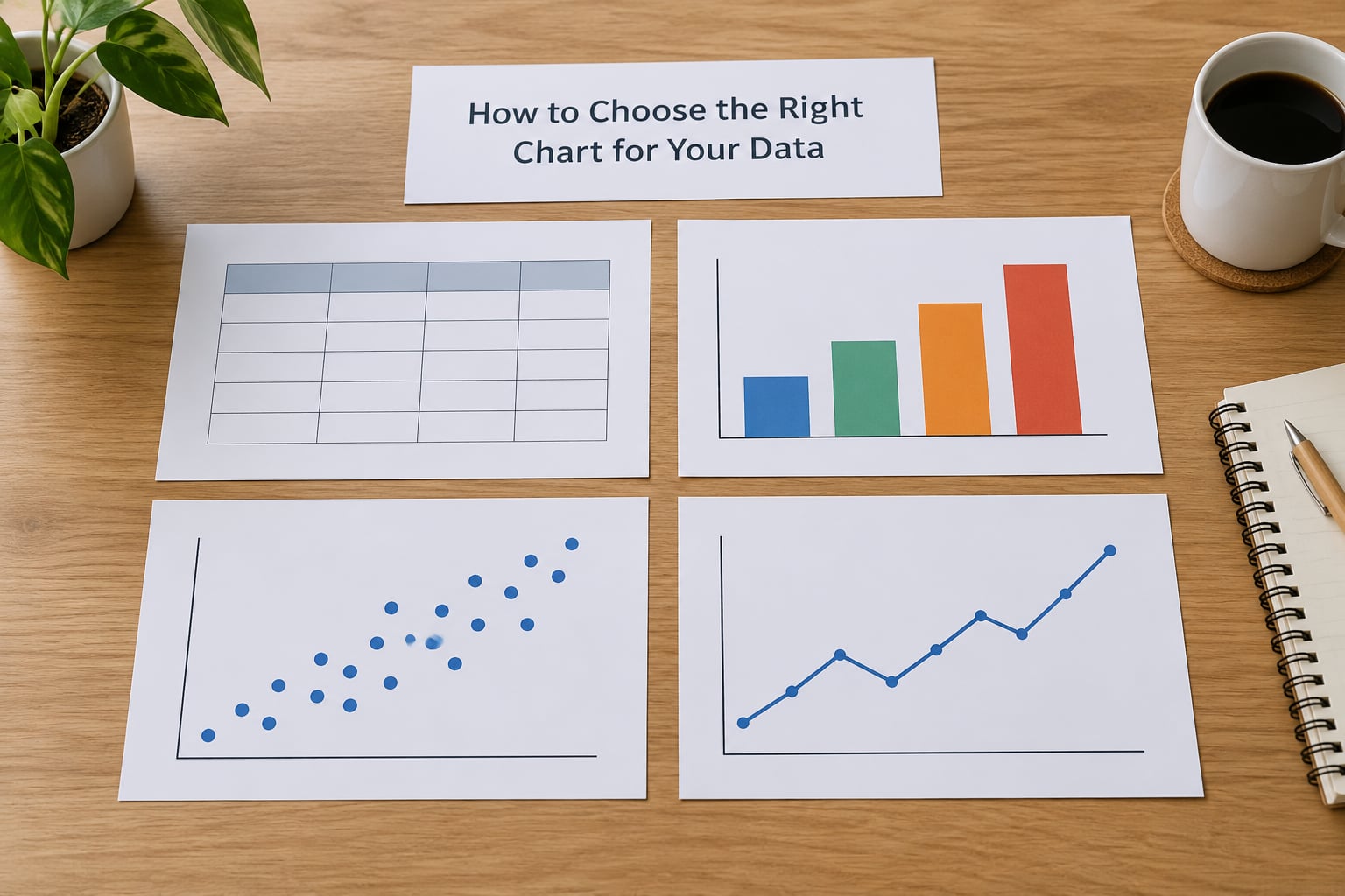
Work through four questions in order. The order matters, because each answer narrows the field for the next one, and by question four only a handful of chart types survive.
- What is the data made of? Categories, numbers, dates, locations, or a hierarchy. This rules out half the catalogue immediately.
- What is the analytical goal? Comparison, trend, composition, distribution, relationship, or ranking.
- Who reads it? An analyst who wants granularity, a manager who wants a summary, or an executive who wants one number.
- What is the medium? A journal figure in grayscale, a dashboard tile, a conference slide viewed from the back row, or a spreadsheet the reader will filter themselves.
The perceptual reason this ordering works is simple and worth knowing: people compare position and length far more accurately than they compare angle, area, or colour intensity. Bar length on a shared baseline is read almost instantly. A pie slice at 17 percent is read slowly and inaccurately. Choose the encoding your reader can decode fastest, not the one that looks most decorative.
Quick reference: match your analytical goal to a chart
| Analytical goal | Question you are asking | Use this | Avoid when |
|---|---|---|---|
| Comparison | Which category is biggest or smallest? | Sorted bar or column chart | You have more than about 12 categories |
| Trend over time | How did this change month to month? | Line chart | Time points are irregular and spacing matters less |
| Composition | What share of the total is each part? | 100% stacked bar or treemap | There are more than 5 parts or shares change often |
| Distribution | How are values spread out? | Histogram, box plot, violin | You only have a handful of observations |
| Relationship | Do two numeric variables move together? | Scatterplot | One variable is categorical or the sample is tiny |
| Ranking | What is the order, and where is the gap? | Ordered bar, lollipop, slope chart | Labels are long and bars must be read out loud |
| Deviation | What explains the gap between two states? | Waterfall chart | The components are not additive |
If your goal is not on that list, you may not need a chart at all. A single well-set number with a comparison to last period often beats a figure, and a table is hard to beat when the reader needs exact values rather than a pattern.
Start With the Message You Want to Communicate
Write the sentence your chart has to support before you open any software. Not “show monthly revenue” but “headcount grew 12 percent while output per head stayed flat, so cost per unit rose”. That sentence tells you the goal is trend plus comparison, which points at a line chart with an overlaid bar, and it tells you what to label.
Six goals cover nearly everything you will ever plot:
Comparison
Comparing discrete groups on one measure. Exam scores by group, spend by supplier, survey response counts by option. Length encodes the value, so bars win.
Trend
Showing movement across an ordered sequence, usually time. The connecting line is the point because it makes direction and slope visible. Monthly active users, weekly case counts, quarterly revenue.
Composition
Showing how a total divides into parts. Market share, budget lines, where a sample came from. The reader wants to see share, so normalise to 100 percent when comparing across groups.
Distribution
Showing the shape of one numeric variable: where it clusters, how wide it is, whether it is skewed, whether there are outliers. This is the goal people most often get wrong because they reach for a bar chart of averages, which hides everything interesting.
Relationship
Showing how two numeric variables move together. Marketing spend against leads, exam score against study hours. Scatterplots expose nonlinearity and clusters that a correlation coefficient hides.
Ranking and deviation
Ranking is ordering plus magnitude of gaps. Deviation is explaining a change from one total to another, such as a profit bridge. Both have specific chart families that outperform a generic bar chart.
Now match the chart to the reader
| Reader | What they need | Format that works |
|---|---|---|
| Analyst or peer reviewer | Granularity, exact values, the raw shape of the data | Detailed chart with data labels, or the figure plus an appendix table |
| Manager | A pattern and a comparison to a target | Sorted bar or line with a reference line at target |
| Executive | One number, its direction, and confidence it is real | KPI figure with change versus last period, no chart at all |
| General audience | An immediate takeaway in under five seconds | One message per chart, direct labels, no legend hunting |
This is the step people skip, and it is why the same analysis gets a detailed chart for the methods appendix and a single KPI card for the summary slide. Both are correct. They are different readers.
What Kind of Data Do You Have?
Data type constrains the chart more tightly than most people expect. Identify the type of each variable and several options disappear.
Categorical data
Labels with no inherent order: region, product category, treatment group. Compare with bars or columns, or count them with a bar chart. A table of counts sorted by size is almost always the first draft.
Ordinal data
Labels with a real order: satisfied, neutral, dissatisfied; income bands; age groups; Likert scales. Keep the order fixed on the axis and never sort the bars, because the sequence carries meaning. Charts for ordinal data should show the full response distribution, not a mean, since a mean of Likert answers is a number nobody can act on.
Continuous numeric data
Measurements with meaningful decimals: age in months, income, reaction time, a score. Show the distribution rather than the average. A mean of 72 with a standard deviation of 14 and a bimodal distribution of 72 are three completely different pictures, and only one of them is honest.
Time-based data
Values indexed by date or interval. Time goes on the horizontal axis, always left to right, at even spacing. If you collected data every three months, space the points three months apart; uneven spacing draws a slope that implies a rate of change you did not observe.
Geographic data
Values attached to places. A choropleth shades regions by value and is quick to scan, but two biases follow from the format: large areas look more important than small ones, and raw counts are misleading when populations differ. Shade by rate rather than count, and pick one projection for the whole report rather than switching between views.
Survey and small-sample data
With fewer than about 30 observations, a histogram is noise and a box plot shows almost nothing. Show the individual points instead. A strip plot or beeswarm of every response tells the truth about a sample that small, and it makes outliers visible instead of quietly deleting them.
Which Chart Best Fits Each Analytical Task?
Here is the working reference, with a use, an avoid, and the mistake I see most often for each type.
Bar and column charts
Use a bar or column chart when you are comparing discrete categories on one measure. Columns work when category names are short and you have few of them; horizontal bars win when names are long, because text stays readable.
Avoid a bar chart for a continuous variable, where the gaps between categories are arbitrary. The most common mistake is a y-axis that does not start at zero. Bar length is the encoding, so a truncated axis turns a 3 percent difference into what looks like a collapse. If you need to show small differences, use a dot plot instead, because position can be read honestly on a non-zero axis.
Histogram
Use a histogram to show the distribution of one continuous variable. Bars touch, because the underlying values are continuous and there is no gap between 62 and 63 percent.
Avoid it when your data are categories; that is a bar chart. The most common mistake is leaving the default bin width. Too few bins hide a bimodal shape, too many make the chart look like a brick wall, and the width silently changes what the chart appears to show. Adjust the bins until the shape stops moving, and say what width you used in the caption.
Line chart
Use a line chart for change across an ordered sequence, almost always time. It is the fastest way to show direction, slope, and turning points.
Avoid it when your x-axis is unordered categories, where the connecting lines invent a progression that does not exist. The most common mistake is a spaghetti chart: fifteen overlapping series that nobody can trace. Above five or six lines, use small multiples, one panel per series on a shared scale.
Area chart
Use an area chart when the total matters as much as the trend, or for a stacked view of composition over time. The filled space communicates cumulative volume.
Avoid it when you need precise comparisons between two lines, since readers compare the edges, not the fill. The mistake is stacking more than three layers; only the bottom band has a shared baseline, so the rest are read by guesswork.
Scatterplot
Use a scatterplot to see whether two numeric variables move together, and to spot clusters, curvature, and outliers. Add a trend line only when you have tested the relationship and can name the model.
Avoid it when one variable is categorical. The most common mistake is overplotting: a thousand points in one grey blob. Fix it with transparency, smaller points, or a hexbin plot where each hexagon counts observations. Also drop the “correlation implies causation” caption problem by showing the confound instead of asserting a link.
Box plot and violin plot
Use a box plot to compare the centre and spread of a numeric variable across groups, and a violin to show the density shape when you need more than the quartiles. For exam scores by group, this pair beats a chart of averages.
Avoid a box plot as a single summary for one group, where a strip plot of the raw points is more informative. The most common mistake is drawing the box without a scatter layer, which makes outliers invisible. Always overlay the points when n is small.
Pie and donut charts
Use a pie chart when you have one series of parts that sum to a whole, and no more than three or four slices. One comparison, one glance.
Avoid it whenever the reader must compare close values or track a change over several periods. The most common mistake is a 3D pie, which distorts slice angles by perspective and can easily double the apparent area of the front slice. If you have more than five categories, use a sorted bar chart of shares instead.
Heatmap
Use a heatmap for two categorical dimensions plus a value: hour of day by day of week for support volume, correlation matrices, exam scores by group and question. It compresses a large table into a readable pattern.
Avoid a rainbow palette, which creates false bands in what is really a continuous scale. Use a single-hue sequential scale for magnitude and a diverging scale centred on zero when the values have a meaningful midpoint.
Treemap
Use a treemap for hierarchical composition, such as storage used by folder, where nesting carries real meaning.
Avoid it for flat lists of categories; that is just a bar chart with extra steps. The mistake is nesting so deep that the smallest tiles are unreadable, and mixing levels so the reader cannot tell which rectangles are peers.
Dot plot, lollipop, and slope chart
Use these for ranking. A dot plot compares values on a non-zero axis honestly; a lollipop looks cleaner than a full bar when there are many categories; a slope chart shows change between two time points across groups.
The mistake is decorating them. A lollipop with no reference point and a dot plot with gridlines every unit both add ink and remove meaning.
Waterfall chart
Use a waterfall chart to explain how a starting value becomes an ending value through additive contributions. Budget versus actual, a margin bridge, a profit decomposition.
Avoid it when the components do not add up to the total, because the running balance then lies. Label each bar with its contribution so the reader can check the arithmetic themselves.
Map charts
Use a choropleth for rates across administrative regions and a symbol or bubble map for point locations. Use a hexbin or density layer for raw points so dense areas do not paint over each other.
Avoid a choropleth of raw counts, which mostly shows where people live. The mistake is an area comparison between a large rural region and a small dense one; a ranked bar chart of the same values is frequently the more honest display.
Bar chart vs column chart vs histogram vs box plot
These four get confused more than any others, so here is the short version. A column chart is a vertical bar chart for categories. A bar chart is the same encoding rotated horizontally for long category names. A histogram shows a continuous variable as adjacent bins, with touching bars. A box plot summarises the centre and spread of a variable and shows outliers as separate points. Choose by what your variable is: categories get bars, continuous gets a histogram, and a continuous variable compared across groups gets a box plot.
Running the process in your software
The selection logic is the same everywhere; only the picker is different. In Excel, use Insert, then Recommended Charts, and read the All Charts tab left to right, since it is grouped by purpose. In Google Sheets, the Insert Chart dialog splits into Recommended and Custom, and the Recommended tab works the same way. In Tableau and Power BI, start with a blank sheet rather than a chart, drag the field you want on the shelf, and let the mark type default before you override it. In R with ggplot2, the equivalent is geom_bar, geom_col, geom_line, geom_histogram, geom_boxplot, and geom_point, which keeps the choice explicit in code instead of in a menu. In Python, matplotlib and seaborn map the same way, and Plotly suits interactive HTML output. In SPSS, Graph, then Chart Builder gives a guided path and a Variable View summary; Stata users typically write twoway commands such as twoway scatter or twoway histogram.
Automatic suggestions are a starting point, not a decision. They optimise for what is easy to render from your column types, which is not the same as what answers your question.
How Many Variables Should the Chart Show?
Each extra variable costs the reader something, so count them before you add them. One variable needs one encoding. Two usually needs colour or shape. Three is where charts start to break, and a fourth is a sign you should be making two figures.
One series
A single line or bar set. Add a reference line at a target or average, which turns a chart into an argument.
Two or three series
Grouped bars for two series, and small multiples once you reach three or more. Small multiples, one small panel per group sharing the same axes, keep every series readable and make patterns obvious that a spaghetti line hides.
Many series
Stacked bars for composition, a heatmap for two dimensions, or facets for anything else. Once you have more than about five series in one panel, restructure rather than recolour.
Size as a third dimension
A bubble chart adds magnitude through area, which is the weakest encoding available. Use it when the third variable is genuinely secondary, add a size legend, and check that the largest bubble does not read as ten times the second largest when it is three times.
How to Choose Colors, Labels, and Annotations
A correct chart with vague labels still fails. Fixing the labelling usually takes five minutes and recovers most of the value.
Title the finding, not the chart
Put the conclusion in the title. “Support volume peaks between 10am and 11am” beats “Support volume by hour”. Readers scan titles first, so the title is the part that gets read.
Label axes with units and period
Write “Responses (percent of n = 412)” and “Quarter” rather than leaving the reader to guess. If the axis is a log scale, say so on the axis itself, since a log axis makes proportional rather than absolute change visible.
Use direct labels before legends
Put the series name at the end of the line or inside the bar where there is room, then delete the legend. A legend forces the reader to look away and back. Keep the legend only when lines overlap or there are more than three series.
Pick one palette and stick to it
One neutral colour for the main series and one accent for the point you want noticed beats six equally bright colours. Use a sequential single-hue scale for magnitude, a diverging scale for values around a meaningful zero, and a categorical palette only when categories have no order.
Make it survive printing and colour blindness
Check your chart in grayscale and with a colourblind simulator. If two lines become the same grey, distinguish them with line style or direct labels instead of relying on red and green, which are the pair most colourblind readers cannot separate.
Add context the data cannot carry
A reference line at your target, an annotation where a policy changed, or a note that the axis starts at a non-zero value all prevent the most common misreading. If a series has missing months, break the line rather than joining across the gap or drawing a zero.
Report uncertainty where it exists. Confidence intervals, error bars, or a plain note that a figure comes from 30 observations tell the reader how much weight the pattern deserves.
Which Chart Should You Avoid?
These are the formats that mislead regularly. Each has a workable replacement.
3D anything
Depth and perspective distort lengths and angles, so the ranking of two bars can change depending on where they sit in the frame. Use a flat 2D chart. If you want visual impact, use a strong title and one accent colour instead.
Pie charts with more than five slices
Angle comparison is imprecise, and adjacent slices of similar size become indistinguishable. Replace with a sorted bar chart of shares, which also orders them for the reader.
Truncated bar axes
A bar chart whose axis starts at 30 exaggerates small differences into dramatic ones. Keep the baseline at zero for bars. For small differences, switch to a dot plot, which does not require a zero baseline.
Dual-axis charts
Two y-axes let the author align the scales so the curves cross wherever they like, manufacturing or destroying a relationship on demand. Two separate charts, or normalise both series to a common index, tells the truth without the trick.
Rainbow palettes
Multi-hue scales introduce bands that are not in the data and reverse the perceived order of values. Use a sequential single-hue scale for magnitude and a diverging one for signed values.
Overplotted scatterplots
A single black mass hides the structure entirely. Add transparency, reduce point size, bin into hexagons, or facet by group.
Charts that answer no question
The most common anti-pattern is not a chart type at all. If a figure has no finding behind it, it is decoration. Delete it or write the sentence it is supposed to prove first, and see whether the figure still earns its place.
How to Check Your Final Chart
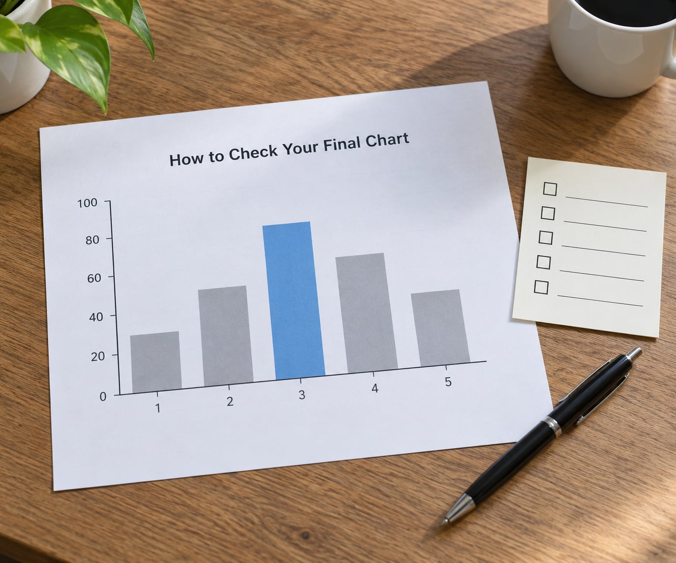
Run this list before the figure leaves your hands. It takes about two minutes and catches nearly every problem I have seen in submitted work.
- Does it answer the question? Read your title as a sentence. If it describes the chart rather than the finding, rewrite it.
- Is the baseline honest? Bars start at zero, or you are using a dot plot and have said so.
- Can a stranger read it? Someone outside your project should get the point in five seconds without asking you a question.
- Is it accessible? Grayscale legible, colourblind safe, readable when reduced to column width in a paper.
- Is there statistical context? Sample size stated, uncertainty shown where it matters, outliers visible rather than dropped.
- Is the source noted? Data source, period covered, and any exclusions, either under the figure or in the caption.
- Is the font big enough? Minimum around 8 points in print, more on slides.
- Would you defend it? If someone asks why you chose this form, you should have a reason that is not “it was the default”.
Print it or view it at actual size. Charts that look fine at full screen become unreadable at the size they will actually be read.
Frequently Asked Questions
How do I choose the right chart type for my data?
Ask three questions in order: what is the data made of, what analytical goal am I serving, and who reads it. Categorical data compared across groups needs a sorted bar chart, values indexed by time need a line chart, a single continuous variable needs a histogram, and two numeric variables need a scatterplot. The reader question then decides how much detail the chart can carry.
What is the difference between a histogram and a bar chart?
A bar chart compares separate categories, so its bars have gaps and any order works. A histogram shows one continuous variable split into numeric intervals, so its bars touch because there is no gap between 62 and 63. If you could put your x-axis labels in any sequence, you want a bar chart. If they are ranges along a number line, you want a histogram.
When should I use a pie chart?
Use a pie chart for a single snapshot of parts that sum to a whole, with three or four slices at most, and ideally where one slice clearly dominates. Avoid it when values are close together, when you need to compare across several periods, or when you have more than five categories. In those cases a sorted bar chart of shares is easier to read and compare.
What are the 5 C’s of data visualization?
Commonly: Clear, Concise, Consistent, Comparable, and Contextual. Clear means one message per chart. Concise means no chartjunk, guides, or borders the data does not need. Consistent means the same colour, scale, and style across a report. Comparable means a shared axis so panels can be read together. Contextual means labels, units, sources, and sample sizes are present.
Which chart should I use for time series data in Excel or SPSS?
Use a line chart for values tracked over time, with dates evenly spaced on the horizontal axis and values on the vertical one. In Excel, Insert then Line or Area. In SPSS, Graph then Chart Builder gives you a Line chart option. Keep one series per line, and above about six series switch to small multiples so overlapping lines do not become unreadable.
How many categories can a bar chart handle before it stops working?
About a dozen is the practical ceiling. Beyond that, labels crowd, readers cannot scan the bars, and the pattern disappears. Group the long tail into an Other category, or switch to a sorted horizontal bar chart with value labels. If you truly need all of them, break the chart into small multiples by region or period.
Conclusion
Start with the sentence you want the reader to take away, then classify your variables, then pick the simplest chart that encodes the message in the way people read most accurately: position and length. Check it against the list above before you send it, and if no chart type fits the goal, consider whether the finding needs a number instead of a figure.