To create a scatterplot in SPSS, open the Graphs menu, choose Chart Builder, pick Scatter/Dot then Simple Scatter, drag your predictor into the X-Axis? zone and your outcome into Y-Axis?, and click OK. The finished chart lands in the Output Viewer, where you can add a fit line, colour points by group, and export it. The whole job takes about two minutes once your variables are set up correctly.
This guide covers IBM SPSS Statistics, and the menu names have been the same since the old PASW SPSS 18 days, so if you are following an older tutorial the paths still apply. I will also show the Legacy Dialogs route, which is what most university handouts teach, and the GRAPH SCATTERPLOT syntax if you would rather not click through dialogs at all.
Table of Contents
- 1What You Need
- 2How to Create a Scatterplot in SPSS: Step-by-Step
- 31. Check That Your Variables Are Numeric
- 42. Open the Graph Menu
- 53. Assign the X and Y Variables
- 64. Set the Graph Options
- 75. Click OK and Check the Scatterplot
- 86. Edit and Format the Chart
- 9Using the Legacy Dialogs Path Instead
- 10SPSS Syntax for a Scatterplot
- 11Grouped Scatter: Colour and Cluster Your Points by Group
- 12How to Add or Remove the Regression Line and Total Fit Line
- 13Plotting Two Variable Pairs Side by Side
- 14Adding Mean or Centroid Markers
- 15Common Mistakes
- 16Frequently Asked Questions
- 17What is a scatter plot and what does it show?
- 18Which type of variable can I use in an SPSS scatterplot?
- 19How do I add a linear regression line to an SPSS scatter plot?
- 20Why does my SPSS scatterplot only show two dots?
- 21How do I plot two variable pairs side by side in SPSS?
- 22Can I make this scatterplot in Excel instead?
- 23Conclusion
What You Need
Three things have to be in place before the dialogs will cooperate.
A saved dataset. The rows in your Data Editor grid are your cases, and each column is a variable. If you have not saved the file, save it, because the chart references variables by name rather than by column position.
Two numeric variables. A scatterplot needs two continuous measures. Income and age, exam score and revision hours, systolic blood pressure and smoking status, dose and response, whatever fits your project.
A decision about the axes. The independent, explanatory or predictor variable goes on the horizontal X axis. The dependent, outcome or response variable goes on the vertical Y axis. If your design is the other way round, simply swap them, but be consistent with how you describe the relationship later.
Check the measurement level too. Open the Variable View tab at the bottom of the Data Editor and look at the Measure column. Anything you intend to plot should read Scale. A variable still set to Nominal or Ordinal will trigger the measurement-level warning dialog the first time you drop it into a scatterplot, and clicking OK there usually gives you a chart you did not want.
One more thing worth deciding early: which template you actually need. The gallery holds more than one option, and picking the wrong one is the reason several people end up with two dots instead of a cloud.
| Template | What it shows | Variables needed |
|---|---|---|
| Simple Scatter | One cloud of points, one relationship | Two scale variables |
| Grouped Scatter | Points split into clusters, coloured and shaped by group | Two scale variables plus one categorical |
| Overlay Scatter | Several relationships drawn on the same pair of axes | Three or more scale variables |
| Scatterplot Matrix | Every pair of several variables in one grid | Three or more scale variables |
| Binned Scatter | Density for large samples where points overlap into a blob | Two scale variables |
Most first plots should be Simple Scatter. Switch to Grouped when you have a group variable you care about, and to Binned only when you have more than a few hundred cases and the points stack on top of each other.
How to Create a Scatterplot in SPSS: Step-by-Step
1. Check That Your Variables Are Numeric
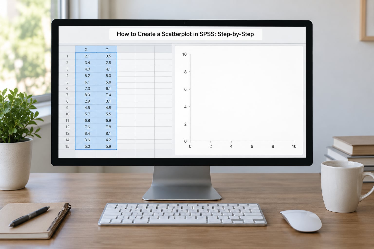
Click the Variable View tab and scan the Measure column for both variables you plan to plot. Scale is what you want. If a numeric variable has been coded as a category, or a column of text labels has been imported as a string variable, SPSS will not treat it as plottable on a numeric axis without work first.
Scan the actual data cells too, not just the labels. Text entries such as N/A, – or unknown inside a numeric column become missing values, and SPSS silently drops those cases from the chart. If your cloud looks shorter than your row count, missing values are the first thing to check.
2. Open the Graph Menu
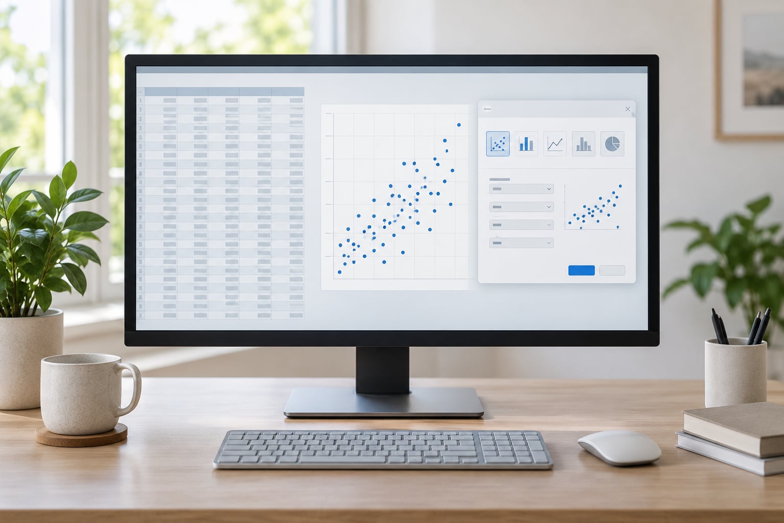
Go to Graphs > Chart Builder. The Chart Builder window opens with a variable list on the left, a gallery and preview in the middle, and an empty canvas on the right with drop zones.
Two things in this window catch beginners out. The chart you see before you finish is drawn from example data, not yours, so a tidy diagonal line in the preview tells you nothing about your dataset. And when you drop a variable that is not set to Scale, a dialog appears asking about the measurement level; choosing OK there forces SPSS to treat the variable as continuous, which is usually what you want but occasionally is not.
3. Assign the X and Y Variables
In the gallery area under Choose from, select Scatter/Dot. Click the Simple Scatter icon, the top-left picture in the gallery, and drag it onto the canvas.
Now drag your independent variable from the variable list onto the X-Axis? drop zone, then drag your dependent variable onto Y-Axis?. SPSS draws the axis titles with the variable names the moment you drop them in, so you can confirm the assignment without leaving the dialog.
To swap the axes, drag the variable off its zone and drop it onto the other one. To clear a zone entirely, drag the variable out of it. Do not drop two variables into the same axis zone: SPSS then aggregates the data and produces one dot per variable instead of one dot per case, which is the source of the two-dot problem people describe.
4. Set the Graph Options
Open Element Properties by clicking the Properties button for the scatterplot element on the canvas. In the dialog you can turn the fit line on or off, add a total fit line and the coefficient of determination, set a confidence band, change point style, and title the graph.
The default in recent releases is a line of best fit with an R-squared label. Leaving it on is fine for most analyses. The parts worth changing early are the marker style, if your points are too small to see, and the title, which is empty by default.
Have a look at Chart > Titles for the graph title and the two axis lines, and Chart > Axes if you want to fix a starting value or drop the axis at zero. Leave the rest alone for now; you can format the finished chart in the Chart Editor afterwards, which is easier than fiddling in a dialog.
5. Click OK and Check the Scatterplot
Click OK. The chart opens in the Output Viewer. If it did not, check the Output list at the bottom of the window, since the chart window can open behind the editor or on a second monitor.
Before you admire the pattern, look for four things.
- Form. Is the relationship straight, curved, or absent? A curve means linear regression is the wrong tool even if the correlation looks respectable.
- Direction. As one variable rises, does the other rise too, or fall?
- Strength. How tightly do the points hug an imaginary line? A tight band and a loose round cloud tell very different stories even at the same correlation value.
- Outliers and clusters. Look for points sitting far from the main body, and for separate groups of cases that suggest unexamined subgroups.
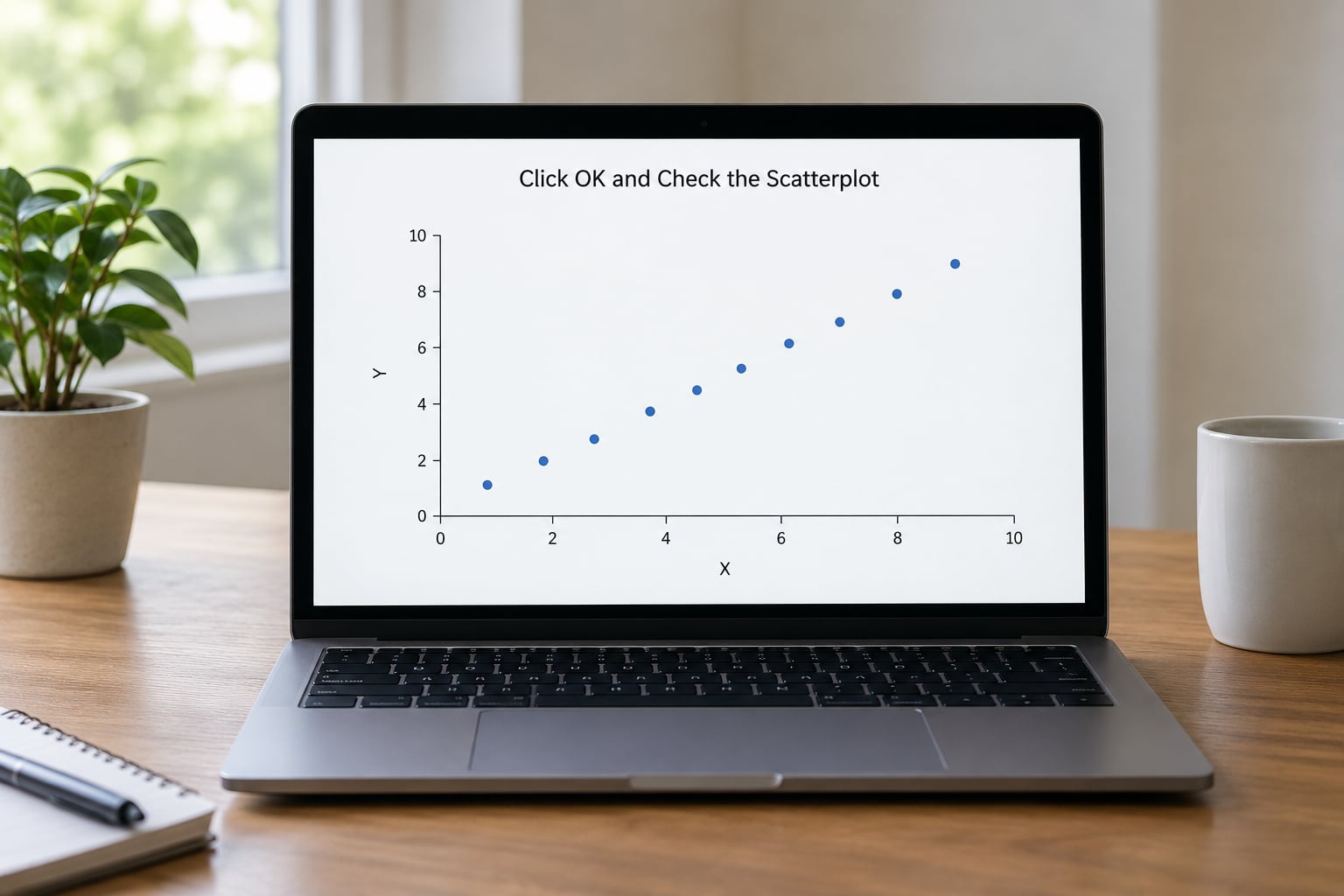
If the plot shows two, three or four dots instead of one per case, you have put more than one variable in a single axis zone. Go back and drag the extra variables off.
6. Edit and Format the Chart
Double-click the chart in the Output Viewer to open the Chart Editor. From here you can click any element and change it directly: click an axis title to retype it, click a point to resize or recolour it, click the fit line to delete or restyle it.
The Format menu and the Elements panel on the left are where the useful controls live. Under Elements you can add a subtitle, a footnote, a legend or a second fit line. Under Format you set line widths, marker shapes, gridlines and chart area borders.
When it looks right, click outside the chart to close the editor. To get the image into a document, right-click the chart in the Output Viewer and choose Copy Special to paste it as a picture, or use Export to save it as an image file. For a report, Copy Special into Enhanced Metafile keeps the chart sharp when Word scales it.
Using the Legacy Dialogs Path Instead
Charts built by Chart Builder are stored as new chart XML and you cannot always regenerate them with simple syntax. Legacy Dialogs produces classic graphics, which some supervisors still ask for because the syntax is short and reproducible.
Go to Graphs > Legacy Dialogs > Scatter/Dot, pick Simple Scatter, and click Define. Put the dependent variable in the Y box and the independent variable in the X box, then click OK. Tick Display total fit line in the dialog if you want the fit line drawn on the plot.
SPSS Syntax for a Scatterplot
To reproduce or automate the chart, open a syntax window with File > New > Syntax and run:
GRAPH SCATTERPLOT
  /ELABEL=VAR1(X) VAR2(Y)
  /MISSING=LISTWISE.
Swap VAR1 and VAR2 for your own variable names. ELABEL sets which variable sits on which axis, and MISSING=LISTWISE excludes any case that is missing on either variable, so the dots line up with the cases used in a bivariate correlation run later.
To colour points by a grouping variable in syntax:
GRAPH SCATTERPLOT
  /ELABEL=VAR1(X) VAR2(Y)
  /CLUSTER=GROUP BY VAR1 VAR2.
Grouped Scatter: Colour and Cluster Your Points by Group
Drag your categorical variable, such as gender or treatment condition, onto the canvas. Chart Builder adds Set Color and Set Shape drop zones automatically, and one click puts every case in colour. Colour is what most people want; shape helps when the chart gets photocopied in black and white for a journal.
The legend appears automatically. If it does not, click the chart in the Output Viewer, then click Edit > Legend in the Chart Editor and tick the categories you want.
How to Add or Remove the Regression Line and Total Fit Line
A regression line is the least-squares line through the points, the line of best fit that summarises the direction and strength of a linear relationship. The total fit line is the same line for every case in the plot.
To add one, double-click the chart, click the Element Properties button on the Properties toolbar, tick Regression Line, and click Apply. To add the total fit line instead, choose Total Fit Line from the Add Element list on the Format menu.
To remove the line, click it once to select it, then click it a second time and press Delete. If it refuses to select, it is most likely grouped with the points, so use the Elements panel and untick it there instead.
Plotting Two Variable Pairs Side by Side
Chart Builder will not put two separate scatterplots on one canvas. For that, use Graphs > Legacy Dialogs > Panel Charts, or better, split your data by a grouping variable.
Choose Scatter/Dot > Simple Scatter in Legacy Dialogs, then in the panel chart window put the first pair on the X and Y axes and add your grouping variable to the Panel by box. Each group gets its own mini-scatterplot, arranged in a grid, with the same axes. Run it once per pair if you genuinely want different variable pairs rather than different groups.
For four or more variables, skip the pairs entirely and use a Scatterplot Matrix: Graphs > Graphboard Template Chooser > Scatterplot, tick every variable you want in the grid, and click Finish. You get the relationship between every pair at once, which is the fastest way to spot a near-duplicate variable before you build a regression model.
Adding Mean or Centroid Markers
SPSS cannot add a mean point to a chart from the menus. What you can do is calculate the means yourself, add a row containing them, and plot that row as its own group. If you want a mean-difference plot for comparing two measurement methods, compute the difference and mean for each case in Transform > Compute Variable, then scatter difference against mean.
Common Mistakes
Most disappointing scatterplots come from one of a handful of mistakes. Here is what goes wrong, why, and the fix.
| Symptom | Cause | Fix |
|---|---|---|
| Only two or three dots appear | Two variables dropped into the same axis zone, so SPSS plotted one point per variable | Drag each variable into its own X-Axis? or Y-Axis? zone |
| Measurement level warning on drop | Variable is coded Nominal or Ordinal in Variable View | Set Measure to Scale, or click OK once if the values really are continuous |
| Chart looks nothing like the preview | The Chart Builder preview uses example data | Ignore the preview; judge only the Output Viewer chart |
| Fewer dots than cases | Missing or non-numeric values in either column | Check the cells, then use MISSING=LISTWISE in syntax |
| Points form one solid blob | Too many overlapping cases at normal resolution | Use Binned Scatter, which shows point density |
| Legend missing or unreadable | Legend not switched on, or too many categories | Chart Editor > Elements > Legend, or collapse rare categories into Other |
| Unwanted line across the points | Regression line on by default in recent releases | Select the line in the Chart Editor and press Delete |
Then there is the mistake that produces no error at all. A scatterplot shows association, never cause. A tight upward line between two variables tells you the two move together in your sample and nothing more. Common causes, reverse causation and a third variable hiding behind both produce exactly the same picture, which is why the plot is a check on your reasoning rather than proof of it.
The other quiet error is reading a scatterplot without the number next to it. Run Analyze > Correlate > Bivariate on the same two variables and put Pearson’s r and the sample size in your report next to the figure. A visual and a coefficient answer different questions, and reviewers expect both.
One last habit worth building: keep the chart until you know what it is for. A scatterplot that never informs a decision is decoration. If you are checking linearity before a regression, label the figure as such and keep it in the appendix rather than the results section.
Frequently Asked Questions
What is a scatter plot and what does it show?
A scatterplot graphs two continuous variables against each other, with one on the horizontal X axis and the other on the vertical Y axis, so every case appears as a single dot. It shows the form, direction, strength and outliers of the relationship, which is why you make one before running a correlation or a linear regression. A correlation coefficient hides the shape of the data, and the plot does not.
Which type of variable can I use in an SPSS scatterplot?
Both axes need numeric variables set to Scale in the Variable View Measure column. Nominal and ordinal variables cannot form a numeric axis, though they can colour or shape the points as a grouping variable instead. Check that no cell contains text such as N/A, because those values become missing and SPSS drops the case from the chart silently.
How do I add a linear regression line to an SPSS scatter plot?
Double-click the chart in the Output Viewer to open the Chart Editor, click Properties on the toolbar, and tick Regression Line in the Element Properties dialog, then click Apply. To add it during chart creation instead, set it in the same dialog before you press OK. To remove the line, click it twice to select it and press Delete, or untick it in the Elements panel.
Why does my SPSS scatterplot only show two dots?
Most often two variables have been dropped into the same axis zone, so SPSS plotted one point per variable rather than one per case. Drag the extra variable off and place it in the other axis zone, or into a separate drop zone such as Set Color. Two dots can also mean the two columns hold a single repeated value, so check the data cells if the plot stays wrong.
How do I plot two variable pairs side by side in SPSS?
Use Graphs u0026gt; Legacy Dialogs u0026gt; Panel Charts. Choose Simple Scatter, define your first variable pair on the X and Y axes, and add a grouping variable to the Panel by box so each group gets its own mini-plot with matching axes. For four or more variables, run a Scatterplot Matrix from Graphs u0026gt; Graphboard Template Chooser instead, which shows every pair at once.
Can I make this scatterplot in Excel instead?
Yes, if you do not need the SPSS statistics alongside it. Select your two numeric columns, insert a scatter chart, then set the axis titles and remove the gridlines for a cleaner figure. Excel gives you faster formatting control but no easy grouping by category, no fit-line statistics beyond the equation box, and nothing that matches the IBM SPSS output you would report in a methods section.
Conclusion
Start with the boring part, because it decides whether anything after it works. Open Variable View, confirm both variables are numeric and set to Scale, and clear any stray text values sitting in those columns.
Then go to Graphs > Chart Builder, choose Scatter/Dot, drag Simple Scatter onto the canvas, put the predictor on X-Axis? and the outcome on Y-Axis?, and click OK. Ignore the preview, because it uses example data rather than yours.
Only once you have the chart in the Output Viewer should you start formatting it: add a title, decide whether the fit line stays or goes, colour the points by group if you need to compare them, and export. Judging the pattern before you polish the picture keeps you from falling in love with a chart that shows nothing.