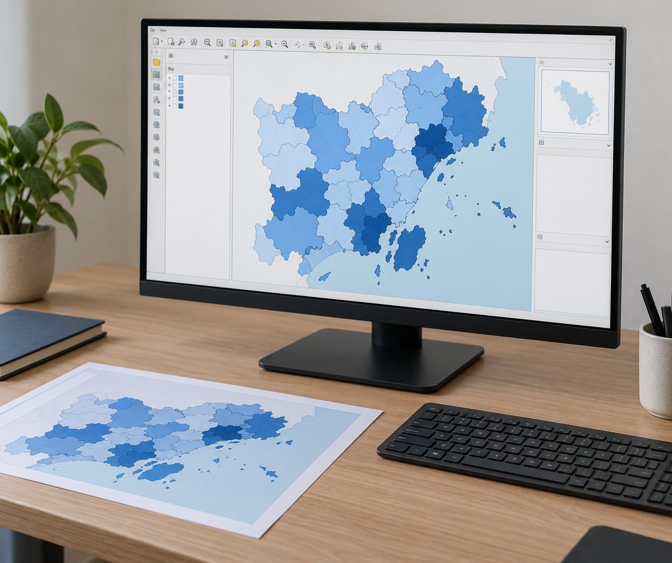
A choropleth map is a thematic map where every area (county, state, census tract) is shaded in proportion to one numeric value, such as population density or median income. To make a choropleth map in QGIS you add a polygon boundary layer, join a table of values to it, then set the symbology to the Graduated renderer. The whole workflow takes about 30 minutes once your files are ready, and this guide walks through it in QGIS 3.x with the exact menu names.
QGIS is free, open-source desktop geographic information system software. If you have never opened it before, the tricky part is not the map, it is getting your two datasets to actually talk to each other. Most people who think their choropleth map is broken are actually looking at a failed join or a column that QGIS read as text instead of numbers. Fix that and the rest is a handful of clicks.
Table of Contents
- 1What You Need
- 2Step-by-Step: How to Make a Choropleth Map in QGIS
- 3Step 1: Prepare the Boundary and Value Data
- 4Step 2: Load the Boundary Layer Into QGIS
- 5Step 3: Join the Statistical Data to the Map
- 6Step 4: Choose a Classification Method and Color Ramp
- 7Step 5: Style and Label the Choropleth Map
- 8Step 6: Check the Result for Mapping Errors
- 9Step 7: Export the Finished Map
- 10Common Mistakes and How to Fix Them
- 11Frequently Asked Questions
- 12What data do I need to make a choropleth map in QGIS?
- 13Should I use Natural Breaks, Equal Count, or Equal Interval in QGIS?
- 14Why are some regions uncolored after I join data to polygons?
- 15How do I choose colors for a choropleth map in QGIS?
- 16Can I export a QGIS choropleth map as an image or PDF?
- 17Conclusion
What You Need
Four things, and you can stop reading if you do not have the first two.
- A polygon boundary layer for the geographic units you want to colour. Shapefiles, GeoPackages and GeoJSON all work. It must be polygons, not points or lines, because a choropleth fills areas.
- A table of values with one row per geographic unit and a column holding the number you want to map. A CSV works fine.
- A key that matches on both sides. The boundary file needs a unique area identifier (a FIPS code, a region code, a post code) and your value table needs the same identifier in the same format.
- QGIS 3.x. The steps below use the QGIS 3 interface. If you are on QGIS 2, the panel labels differ slightly, though the logic is identical.
Before starting, decide whether your values are totals or rates. A raw count mapped across regions of wildly different sizes is really a map of region size, not of the thing you care about. If your numbers are counts, work out a rate first (people per square kilometre, cases per 100000 residents, households per 1000 people). Many beginner maps go wrong here rather than in the software.
Also confirm the two datasets describe the same places. A 2020 population file joined to 2010 boundaries will silently give you blank or mismatched results, and you will spend an hour staring at a legend wondering why.
Step-by-Step: How to Make a Choropleth Map in QGIS
Step 1: Prepare the Boundary and Value Data
Open your value file in a spreadsheet first. Confirm one row per region, no duplicates, no blank cells in the value column, and a single ID column with no mixed formats. Leading zeros are the classic trap: if a code reads as 0021 in one file and 21 in the other, the join matches nothing.
In QGIS you can check the boundary geometry yourself: load the layer, then open the Attributes panel and look at the WKT column. Anything starting with POLYGON or MULTIPOLYGON is what you need. If it says POINT or LINESTRING, you have the wrong layer for a choropleth.
Step 2: Load the Boundary Layer Into QGIS
Start a fresh project so nothing inherits a stray coordinate reference system. Go to Project then New Project, then Layer, Add Layer, Add Vector Layer, and point it at your shapefile or GeoPackage.
Double-click the new layer to open Layer Properties and check the Information tab. Note the CRS. Then switch to the Source tab, where QGIS shows how many features loaded and how many are valid geometry. A feature count of zero, or a pile of invalid geometries, means the file is damaged or points at the wrong format.
You can tell it worked because the canvas fills with coloured polygons. If the canvas is grey and empty, zoom to the layer with right-click, Zoom to Layer.
Step 3: Join the Statistical Data to the Map
Load your value table with Layer, Add Layer, Add Delimited Text Layer. Tick No Geometry (attribute only table) so QGIS treats it as data rather than trying to map it.
If your values arrive as text, create a small CSV Type Definition file next to your CSV, same name, .csvt extension, with one line per column that states the type:
"Integer",1
"String",1
"Real",1
QGIS reads that file and treats those columns as numbers, which is what lets the graduated renderer work at all.
Now open the polygon layer’s properties and go to the Joins tab. Click the green plus. Set Join Field to the code in your value table, and Target Field to the matching code column in the polygon layer. Choose Keep all records so no polygon is dropped for failing to match.
Open the polygon attribute table and look for your new value columns. If they are there but empty, the join ran and the keys disagree. If they are not there at all, the join was not applied. That check takes ten seconds and catches most failures.
Once values are joined, save the layer so the attributes stick. Right-click, Save As, and write it to a GeoPackage.
Step 4: Choose a Classification Method and Color Ramp
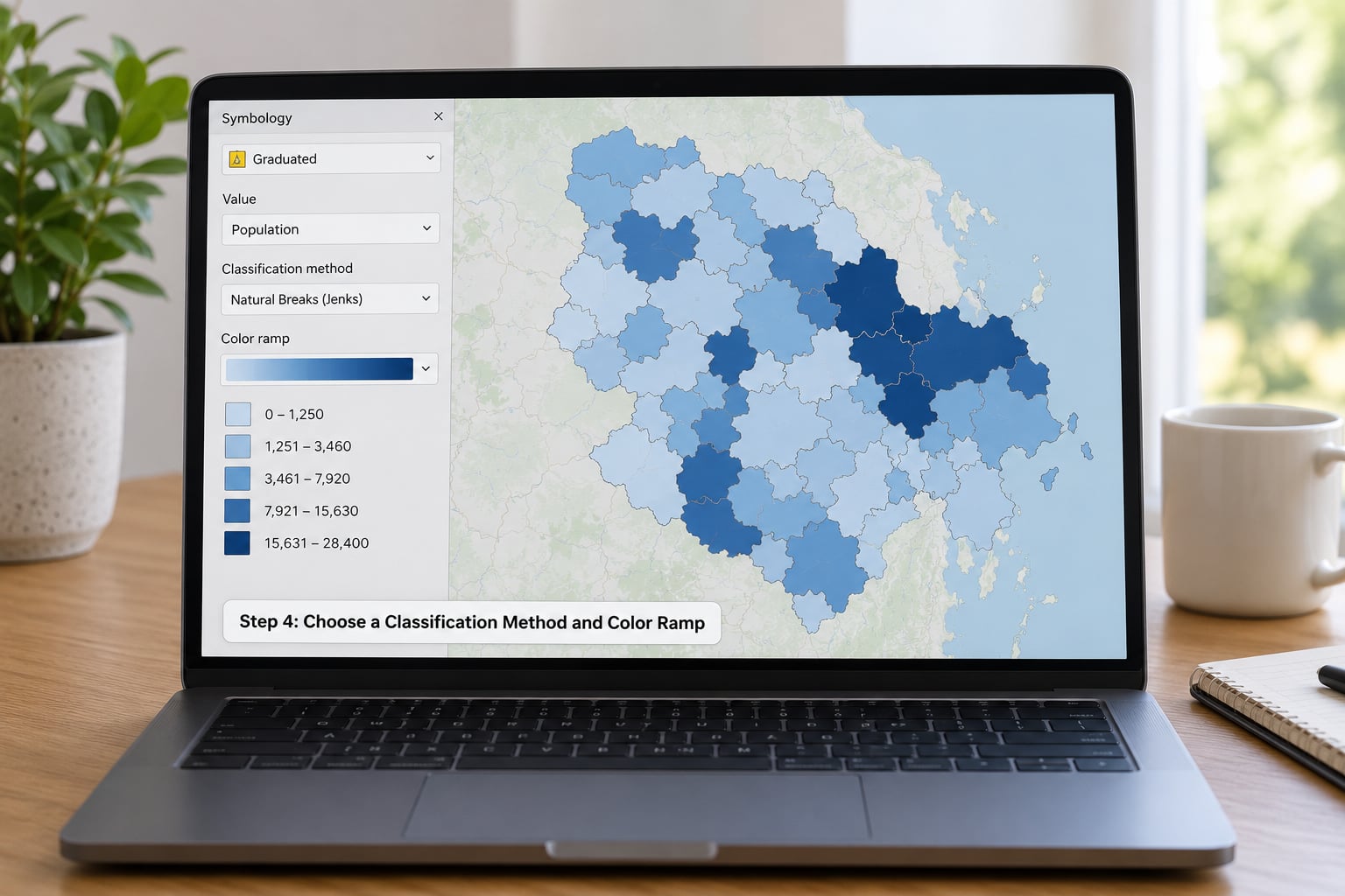
This is the step that actually makes the map. Open Layer Properties, go to Symbology, and change the renderer from Single Symbol to Graduated. Pick your value column, choose a mode, set the number of classes, then press Classify.
| Classification method | What it does | Best for | Watch out for |
|---|---|---|---|
| Natural Breaks (Jenks) | Groups values into classes where they cluster naturally | Skewed data, most regional statistics | Class sizes can be wildly uneven, and small changes can move breaks |
| Equal Interval | Splits the value range into equal-width slices | Evenly spread data, absolute ranges you can explain | Produces empty or near-empty classes when data is skewed |
| Quantile (Equal Count) | Gives every class the same number of features | Comparing many maps with different distributions | Class ranges differ per map, so colours are not comparable across maps |
| Pretty Breaks | Rounds breaks to tidy round numbers | Public-facing maps read by non-specialists | Less optimal grouping than Jenks |
| Standard Deviation | Breaks at fixed distances from the mean | Showing how far each area sits from average | Awkward when the distribution is not roughly normal |
| Geometric Interval | Equal ratios instead of equal differences | Rates that span orders of magnitude, like density | Unfamiliar to most readers, needs explaining in the caption |
If you are unsure, Natural Breaks is a reasonable default for skewed data, and then say so in your methods section. Picking a method silently is what makes choropleth maps untrustworthy.
With the classes set, open the colour ramp selector and choose a sequential scheme: light for low, dark for high. Blue, or a single-hue ramp with a light-to-dark progression, works well and stays readable for colour-blind readers. Diverging ramps only make sense when a midpoint is meaningful, such as the national average.
The Classify dialog also lets you hand-edit break values. If one outlier is stretching your whole ramp, raise its upper break or exclude it from the classification and colour it separately with a rule-based renderer.
Step 5: Style and Label the Choropleth Map
Rename the layer to something meaningful, like Median income by county 2024. In the Symbology panel, set a thin stroke in a light grey or set fill transparency around 10 to 20 percent, so neighbouring polygons stay visually separate and small areas do not disappear under large ones.
Add labels from the Labels tab. Use a short name field, not a long one, and set a text buffer of about 1 mm white so names stay readable over dark fills. Labels only work at some scales: on a national map, county labels are noise, so scale visibility or a manual placement is the honest choice.
Keep the legend honest. Title it with the variable and its units, for example Median income (USD per household), and avoid four decimal places on a value your source only measured to the nearest hundred.
Step 6: Check the Result for Mapping Errors
Now audit the map rather than admire it. Look for polygons in the default no-data grey, which means either a NULL value or a failed join, and count them against your table. A viewer reads grey as zero, so if it is really unknown, say so in the caption or overlay a no-fill boundary layer beneath the choropleth.
Check the histogram in the Classify dialog for one polygon sitting far away from everything else. That is usually a data entry error, such as a decimal point in the wrong place.
Then re-read your variable name and ask whether the map says what the caption claims. Totals read as rates, a rate computed with the wrong denominator, or one region using a different year than the rest, are the errors that survive review.
Finally, run Vector, Geometry Tools, Check Validity on a copy. Self-intersecting or unclosed polygons produce holes and odd slivers that look like classification artefacts.
Step 7: Export the Finished Map
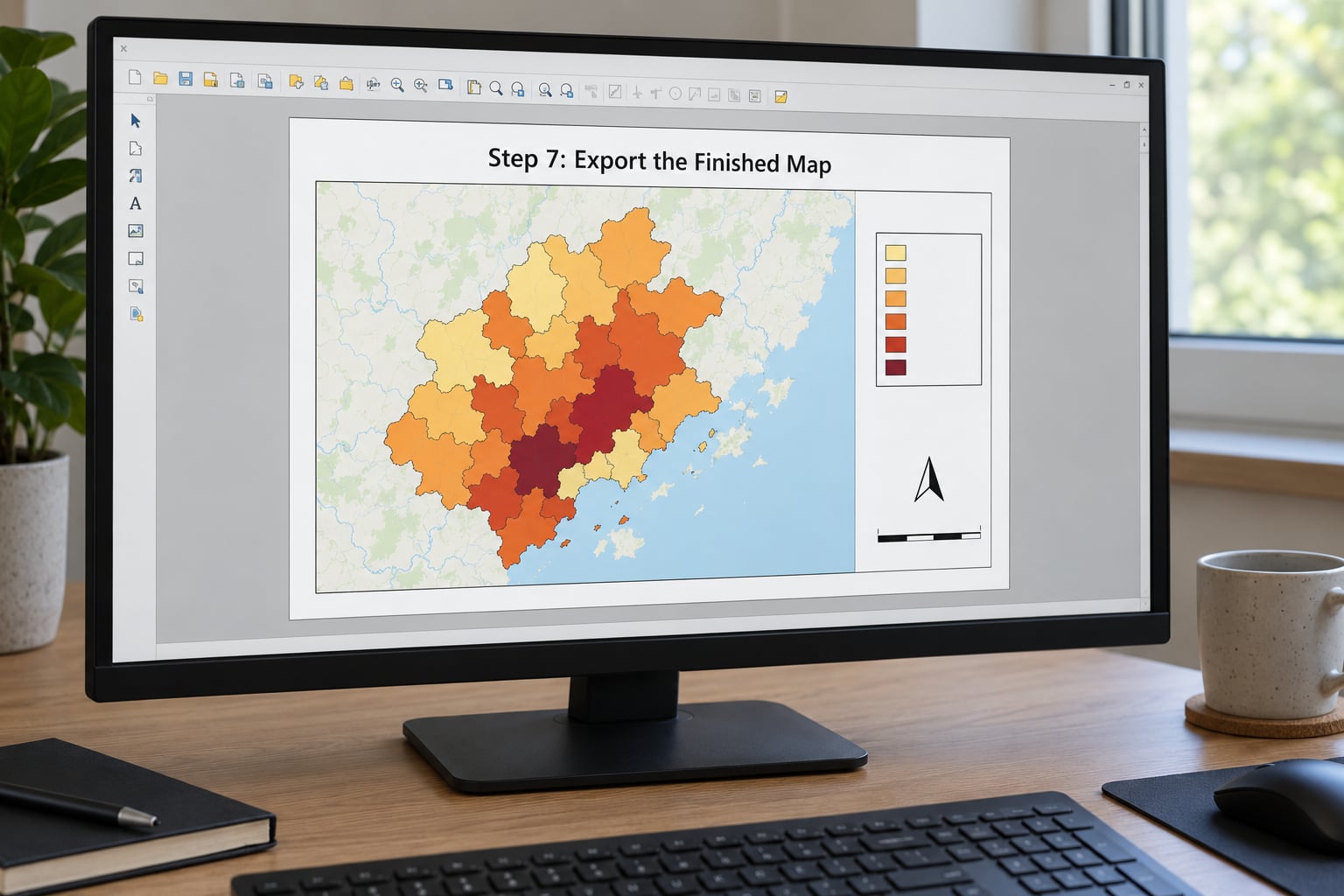
Saving a screenshot of the canvas gives you a map for a slide, not for a report. For anything you intend to print or hand in, build a Print Layout: go to Project, New Print Layout, choose a page size such as A4 Landscape, then Add Item and Map Frame, and draw the frame where the map should sit.
Add the supporting items and drag each one where you want it: Add Item and Add Label for the title, Add Item and Add Legend for the key (uncheck the unwanted layers and the auto-generated title), Add Item and Add Scale Bar, and Add Item and Add Picture for a north arrow if orientation matters.
Write a source line at the bottom with the dataset name, the year and the classification method. That single line is what separates a map someone can check from decoration.
Export from the layout with Export as PDF for vector output, or File, Export As Image and set the DPI to 300 for print-quality PNG or JPEG. Use the layout’s Export as Image for the DPI setting; the File menu version exports whatever the canvas is. Then save your QGIS project so you can reopen and adjust anything later.
Common Mistakes and How to Fix Them
| Symptom | Likely cause | Fix |
|---|---|---|
| Every polygon is the same colour | Value column imported as text, or the join matched nothing | Add a .csvt type file, then open the attribute table and confirm the value column holds numbers |
| Classify button is greyed out | No field selected, or the chosen field is all NULL or text | Select a numeric column in the Column list; check field type in the Attributes panel |
| Some regions stay uncoloured | Failed join match or a NULL in the value column | Compare record counts, check key formats for leading zeros, and decide how to show no-data |
| Map is mostly one flat shade with a few odd polygons | One extreme outlier stretching the class range | Inspect the histogram, correct the value or raise the top break manually |
| Large regions dominate | Raw totals mapped instead of rates | Compute a rate per area or per population in the field calculator before styling |
| One or two classes are empty | Equal Interval or too many classes on skewed data | Switch mode to Natural Breaks or Quantile, or reduce the class count |
| Map looks stretched or in the wrong place | Boundary layer and value data use different projections | Check the CRS in Layer Properties, then reproject one layer to match the other |
| Labels overlap or vanish | Labels applied at the wrong scale or collision turned on | Scale-based visibility, then enable “Show all labels for this layer” only if needed |
| Old tutorial steps do not match your screen | QGIS 2 versus QGIS 3 interface differences | In QGIS 3, symbology lives in Layer Properties with renderer dropdowns rather than a separate graduated tab |
One last piece of cartographic honesty. Choropleths hide variation inside each area and exaggerate whatever differences your class count happens to reveal, so two neighbouring areas in the same class can be far apart in reality. That is the modifiable areal unit problem in one sentence: change the boundary set and the pattern can change too. Where a few areas dominate and the rest are small, a graduated circle or proportional symbol map encodes the same data by size rather than by colour, and often tells the story more honestly.
Frequently Asked Questions
What data do I need to make a choropleth map in QGIS?
You need two files. The first is a polygon boundary layer containing the areas you want to colour, with a unique code for each one. The second is a table of values with the same codes and a numeric column holding the variable to map, such as income or population. Both must describe the same places and the same time period, or regions will end up blank after the join.
Should I use Natural Breaks, Equal Count, or Equal Interval in QGIS?
Use Natural Breaks when your data is skewed, which is the usual case for income, density or population, because it groups values where they actually cluster. Quantile is useful when you want every class to hold the same number of regions, for example when comparing maps across different datasets. Equal Interval is the simplest and most explainable, but it creates empty classes whenever the data is lopsided.
Why are some regions uncolored after I join data to polygons?
Those polygons did not match a row in your value table, or their value is NULL. The usual cause is a format mismatch, where a code reads as 0021 in one file and 21 in the other. Open the polygon attribute table and check whether the joined column is empty for those features only. Grey in QGIS means no data, not zero, so caption your map to say which it is.
How do I choose colors for a choropleth map in QGIS?
Pick a sequential ramp with one hue running from light to dark when your values simply rise from low to high. Diverging ramps only suit data with a meaningful midpoint, such as the national average. Avoid rainbow schemes, which invent boundaries where your data has none. In the Symbology panel, set a light grey stroke and around 10 to 20 percent fill transparency so neighbouring polygons remain distinct.
Can I export a QGIS choropleth map as an image or PDF?
Yes, and you should export from a Print Layout rather than saving a canvas screenshot. Build a layout with a map frame, title, legend, scale bar and source note, then use Export as PDF for vector output or the layout’s Export as Image dialog and set DPI to 300 for print-quality PNG. Exporting from the File menu instead captures the canvas at screen resolution.
Conclusion
Start with the join, not the colours. Identify your polygon layer, find the unique area code in it, and confirm your value table uses that exact code with leading zeros intact. Load both, run the join, and open the attribute table to see numbers sitting in the polygons. Everything after that, classification method, ramp, labels, layout and export, is a decision you can revisit in seconds. Get the join right and the map is already finished.