Reading a satellite image for the first time is mostly a matter of checking five things before you interpret anything: where the image came from, when it was taken, how fine its pixels are, how its colours were made, and what the ground looked like at that moment. Get those right and the rest is pattern recognition you can learn in an afternoon.
This guide walks through how to read a satellite image for beginners in eight steps, from picking a scene to confirming what you think you are seeing. No paid software, no coding, no degree in geography. Most readers finish the whole process inside one sitting.
One warning before we start. A satellite image is not a photograph. It is a grid of numbers, and the colours you see were chosen by somebody. Everything below exists to slow you down just enough that you read the data instead of the colours.
Table of Contents
- 1What You Need
- 2Step-by-Step: How to Read a Satellite Image for Beginners
- 3Step 1: Check the Image Source, Date, and Purpose
- 4Step 2: Establish Orientation and Scale
- 5Step 3: Understand Bands and Color Rendering
- 6Step 4: Identify Major Land-Cover Patterns
- 7Step 5: Check Shadows, Relief, and Image Distortion
- 8Step 6: Look for Seasonal and Environmental Effects
- 9Step 7: Compare Images to Detect Change
- 10Step 8: Verify Your Interpretation
- 11Common Satellite Image Interpretation Mistakes
- 12Frequently Asked Questions
- 13Can beginners read satellite images without GIS software?
- 14How do I know whether a satellite image is true color or false color?
- 15What is the best satellite image resolution for identifying land cover?
- 16How can I distinguish a shadow from water or a dark surface?
- 17Why does the same location look different in satellite images from different dates?
- 18How do I use two satellite images to detect land-cover change?
- 19Conclusion
What You Need
You need four things to do a proper first reading, and all four are free.
An image. Free satellite imagery is available from several public portals without a signup. Pick something you know well, because a familiar place makes errors obvious. Your own town works better than anywhere exotic.
A viewer. A browser-based map tool is enough for a first pass. Desktop GIS software exists, but a learning curve there will hide the thing you actually came to learn. Beginners on the NASA Earthdata portal and on the Copernicus Browser get a usable image on screen without installing anything.
The metadata. Every real image comes with a record of the sensor, the date, the processing level, and the bands available. If you cannot find it, ask yourself whether you would trust a map with no scale bar. The answer is the same.
A scale reference. A scale bar, a north arrow, a place name, a coastline. Something that tells you how big you are looking at and which way is up.
You also need one piece of background: what a spectral band is. Sunlight reflects differently off water, vegetation, soil and concrete, and a sensor records each of those responses as a separate layer. Once you know that, the strange colours stop being strange.
You do not need an account, a licence, or any paid tool to complete this workflow. Every step below works on a free public image.
Step-by-Step: How to Read a Satellite Image for Beginners
The process below is deliberately ordered. Skipping to the middle of it is the single most common way beginners end up confidently wrong, so work through it in sequence and stop at each observable result before moving on.
Step 1: Check the Image Source, Date, and Purpose
Every satellite image is a measurement of a specific place at a specific moment, and it was built for a specific job. Find out what you are holding before you look at what it shows.
Look for the sensor name, the acquisition date, the processing level, and any statement about intended use. Optical sensors record reflected sunlight and need daylight and clear skies. Radar sensors send out their own signal and record the echo, so they work at night and through cloud, which is why radar imagery looks nothing like a colour photo.
A scene that looks flat and grey may be a radar product rather than a failure. The date matters just as much. A harvest month, a drought month and a flood month produce three entirely different pictures of the same farm.
You will know it worked when you can say, in one sentence, when the image was taken, what the sensor measured, and what it is meant to be used for. If any of the three is a guess, go and find the metadata.
Step 2: Establish Orientation and Scale
Before you interpret features, know which way you are facing and how much ground each pixel covers. Interpretation done at the wrong zoom level is interpretation done wrong.
Use the north arrow first, then confirm it against something physical: a coastline, a river bend, a highway junction. Place names are the quickest check. In a satellite image, roads run for tens of kilometres in near-straight lines and buildings cluster around them, so a familiar motorway junction can orient you in seconds.
Three different resolutions get confused constantly, so separate them now:
- Spatial resolution is the ground size of one pixel. Thirty metres sees a house; ten metres sees a car; one metre sees the lane markings.
- Temporal resolution is how often the satellite returns to the same spot. Sixteen days is a fast revisit; a week is a very fast one.
- Map scale is the ratio on your screen. Zooming changes the map scale but never changes the spatial resolution, because the pixels stay the same size no matter how you display them.
The same scene can look sparse and abstract at full extent and detailed and busy when you zoom to a single district. Zooming adds no information your data did not already contain.
You will know it worked when you can point to one feature and state roughly how many metres the ground under your cursor covers. If you cannot, the resolution is still unknown.
Step 3: Understand Bands and Color Rendering
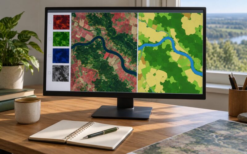
Most multi-band sensors can be displayed as a three-band colour composite, and the band order you choose decides what the image looks like. Read the colour by reading the band order.
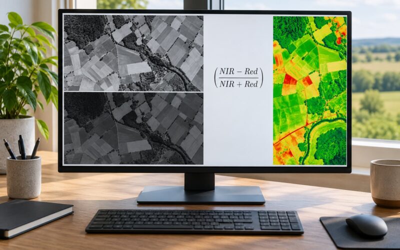
Healthy vegetation reflects strongly in near-infrared, or NIR, because leaf structure scatters that wavelength hard. It absorbs red light for photosynthesis. So in a composite that puts NIR in the red channel, vegetation shows up bright red. Red is not a warning here; it is a measurement.
Here is the cheat sheet for Landsat and Sentinel-2 style sensors:
| Goal | Band order | What you will see |
|---|---|---|
| True colour | 4-3-2 | What a person would roughly see from a very high plane |
| Healthy vegetation | 8-4-3 | Bright red for vigorous growth, dark for stressed or bare |
| Built-up land | 7-4-1 or 6-5-4 | Cities pale or cyan against a red background |
| Water | 7-4-1 | Water dark, land bright cyan and orange |
| Burn scars | 6-5-4 | Fresh burn areas distinct from healthy vegetation |
Water absorbs almost everything in the visible range and most of the NIR, which is why open water reads as near-black in most composites and turns bright in a shortwave infrared one. Snow also reads bright. Distinguishing the two is a matter of shape, texture and what sits next to them.
You will know it worked when you can predict what a feature looks like before you look at it. Pick a field you know is healthy vegetation, decide which band order you expect it to stand out in, then check.
Step 4: Identify Major Land-Cover Patterns
Most land cover is identifiable from four cues at once: colour, texture, shape and spatial arrangement. No single cue is reliable on its own.
Water is smooth, dark and geometrically irregular, following drainage rather than geometry. Vegetation is mottled and soft-edged, with tonal variation between fields. Bare soil is bright and uniform. Sand is bright with soft, wind-shaped edges. Urban areas are angular, with a dense speckled texture, straight road segments and a grey-to-tan tone. Roads and railways are long, thin and unusually straight, often with lighter shoulders.
Agricultural fields are the easiest place to practise, because they come in rectangles with sharp boundaries. Forest is messy, irregular and dark in a true colour image. Wetlands sit low, look mottled with dark channels, and sit where a river slows.
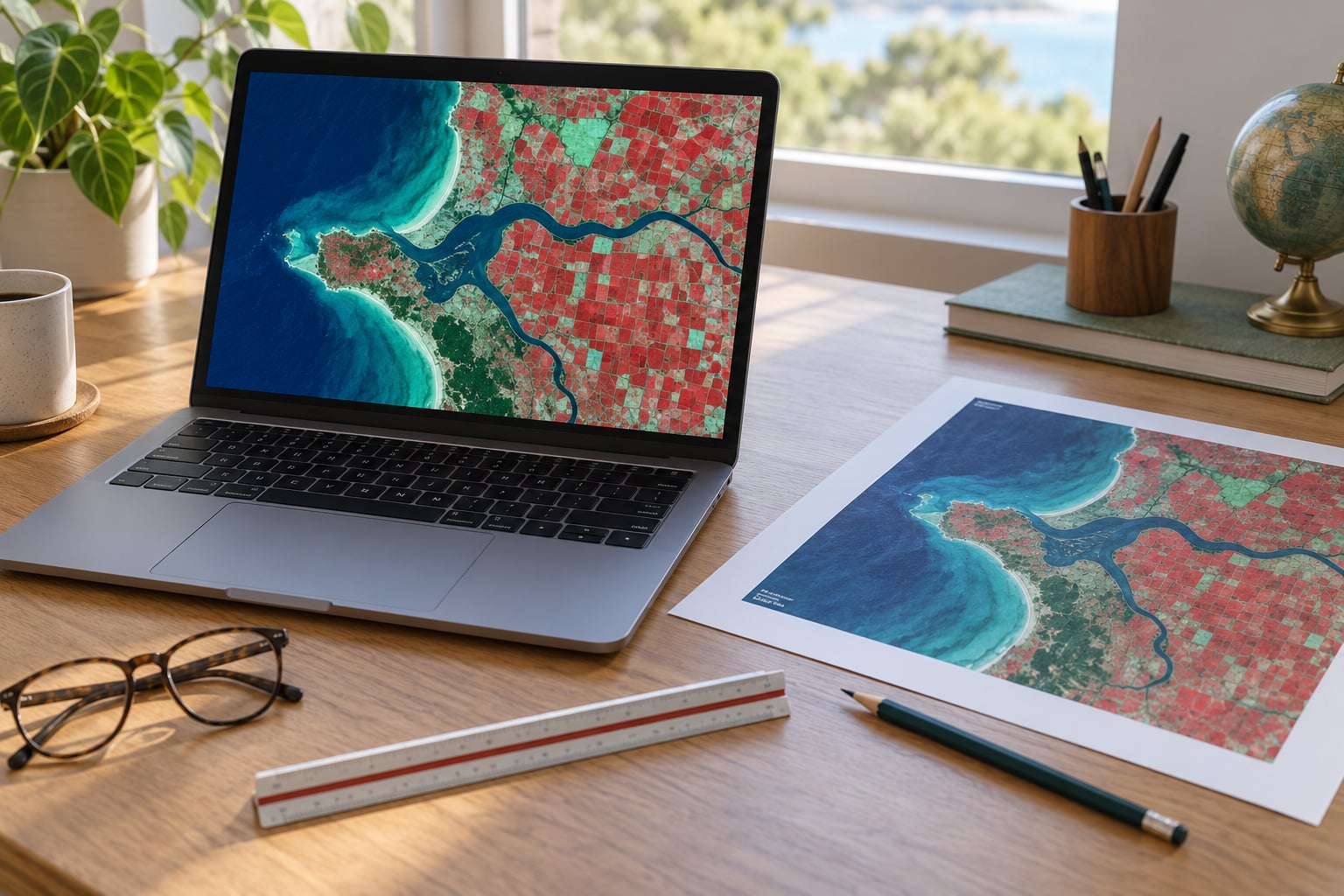
Worked example: take a coastal town with farmland around it. Start at the coastline, which is unambiguous. Water is darker and smoother than anything else. Follow the boundary inland. On the landward side you will find a band of mottled green-grey with an irregular texture; that is vegetation. Push further in and the texture becomes speckled and the tone greys out; that is the built-up area. The straight pale lines radiating outward are roads, and they are often the clearest single clue that you have found a town.
You will know it worked when you can name four land-cover classes in the scene and point to a confident example of each. If you are stuck on one class, move on and return to it after you have an anchor from the others.
Step 5: Check Shadows, Relief, and Image Distortion
A dark patch in a satellite image is not automatically water, and a bright patch is not automatically healthy vegetation. Sun angle, terrain and sensor geometry create darkness that means nothing at all about the surface.
Three causes account for most of it. First, shadows: tall objects and steep terrain cast shadows displaced in one consistent direction from the object casting them. Shadows move between dates while the objects do not. Second, hillsides: slopes facing away from the sun appear darker purely because they receive less light, so a mountain range can look striped. Third, water in shadow: still water in deep shade goes black and can easily be mistaken for a tar pond or burn scar.
Image distortion adds a fourth case. Off-nadir viewing near the edge of a scene makes buildings lean away from the centre, and terrain relief produces displacement. Both are predictable in direction and magnitude, which is why experienced readers avoid drawing conclusions from the outer margin of a scene.
Compare a second date or a nearby cloud-free scene from the same season before you commit to an interpretation. A genuine water body stays exactly where it was. A shadow moves.
You will know it worked when every dark feature you have flagged is either confirmed by context or explicitly labelled uncertain. Anything left in the uncertain pile stays there.
Step 6: Look for Seasonal and Environmental Effects
A satellite image is a snapshot of a moving system, and treating it as a permanent record is the root of most beginner errors.
Rainfall turns bare soil dark and raises river levels, often within days. Crops have a growth cycle that changes field colour weekly through the season and leaves stubble or bare soil after harvest. Floods widen river channels and fill low ground that is dry for most of the year. Drought dulls vegetation and can trigger irrigation that shows up as small dark or bright patches in otherwise uniform fields. Fire leaves dark burn scars that fade as regrowth starts, and the smoke from an active fire obscures the ground beneath it. Tides change exposed shoreline by several metres twice a day. Snow and ice cover everything above a certain altitude and melt unevenly, usually from south-facing slopes first.
Two dates taken a fortnight apart can show more difference than two dates taken five years apart. Comparing across seasons without noting the season is one of the most common ways to invent change that does not exist.
You will know it worked when you can name the season your scene was captured in, or say plainly that you do not know.
Step 7: Compare Images to Detect Change
Change detection works when two scenes are comparable, so alignment matters more than resolution. Same sensor, same band combination, similar time of day, similar season.
Pick an earlier scene covering the same footprint. Display both with identical rendering, then flicker between them or put them side by side. Work outward from a stable anchor, such as a road junction or a river bend that has not moved, and record differences as you go. Note the direction of change and roughly how large the area is.
Then separate the candidates. Seasonal variation is the first thing to exclude: growth stages and harvest dates. Shadows and sun angle are second, because they change tone without changing the ground. Clouds and haze hide rather than change. Registration differences show up as thin edges along fixed boundaries where two scenes have been nudged a few metres out of alignment. Lighting differences shift overall brightness across the whole scene and are usually obvious once you notice them.
What survives all five of those filters is a much stronger claim than anything you started with.
You will know it worked when each difference you have recorded has at least one reason to believe it is real.
Step 8: Verify Your Interpretation
The last step is the one beginners skip, and it is the one that separates an observation from a guess.
Check what you have found against something independent: a topographic map, a place name, a road layer, a weather record for that date, field photographs, a second sensor, or higher-resolution imagery of the same spot. If your reading of the scene says a field is irrigated and the local rainfall record shows a drought, one of you is wrong, and finding out which is the useful outcome.
Until you have that support, write your conclusions in hedged language. The scene appears to show recent bare-soil harvesting. The dark region is probably a building shadow. Appears to be and probably are not weakness; they are an accurate description of the confidence you actually have, and a reader who later finds ground truth will trust your other claims more for it.
You will know it worked when you could show your note to someone on the ground and ask them to correct it.
Common Satellite Image Interpretation Mistakes
People ask me how to read a satellite image for beginners most when a project lands on their desk with a screenshot and no instructions. These six errors account for most wrong readings. Each one has a specific cause, and each one has a fix you can apply in a few seconds.
Assuming the colours are natural. Most composites are false colour, and a false colour composite deliberately maps invisible wavelengths into visible ones. Fix: find the band order before you describe anything by colour.
Confusing resolution with accuracy. A ten-metre image can be geometrically misregistered by several metres, and a one-metre image can still be wrong if it was captured at an oblique angle. Sharp is not the same as correct. Fix: check the processing level and the georeferencing note before measuring anything.
Overlooking clouds and haze. Thin cloud and aerosol haze wash out colour and reduce contrast, which flattens texture and hides small features. Fix: check the cloud cover figure for the scene, and treat low-contrast areas as unreliable for classification.
Reading shadows as features. A shadow that looks exactly like water is still a shadow. Fix: check for displacement in a consistent direction, and compare against another date from the same season.
Mistaking seasonal variation for permanent change. Difference images taken across different crop stages produce large, entirely natural differences. Fix: keep the season constant whenever the question is about lasting change.
Interpreting a single image with no context. One scene carries no idea of normal conditions, so it cannot tell you whether something is unusual. Fix: pull two or three dates before concluding anything about a trend.
Before you write a conclusion, run three quick checks. Can you point to the metadata? Can you name the band order? Can you show at least one independent source that supports what you think you are seeing? If any answer is no, that is the next piece of work, not a paragraph.
It is also worth knowing when satellite imagery is the wrong tool. Anything smaller than the pixel size is simply not there, and no amount of processing will create it. If you need to count individual cars, judge building condition, or identify tree species, you need a different data source. For small-area, high-detail work, drone imagery or aerial photography beats a free satellite scene almost every time.
Frequently Asked Questions
Can beginners read satellite images without GIS software?
Yes. A browser-based viewer is enough for everything in this guide: checking metadata, switching band combinations, comparing two dates and noting features. Desktop software such as QGIS only becomes necessary once you start measuring areas, counting pixels or exporting layered results. Many beginners do their entire first month of interpretation inside a free web viewer before installing anything.
How do I know whether a satellite image is true color or false color?
Check the metadata or the layer name for the band order. A true color composite assigns the blue, green and red bands to the blue, green and red display channels, usually written as 4-3-2 on Landsat and Sentinel-2 sensors. Anything else is false color. A quick visual clue: in a true color image, vegetation is green and water is dark; if vegetation looks red, you are looking at a near-infrared composite.
What is the best satellite image resolution for identifying land cover?
Ten to thirty metres is the practical range for land cover work. At thirty metres you can separate fields, forest blocks, water bodies and urban areas reliably. Below ten metres individual structures separate cleanly. Above sixty metres, pixels start blending neighbourhoods into single values, and land cover becomes a guess. If you only need to see water, forest and city, a coarse product is often easier to read, not harder.
How can I distinguish a shadow from water or a dark surface?
Look for three things: a dark shadow keeps a relationship to the object that casts it and shifts position between dates, while water stays fixed; a shadow has soft edges, water usually has a sharp shoreline; and a shadow still shows texture from the surface underneath, whereas deep water is smooth. When in doubt, compare the same location on a second date from the same season.
Why does the same location look different in satellite images from different dates?
Because the ground itself changes and because the lighting and sensor change with it. Rainfall darkens soil, crops change colour through their growth cycle, flooding alters river width, fire leaves new burn scars, and snow covers everything above a certain altitude. Different sensors and viewing angles add their own brightness and geometry differences. That is why you compare dates only when you control for season, sensor and band combination.
How do I use two satellite images to detect land-cover change?
Choose two scenes from the same sensor and band combination, covering the same footprint, taken in the same season and at a similar time of day. Align them, apply identical rendering, and compare them side by side or by flickering between them. Work from a stable anchor such as a fixed road junction, record each difference with its direction and size, then rule out seasonal variation, shadows, clouds, misregistration and lighting before calling it real change.
Conclusion
Reading a satellite image is a fixed sequence, and it works every time: identify the source, date and sensor, fix your orientation and scale, confirm the band order and colour treatment, classify land cover from shape and texture, check for shadows and seasonal effects, compare dates for change, then verify before you commit to a claim.
If you only do one thing today, open a free portal, load a recent scene of a place you know, and before you look at anything else, find the acquisition date and the band order. Those two answers explain most of what you are about to see.