To present geospatial results in a results chapter, give every map a number, a self-contained caption and a supporting table of the underlying values, then describe what the pattern shows in the text without claiming that location caused it. The chapter is an argument built from figures, not a folder of screenshots, and the writing around each figure carries as much weight as the figure itself.
Most difficulty here is not technical. People can geocode, run a hot spot analysis and export a clean choropleth. What trips them up is the sentence after the figure: a paragraph that says the map “clearly shows” a pattern without saying which pattern, how big it is, or what it might mean. Examiners notice that paragraph more than they notice the colour ramp.
This guide works through the sequence, from checking what you have to writing the caption, with a technical checklist for submission and a set of mistakes that repeatedly cost marks. It is written for a thesis, dissertation, journal article or research report — anything where a reader has to believe your spatial findings without watching you work.
Table of Contents
- 1What You Need
- 2Step-by-Step: How to Present Geospatial Results in a Results Chapter
- 31. Define how to present geospatial results in a results chapter
- 42. Organize the analysis in a logical order
- 53. Report the spatial analysis clearly
- 64. Create maps readers can interpret
- 75. Add supporting tables and statistics
- 86. Write figure captions and map references
- 97. Interpret the findings without claiming causation
- 10Common Mistakes
- 11Frequently Asked Questions
- 12Do I need maps in a geospatial results chapter?
- 13How many maps should I include in a results chapter?
- 14Should I use QGIS, ArcGIS, R, or Python to present geospatial results?
- 15How do I report a statistically significant spatial result?
- 16Should the interpretation of a map go in the results or discussion chapter?
- 17Conclusion
What You Need
Before you write a word, gather the material. A results chapter built from a folder of exports reads like a folder of exports.
- Your research question, restated as a spatial claim. “Where do X occur?” is a mapping task. “Does X cluster near Y more than chance would predict?” is a spatial statistics claim, and the chapter has to answer that exact question.
- The analysis plan or a list of planned outputs. Every figure in the chapter should trace back to a question you set out to answer. Anything else belongs in an appendix or nowhere.
- Your GIS and remote-sensing outputs — vector layers, raster surfaces, attribute tables, the derived statistics and any non-spatial plots that support them.
- A basemap, a legend, a scale bar, a north arrow where north matters, and the coordinate reference system for every figure, so nothing is assembled ad hoc at 2am the night before submission.
- Supporting statistics: counts, areas, means, medians, ranges, test statistics, degrees of freedom, p-values and effect sizes.
- The software and version that generated each figure, for the methods section and for the reproducibility archive.
Two of these deserve more attention than they get. The coordinate reference system and the classification scheme both belong in the methods section, but a figure that contradicts either is the first thing a reviewer will pick up. Fix them before styling, not after.
Step-by-Step: How to Present Geospatial Results in a Results Chapter
1. Define how to present geospatial results in a results chapter
Start by writing one sentence per figure that says what claim it supports. If you cannot write that sentence, the figure is decoration and it should be cut. This is the whole discipline of figure-text coupling: the figure proves a point, and the paragraph states the point before the reader has to work it out from colour.
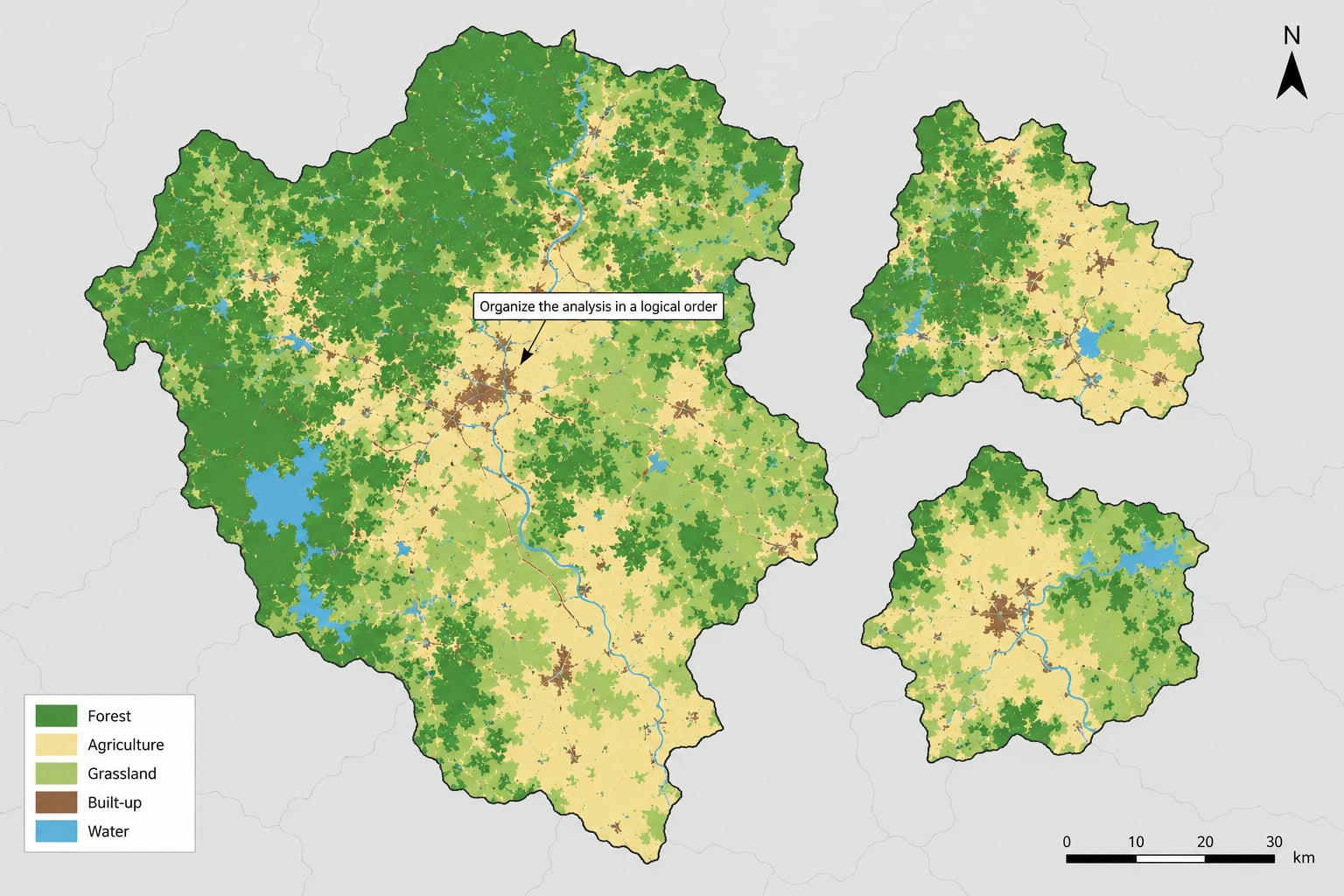
Then decide the order the evidence appears in. The convention that works for most spatial studies is a move from general to specific: overall extent, then distribution, then comparison, then inference, then a summary of what the spatial evidence adds. A worked example helps. If your question is whether land cover changed between two image dates across three administrative zones, the order is: a map of the study area and the three zones, a map of change per zone, a table of change in area and percentage for each zone, a comparison of the highest and lowest zone, then a sentence on whether the differences exceed what you would expect from classification error alone.
Each paragraph around a figure should do four jobs in order: state what is shown, state the specific finding with numbers, compare it to a baseline or to another area, and name the limitation. Skipping straight to job four is what produces a results chapter that reads like a discussion chapter with the evidence removed.
2. Organize the analysis in a logical order
Order your sections so the argument builds rather than accumulates. Descriptive patterns come first, because the reader needs the lay of the land before any comparison means anything. Mapped distributions follow, showing where the phenomenon sits. Comparisons among areas come third, and inferential tests fourth, once there is a specific contrast to test. Interpretation closes the section, and only lightly.
Readers should be able to trace a line from the overall dataset to a single spatial finding. That means no forward references. Do not put the hot spot analysis before the map that shows where the events are; a reader who has not seen the pattern yet has nothing to attach a cluster statistic to.
One useful check: read only the first sentence of each paragraph in order. If those sentences form a coherent summary of your findings, the structure works. If they form a list of techniques, the section is describing your process rather than reporting results.
3. Report the spatial analysis clearly
Much of what readers need is technical and belongs in the methods section, not the results. Data sources and acquisition dates, study boundaries, the spatial unit of analysis, coordinate reference system and projection, spatial resolution, the classification method, any transformations you applied, and the software with versions all go in methods.
In the results section you report what those choices produced. “Zones 2 and 3 were classified using supervised classification with the same training set and signature” is a method. “Built-up area in Zone 3 increased by 214 hectares between 2015 and 2020, the largest absolute change of the three zones” is a result.
Keep descriptive GIS operations separate from statistical testing. A buffer, an overlay and a spatial join describe the data. Moran’s I, a Getis-Ord statistic, a spatial regression or a permutation test support a claim about whether a pattern departs from what chance would produce. Report the first set as process and the second set as evidence, and never let the first stand in for the second.
State your unit of analysis explicitly, and note the modifiable areal unit problem while you are there. The same data aggregated to wards, districts or regions can produce different patterns and different significance. One sentence acknowledging this is standard practice in a good spatial chapter, and its absence is a routine examiner question.
4. Create maps readers can interpret
Choose the map type that matches the measure, then simplify. A choropleth shades areas by a normalised rate. Proportional symbols size points by value. A density surface shows where events concentrate without implying defined boundaries. A box map avoids the area-visualisation problem of very small units. A flow map shows direction and volume between places. Small multiples repeat one map across periods or sub-groups so change is visible without the reader flipping between pages.
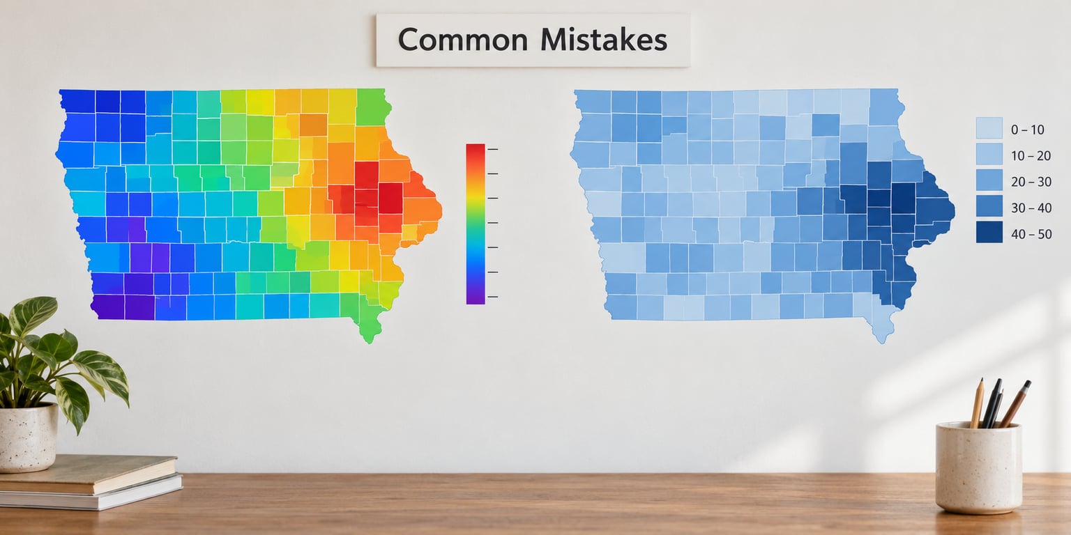
Then do the unglamorous work. Crop to the study area. Use a sequential colour ramp for a measure with one direction of interest, and a diverging ramp only when there is a meaningful midpoint, such as change from a baseline of zero. Choose class breaks deliberately and name the scheme in the caption: quantile guarantees equal numbers per class and hides outliers, equal interval guarantees readable colour steps and exaggerates skew, natural breaks follows the data distribution and can leave classes too small to read. Do not mix schemes between figures in the same chapter.
Every figure needs a title, a legend with labelled class ranges, a scale bar, and a north arrow when orientation is not obvious. Add a locator or inset map when the study area is small enough that the reader cannot place it. Label features the text actually refers to — if the paragraph says “the northern cluster”, the map must have a label or a clear outline for it.
Two habits separate a publication figure from a screenshot. A colour-blind-safe palette that survives greyscale printing, and a deliberate check that the visual weight of the map matches your claim. If the finding is a modest difference between two zones, a rainbow ramp that paints half the map in hot colour overstates it. Restrain the palette to the strength of the evidence.
Export as vector PDF or SVG where the journal accepts it, or at 300 dpi for raster. Embed fonts, use a colour space the printer can handle, and check the final figure at its printed size rather than zoomed in on screen.
5. Add supporting tables and statistics
A map shows where. It should never be the only place a number appears. Readers cannot reliably estimate an area, a count or a rate from a colour, and reviewers know it, which is why a map without a value table is an incomplete figure.
Put exact values in a table. Include what supports the claim and nothing decorative.
| What you report | Why it belongs there | Format |
|---|---|---|
| Raw counts per unit | Lets the reader check the denominator and spot unequal exposure | Whole numbers, one row per unit |
| Normalised rate | Removes the effect of population or area and shows the actual comparison | Rate per stated denominator, two decimals |
| Area or percentage change | Gives the magnitude of a mapped difference in physical or proportional terms | Units and percentage, with the baseline year named |
| Mean, median, range | Describes the distribution behind a choropleth that hides it | One row per group compared |
| Test statistic, degrees of freedom, p-value | Shows the inferential claim was tested rather than eyeballed | Named test, statistic, df, p |
| Effect size or confidence interval | Separates a statistically detectable result from a practically meaningful one | Estimate with interval, units stated |
Normalise your counts. Mapping incident totals across zones of very different population simply repaints the population map, which tells the reader nothing about the phenomenon they asked about. Report the rate, state the denominator in the caption, and keep the count in the table so the arithmetic is visible.
Where your model or index produces a range rather than a point, show the range. An uncertainty layer, a confidence interval column or a set of small multiples at different thresholds tells the reader how much of the visible pattern is stable. A pattern that flips depending on the threshold you picked is not a finding yet.
6. Write figure captions and map references
Write the caption so the figure makes sense to a reader who has skipped your chapter, a reviewer looking at the PDF out of order, and a future reader in five years. A working template:
Figure 4. [Map type] showing [measure, stated as a count or a rate with denominator] across [study area and unit of analysis] for [period]. [Classification method and number of classes]. [Main pattern in one sentence, neutral in tone]. Source: [data source, year]. Coordinate reference system: [CRS].
What goes in the caption rather than the text: map type, study area, spatial unit, period, classification scheme, data source, projection. What goes in the text: what the pattern means, how big it is, how it compares, what it might imply. Duplicating the caption in the paragraph wastes space; leaving the caption empty means the figure cannot travel on its own.
Reference every figure and table in numerical order, and introduce it in the sentence before it appears. “The concentration in the northern districts is visible in Figure 4” works. “As shown in the map below” does not, because the number becomes unclear once the document is paginated. Follow the style guide your department or journal uses for figure numbers and italicisation; the APA manual is the usual default when nobody has specified otherwise.
7. Interpret the findings without claiming causation
Knowing how to present geospatial results in a results chapter means holding three things apart: the pattern itself, the comparison, and the explanation. In the results you do the first two. To interpret findings without overstating them, say what the pattern means, where it occurs, how it compares with what you expected or with the published literature, and how certain you are. Four sentences, four jobs, and none of them requires a causal verb.
Where you do claim causation, the claim belongs in the discussion chapter, where the alternative explanations can be weighed. In the results you report the spatial relationship: which zones, which direction, how large, and whether the test supports it. “Zone 3 shows the highest rate at 41.2 per 10,000, roughly three times the study-area average of 13.6, and the difference is significant at p < 0.01” is a result. “The concentration around the new facility is caused by the facility” is a discussion claim, and it needs evidence your analysis has not produced yet.
Be honest with null results. A hot spot analysis that returns no significant clusters, or a spatial regression whose coefficients behave like a null model, is a legitimate and reportable outcome. State it plainly, note what it rules out, and resist the temptation to reclassify until something appears. Reviewers trust a null finding reported cleanly far more than a marginal one dressed up as a discovery.
Where you are working with sensitive point data, aggregate or mask it before it goes in a figure. Reporting a home address or a clinic location on a published map can identify an individual even when the underlying dataset is nominally confidential. Suppress small counts, or jitter locations, and say in the caption that you have done so.
Common Mistakes
Each of these recurs in submitted spatial chapters, and each has a straightforward correction.
- Decorative basemaps. Satellite imagery or a street basemap underneath a county choropleth competes with the data. Fix: use a plain neutral background and keep the thematic layer as the only saturated layer.
- Unlabelled or arbitrary class breaks. Fix: name the scheme in the caption, choose it to suit the distribution, and use the same scheme in every comparable figure.
- Missing legend, scale bar or projection note. Fix: treat these as mandatory, not optional, and check them before export.
- Raw counts mapped without normalising. Fix: convert to a rate with a stated denominator and keep the count in the table.
- Methods reported as findings. Fix: move data sources, classification, transformations and software into the methods section and leave the results with what the analysis produced.
- Interpretation written inside the results. Fix: keep the one-sentence meaning in results; move explanation, causality and policy implication to the discussion.
- Treating any p-value below 0.05 as a finding. Fix: report the effect size and interval alongside the test, and say whether the magnitude matters for the research question.
- Listing software commands instead of results. Fix: replace the step-by-step of the analysis with what the output shows, and give the tool only in methods.
- A map with no table behind it. Fix: pair every figure with the values it displays so the reader can verify the colour against the number.
- Undisclosed unit-of-analysis sensitivity. Fix: state the modifiable areal unit problem as a limitation, and if you tested an alternative zoning, report whether the pattern held.
One more worth naming: publishing an interactive map instead of a static figure. Interactive maps work well as supplementary material, where readers can zoom and query, but most journals and most printed theses still require a static figure that carries the finding on its own. Build both, cite the interactive version, and never let the interactive version be the only place a result exists.
Frequently Asked Questions
Do I need maps in a geospatial results chapter?
Only if the spatial pattern is part of your answer. If where something happens changes the interpretation, a map earns its place. If the finding is a relationship that holds uniformly across space, a table or a plot serves the reader better and a map is decoration. The test is simple: could a reader picture the pattern from a table alone? If yes, the table may be enough.
How many maps should I include in a results chapter?
As many as your claims require, and usually fewer than you expect. Each figure should support a specific finding stated in the text, and each should be referenced in numerical order before it appears. A common pattern is one map for the study area, one for the main result, one for the comparison or contrast, and a small-multiples panel for change over time. Every additional map costs the reader attention.
Should I use QGIS, ArcGIS, R, or Python to present geospatial results?
Use whatever produced your analysis, and name it in the methods section with a version. The tool is not what the reader is evaluating; the classification, the palette, the caption and the reported values are. QGIS and ArcGIS are common for cartographic output, R packages such as sf and tmap handle reproducible scripted figures, and GeoPandas in Python fits existing analysis pipelines. Choose based on your pipeline and commit the script.
How do I report a statistically significant spatial result?
Give the test, the statistic, the degrees of freedom where applicable, the p-value and the effect size with its interval, then say in one plain sentence what the pattern means geographically. Significance alone is not a finding: a detectable difference of no practical size is still a null result for your research question. If the test is sensitive to the unit of analysis or to the classification threshold, say so and report what happened when you varied it.
Should the interpretation of a map go in the results or discussion chapter?
Both, at different depths. The results chapter should say what the pattern is, where it occurs, how large it is and how it compares, with the test reported. The discussion chapter explains why it might have happened, weighs the alternative explanations, connects to the literature and addresses limitations. Moving interpretation wholesale into the results leaves your findings unsupported; leaving it all in the discussion leaves the results chapter thin.
Conclusion
Before you submit, run five checks on the chapter. Begin with the research question and confirm every section answers some part of it. Choose the clearest spatial display for each claim, and delete the figures that only decorate. Report exact values in tables, separately from the maps that show their pattern. Cite every figure and table in numerical order before it appears, with a caption that names the unit, the measure, the period, the classification and the source. Interpret patterns cautiously, keep causes in the discussion chapter, and report a null result as plainly as a positive one.
The whole discipline behind how to present geospatial results in a results chapter is short enough to hold in your head: a question-first order, one display per claim, values reported separately, every figure and table cited in sequence, and interpretation kept cautious.
If those hold, the chapter does the thing examiners are looking for: a reader can follow the evidence from the question to the finding without seeing your working, and can judge the finding for themselves.